 Menu
Menu
I just upgraded to NativeBase 2.0 and learned the new way of setting up headers.
Is there a way to expand the number of max number characters in the Body before it cuts it and puts ".." on the end.
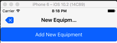
 <Header>
      <Left>
        <Button transparent onPress={ () => this.props.navigator.pop() }>
          <Icon name='ios-backspace'/>
        </Button>
      </Left>

      <Body>
        <Title>New Equipment</Title>
      </Body>
 <Header/>
I'm guessing that it requires some fiddling with the custom theme (or flex?), but I can't seem to see what I have to change
Header.js
import { Platform, PixelRatio } from 'react-native';
import _ from 'lodash';

import variable from './../variables/platform';

export default (variables = variable) => {
  const platformStyle = variables.platformStyle;
  const platform = variables.platform;

  const headerTheme = {
    '.span': {
      height: 128,
      'NativeBase.Left': {
        alignSelf: 'flex-start',
      },
      'NativeBase.Body': {
        alignSelf: 'flex-end',
        alignItems: 'flex-start',
        justifyContent: 'center',
        paddingBottom: 26,
      },
      'NativeBase.Right': {
        alignSelf: 'flex-start',
      },
    },
    '.hasSubtitle': {
      'NativeBase.Body': {
        'NativeBase.Title': {
          fontSize: variables.titleFontSize - 2,
          fontFamily: variables.titleFontfamily,
          textAlign: 'center',
        },
        'NativeBase.Subtitle': {
          fontSize: variables.subTitleFontSize,
          fontFamily: variables.titleFontfamily,
          color: variables.subtitleColor,
          textAlign: 'center',
        },
      },
    },
    '.noShadow': {
      elevation: 0,
      shadowColor: null,
      shadowOffset: null,
      shadowRadius: null,
      shadowOpacity: null,
    },
    '.hasTabs': {
      elevation: 0,
      shadowColor: null,
      shadowOffset: null,
      shadowRadius: null,
      shadowOpacity: null,
      borderBottomWidth: null,
    },
    '.hasSegment': {
      elevation: 0,
      shadowColor: null,
      shadowOffset: null,
      shadowRadius: null,
      shadowOpacity: null,
      borderBottomWidth: null,
    },
    'NativeBase.Button': {
      justifyContent: 'center',
      alignSelf: 'center',
      alignItems: 'center',
      '.transparent': {
        'NativeBase.Text': {
          color: variables.toolbarBtnColor,
          fontWeight: '600',
        },
        'NativeBase.Icon': {
          color: variables.toolbarBtnColor,
        },
        'NativeBase.IconNB': {
          color: variables.toolbarBtnColor,
        },
        paddingHorizontal: variables.buttonPadding,
      },
      paddingHorizontal: 15,
    },
    '.searchBar': {
      'NativeBase.Item': {
        'NativeBase.Icon': {
          backgroundColor: 'transparent',
          color: variables.dropdownLinkColor,
          fontSize: variables.toolbarSearchIconSize,
          alignItems: 'center',
          marginTop: 2,
          paddingRight: 10,
          paddingLeft: 10,
        },
        'NativeBase.IconNB': {
          backgroundColor: 'transparent',
          color: null,
          alignSelf: 'center',
        },
        'NativeBase.Input': {
          alignSelf: 'center',
          lineHeight: 24,
          height: variables.searchBarHeight,
        },
        alignSelf: 'center',
        alignItems: 'center',
        justifyContent: 'flex-start',
        flex: 1,
        height: variables.searchBarHeight,
        borderColor: 'transparent',
        backgroundColor: variables.toolbarInputColor,
      },
      'NativeBase.Button': {
        '.transparent': {
          'NativeBase.Text': {
            fontWeight: '500',
          },
          paddingHorizontal: null,
          paddingLeft: (platform === 'ios') ? 10 : null,
        },
        paddingHorizontal: (platform === 'ios') ? undefined : null,
        width: (platform === 'ios') ? undefined : 0,
        height: (platform === 'ios') ? undefined : 0,
      },
    },
    '.rounded': {
      'NativeBase.Item': {
        borderRadius: ((platform === 'ios') && (platformStyle!=='material')) ? 25 : 3,
      },
    },
    'NativeBase.Left': {
      'NativeBase.Button': {
        '.hasText': {
          marginLeft: -10,
          height: 30,
          'NativeBase.Icon': {
            color: variables.toolbarBtnColor,
            fontSize: variables.iconHeaderSize,
            marginTop: 2,
            marginRight: 5,
            marginLeft: 2
          },
          'NativeBase.Text': {
            color: variables.toolbarBtnColor,
            fontSize: 17,
            marginLeft: 2,
            lineHeight: 21
          },
          'NativeBase.IconNB': {
            color: variables.toolbarBtnColor,
            fontSize: variables.iconHeaderSize,
            marginTop: 2,
            marginRight: 5,
            marginLeft: 2
          },
        },
        '.transparent': {
          marginLeft: -3,
          'NativeBase.Icon': {
            color: variables.toolbarBtnColor,
            fontSize: variables.iconHeaderSize,
            marginTop: 2,
            marginRight: 2,
            marginLeft: 2
          },
          'NativeBase.IconNB': {
            color: variables.toolbarBtnColor,
            fontSize: variables.iconHeaderSize,
            marginTop: 2,
            marginRight: 2,
            marginLeft: 2
          },
          'NativeBase.Text': {
            color: variables.toolbarBtnColor,
            fontSize: 17,
            top: (platform === 'ios') ? undefined : -1.5,
          },
          backgroundColor: 'transparent',
          borderColor: null,
          elevation: 0,
          shadowColor: null,
          shadowOffset: null,
          shadowRadius: null,
          shadowOpacity: null,
        },
        'NativeBase.Icon': {
          color: variables.toolbarBtnColor,
        },
        'NativeBase.IconNB': {
          color: variables.toolbarBtnColor,
        },
        alignSelf: null,
        paddingHorizontal: variables.buttonPadding,
      },
      flex: ((platform === 'ios') && (platformStyle!=='material')) ? 1 : 0.5,
      alignSelf: 'center',
      alignItems: 'flex-start',
    },
    'NativeBase.Body': {
      flex: 1,
      alignItems: ((platform === 'ios') && (platformStyle!=='material')) ? 'center' : 'flex-start',
      alignSelf: 'center',
      'NativeBase.Segment': {
        borderWidth: 0,
        alignSelf: 'flex-end',
        marginRight: (platform === 'ios') ? -40 : -55
      },
      'NativeBase.Button': {
        alignSelf: 'center',
        '.transparent': {
          backgroundColor: 'transparent',
        },
        'NativeBase.Icon': {
          color: variables.toolbarBtnColor,
        },
        'NativeBase.IconNB': {
          color: variables.toolbarBtnColor,
        },
        'NativeBase.Text': {
          color: variables.inverseTextColor,
        },
      },
    },
    'NativeBase.Right': {
      'NativeBase.Button': {
        '.hasText': {
          height: 30,
          'NativeBase.Icon': {
            color: variables.toolbarBtnColor,
            fontSize: variables.iconHeaderSize-2,
            marginTop: 2,
            marginRight: 2,
            marginLeft: 5
          },
          'NativeBase.Text': {
            color: variables.toolbarBtnColor,
            fontSize: 17,
            lineHeight: 21
          },
          'NativeBase.IconNB': {
            color: variables.toolbarBtnColor,
            fontSize: variables.iconHeaderSize-2,
            marginTop: 2,
            marginRight: 2,
            marginLeft: 5
          },
        },
        '.transparent': {
          marginRight: -8,
          paddingHorizontal: 15,
          borderRadius: 50,
          'NativeBase.Icon': {
            color: variables.toolbarBtnColor,
            fontSize: (platform==='ios') ? variables.iconHeaderSize-6 : variables.iconHeaderSize-2,
            marginTop: 2,
            marginLeft: 2,
            marginRight: 2
          },
          'NativeBase.IconNB': {
            color: variables.toolbarBtnColor,
            fontSize: (platform==='ios') ? variables.iconHeaderSize-6 : variables.iconHeaderSize-2,
            marginTop: 2,
            marginLeft: 2,
            marginRight: 2
          },
          'NativeBase.Text': {
            color: variables.toolbarBtnColor,
            fontSize: 17,
            top: (platform === 'ios') ? undefined : -1.5,
          },
          backgroundColor: 'transparent',
          borderColor: null,
          elevation: 0,
          shadowColor: null,
          shadowOffset: null,
          shadowRadius: null,
          shadowOpacity: null,
        },
        'NativeBase.Icon': {
          color: variables.toolbarBtnColor,
        },
        'NativeBase.IconNB': {
          color: variables.toolbarBtnColor,
        },
        alignSelf: null,
        paddingHorizontal: variables.buttonPadding,
      },
      flex: 1,
      alignSelf: 'center',
      alignItems: 'flex-end',
      flexDirection: 'row',
      justifyContent: 'flex-end',
    },
    backgroundColor: variables.toolbarDefaultBg,
    flexDirection: 'row',
    paddingHorizontal: 10,
    justifyContent: 'center',
    paddingTop: (platform === 'ios') ? 15 : 0,
    borderBottomWidth: (platform === 'ios') ? (1/PixelRatio.getPixelSizeForLayoutSize(1)) : 0,
    borderBottomColor: variables.toolbarDefaultBorder,
    height: variables.toolbarHeight,
    elevation: 3,
    shadowColor: (platformStyle==='material') ? '#000' : undefined,
    shadowOffset: (platformStyle==='material') ? {width: 0, height: 2} : undefined,
    shadowOpacity: (platformStyle==='material') ?  0.2 : undefined,
    shadowRadius: (platformStyle==='material') ? 1.2 : undefined,
    top: 0,
    left: 0,
    right: 0,
  };


  return headerTheme;
};
Shivraj Kumar and Srinivas Tamada helped me finding a solution to my problem. I'm just gonna share what I did here:
ran the following
node node_modules/native-base/ejectTheme.js
went into the native-base-theme/components and changed the flex of
Header.js
...
},
    'NativeBase.Body': {
      flex: 4,
      alignItems: ((platform === 'ios') && (platformStyle!=='material')) ? 'center' : 'flex-start',
      alignSelf: 'center',
...
then went to
index.ios.js
import React, {Component} from 'react'
import App from './components/App'
import { AppRegistry } from 'react-native'
import {StyleProvider} from 'native-base'
import getTheme from './native-base-theme/components'

class myApp extends React.Component {
  render() {
    return (
      <StyleProvider style={getTheme()}>
        <App></App>
      </StyleProvider>
    );
  }
};

AppRegistry.registerComponent('myApp', () => myApp);
Upvote if you found the question (and answer) useful.
 342
342
Apply style property flex: 4 to <Body>
110
If you love us? You can donate to us via Paypal or buy me a coffee so we can maintain and grow! Thank you!
Donate Us With