 Menu
Menu
I'm trying to put together a static webpage using Bootstrap 3.0.
The page is basically a narrative, and consists of a series of stacked sections with background images, with text and other images/elements overlaid on top.
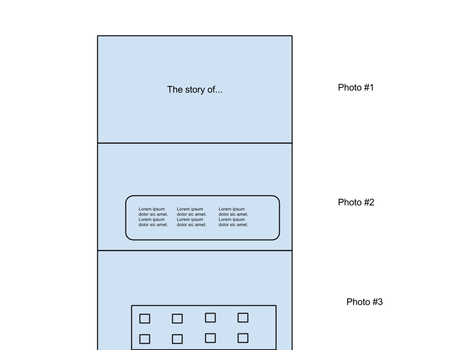
The page is just designed to be scrolled from top to bottom, and each section's background image should fill the horizontal width.
Later on, I'll also be adding parallax with the images using Skrollr (https://github.com/Prinzhorn/skrollr).
However, right now, I'm struggling to get working HTML/CSS with Bootstrap.
Initially, I thought I could do something like this:
<body>
<div class="container">
    <section id="first">
        <div class="row annoucement col-md-4 col-md-offset-4">
            <h1>The story of...</h1>
        </div>
    </section
    <section id="second">
        <div class="row gallery col-md-4 col-md-offset-4">
            <!-- Image gallery boxes -->
        </div>
    </section
</div>
and then in the CSS:
    #first {
        background: url(img/1.jpg) no-repeat center center fixed;
        -webkit-background-size: cover;
        -moz-background-size: cover;
        -o-background-size: cover;
        background-size: cover;
    }
However, the background images aren't visible - the #first element is 1140px x 0px, so the image isn't showing.
I suspect I'm not using the tag types correctly - any suggestions of how I can get the above layout working with Bootstrap?
 303
303
Your markup for the grid system is incorrect, you should look at the examples from the docs, basically the .row should be a container element, also if you want the background to cover the whole page then you can't have the sections inside the container, this is what I'd suggest:
<body>
    <section id="first">
        <div class="container">
            <div class="row announcement">
                <div class="col-md-4 col-md-offset-4">
                     <h1>The story of...</h1>
                </div>
            </div>
        </div>
    </section>
    <section id="second">
        <div class="container">
            <div class="row gallery">
                <div class="col-md-4 col-md-offset-4">
                    <!-- Image gallery boxes -->
                </div>
            </div>
        </div>
    </section>
</body>
Though you may want to use a larger span size for your content, because I believe col-md-4 would be too small, but that's for you to decide :)
194
If you love us? You can donate to us via Paypal or buy me a coffee so we can maintain and grow! Thank you!
Donate Us With

