 Menu
Menu
Similar questions have been asked here before, but after reading through them I've not yet found an answer that works with my site.
I've built the site around Bootstrap but added some of my own media queries. Live test site is at: http://agoodman.com.au
The sections being changed by the media queries are "our fees" and the "map" overlay. If you're on a laptop, resizing the browser makes these sections display as blocks.
My stylesheet links:
    <meta name="viewport" content="width=device-width, initial-scale=1.0">
    <link href="css/bootstrap.css" rel="stylesheet">
    <link href="css/user.css" rel="stylesheet">
"User.css" is just a separate file because I wanted to be able to keep and update bootstrap's main framework as necessary. User.css overrides the styles in bootstrap. My media queries in user.css are as follows:
@media screen or handheld(max-width: 979px) {
    .fee-buttons {
        height: auto;
        font-weight: 600;
        position: relative;
        padding: 0;
        margin: 0;
        list-style: none;
        }

    .fee-buttons .transformation {
        width: 100% !important;
        height: 300px;
        position: relative;
        z-index: 10;
        left:0;
        }

    .fee-buttons .hourly, .fee-buttons .membership {
    float: none;
    width: 100% !important;
    }

    li.button{
    overflow:visible;
    }

}

@media screen or handheld(max-width: 995px) {
    #overlay {
        position: relative;
        display: block;
        width: auto;
        right: 0;
        padding:1em;
    }
}
As I said, on desktop browsers this works fine, but on mobile browsers it's not working at all. I've tested both on an iPhone 4 (using safari) and on an HTC Desire (using the stock android browser) and both display the same way - ignoring the media query and just displaying the full website with lots of really squished and unflattering content.
Any ideas on what I'm doing wrong here?
EDIT:
Here are screenshots of what it's SHOULD look like at a small screen width: 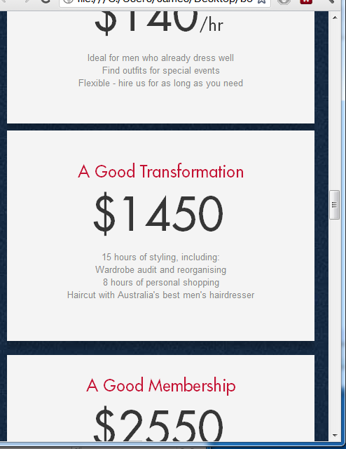
And what it currently looks like on Android and iPhone, where the device is ignoring my media queries: 
 808
808
Sorry to answer my own question, but I found something that worked.
There was an error with the way I set up the media query. Instead of
@media screen or handheld(max-width: 995px)
I changed the query to
@media handheld, screen and (max-width: 995px)
as suggested by this guy: https://stackoverflow.com/a/996820/556006
and it worked perfectly across all devices. Thanks to those who offered suggestions, upvotes to all of you.
94
If you love us? You can donate to us via Paypal or buy me a coffee so we can maintain and grow! Thank you!
Donate Us With
