 Menu
Menu
Goal
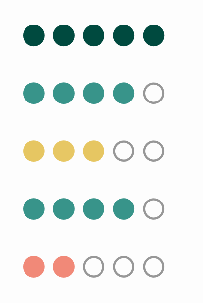
To change color of Ratings ( a material-ui component ) based on the value during hover. For example if I hover on 1rst star, color becomes red, if on 5th star then it becomes green.
I've tried making a custom component which changes color on hover, like this -
const StyledRating = withStyles({
  root: {
    color: "#ff6d75",
  },
  iconFilled: {
    color: '#ff6d75',
  },
  iconHover: {
    color: '#fff',
    backgroundColor: "#000",
  },
})(Rating);
But it changes all of the icons color.
Can anyone please guide me, how to change specific icons in ratings color based on the value I select or hover on.
Current sandbox link.
 656
656
You could use dynamic style (Overriding styles with classes)
const useStyles = makeStyles({
  root: {
    // ...
  },
  'icon-1': { color: 'red' },
  'icon-2': { color: 'coral' },
  'icon-3': { color: 'orange' },
  'icon-4': { color: 'skyblue' },
  'icon-5': { color: 'green' }
});

export default function HoverRating() {
  // ...
  return (
    <div className={classes.root}>
      <Rating
        classes={{
          iconHover: classes[`icon-${Math.ceil(hover)}`]
        }}
        //...
      />
      ...
    </div>
  );
}

174
If you love us? You can donate to us via Paypal or buy me a coffee so we can maintain and grow! Thank you!
Donate Us With