 Menu
Menu
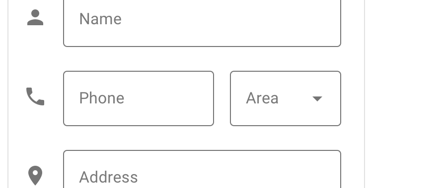
I am currently using Material Design TextInputLayout OutlinedBox as shown below:
        <android.support.design.widget.TextInputLayout
            style="@style/Widget.MaterialComponents.TextInputLayout.OutlinedBox"
            android:layout_width="match_parent"
            android:layout_height="wrap_content">

            <android.support.design.widget.TextInputEditText
                android:id="@+id/myEditText"
                android:layout_width="match_parent"
                android:layout_height="wrap_content"
                android:hint="Title"
                android:inputType="text"/>

        </android.support.design.widget.TextInputLayout>
I am trying to add a dropdown box Spinner under my TextInputEditText, and would like to keep the same styling: OutlinedBox.
I see that dropdowns seem to be supported in Material Design, Material Design Text Fields. As shown on here for the Area:
I am currently using a Spinner to generate the Dropdown.
        <Spinner
            style="@style/Widget.AppCompat.Spinner.DropDown"
            android:id="@+id/option"
            android:layout_width="wrap_content"
            android:layout_height="match_parent"
            android:dropDownWidth="match_parent" />
It doesn't seem possible to add a dropdown following the OutlinedBox design. Is there a library out there that would allow me to make this happen, or is there a better way to implement this within Material Design?
 787
787
I am assuming you want to have an Exposed drop-down menu inside the TextInputLayout I had the same problem, what you can do is use AutoCompleteTextView inside your TextInputLayout as in the following in the XML. here's an example of how I approached the issue.
<LinearLayout android:layout_width="match_parent" android:layout_height="wrap_content" android:orientation="horizontal" android:paddingRight="30dp" android:paddingEnd="30dp" tools:ignore="RtlSymmetry" android:layout_margin="5dp"> <ImageView android:layout_width="30dp" android:layout_margin="10dp" android:layout_height="match_parent" app:srcCompat="@drawable/ic_location_city_black_24dp" android:layout_gravity="center" /> <com.google.android.material.textfield.TextInputLayout style="@style/Widget.MaterialComponents.TextInputLayout.FilledBox.ExposedDropdownMenu" android:layout_width="match_parent" android:layout_height="wrap_content" android:hint="Type" android:orientation="horizontal" > <AutoCompleteTextView android:id="@+id/filled_exposed_dropdown" android:layout_width="match_parent" android:layout_height="wrap_content" android:inputType="none"/> </com.google.android.material.textfield.TextInputLayout> </LinearLayout> </LinearLayout> You will also need an item layout resource to populate the dropdown popup. The example below provides a layout that follows the Material Design guidelines.
res/layout/dropdown_menu_popup_item.xml
<TextView xmlns:android="http://schemas.android.com/apk/res/android" android:layout_width="match_parent" android:layout_height="wrap_content" android:padding="16dp" android:ellipsize="end" android:maxLines="1" android:textAppearance="?attr/textAppearanceSubtitle1"/> In your class add the following code depending on what you want.
String[] type = new String[] {"Bed-sitter", "Single", "1- Bedroom", "2- Bedroom","3- Bedroom"}; ArrayAdapter<String> adapter = new ArrayAdapter<>( this, R.layout.dropdown_menu_popup_item, type); AutoCompleteTextView editTextFilledExposedDropdown = findViewById(R.id.filled_exposed_dropdown); editTextFilledExposedDropdown.setAdapter(adapter); incase this doesn't help kindly check Exposed Dropdown Menus in material design page. [https://material.io/develop/android/components/menu/][1]
This is my first answer on stack overflow I hope it helps.
125
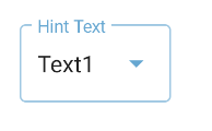
Just use the TextInputLayout included in the Material Components Library with the style Widget.MaterialComponents.TextInputLayout.OutlinedBox.ExposedDropdownMenu.
Something like:
  <com.google.android.material.textfield.TextInputLayout
      style="@style/Widget.MaterialComponents.TextInputLayout.OutlinedBox.ExposedDropdownMenu"
      android:hint="Hint text"
      ...>

    <AutoCompleteTextView
        android:id="@+id/outlined_exposed_dropdown_editable"
        .../>
  </com.google.android.material.textfield.TextInputLayout>
28
I believe that this document isn't showing a Spinner at all. I think it's showing a TextInputLayout with a dropdown icon.
In the Anatomy section, at the Icons subsection, it says
5. Dropdown icon
A dropdown arrow indicates that a text field has a nested selection component.
Now, how you provide the "nested selection component" I'm not sure...
38
If you love us? You can donate to us via Paypal or buy me a coffee so we can maintain and grow! Thank you!
Donate Us With