 Menu
Menu
UPDATED ON Aug 2019 WITH The Material components for android library:
With the new Material components for Android library you can use the new com.google.android.material.dialog.MaterialAlertDialogBuilder class, which extends from the existing androidx.appcompat.AlertDialog.Builder class and provides support for the latest Material Design specifications.
Just use something like this:
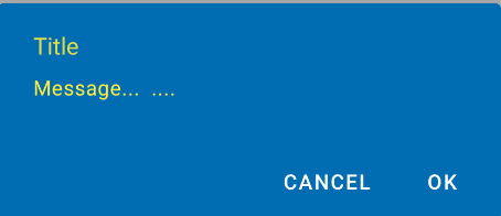
new MaterialAlertDialogBuilder(context)
            .setTitle("Dialog")
            .setMessage("Lorem ipsum dolor ....")
            .setPositiveButton("Ok", /* listener = */ null)
            .setNegativeButton("Cancel", /* listener = */ null)
            .show();
You can customize the colors extending the ThemeOverlay.MaterialComponents.MaterialAlertDialog style:
  <style name="CustomMaterialDialog" parent="@style/ThemeOverlay.MaterialComponents.MaterialAlertDialog">
     <!-- Background Color-->
     <item name="android:background">#006db3</item>
     <!-- Text Color for title and message -->
     <item name="colorOnSurface">@color/secondaryColor</item>
     <!-- Text Color for buttons -->
     <item name="colorPrimary">@color/white</item>
     ....
  </style>
To apply your custom style just use the constructor:
new MaterialAlertDialogBuilder(context, R.style.CustomMaterialDialog)
To customize the buttons, the title and the body text check this post for more details.
You can also change globally the style in your app theme:
 <!-- Base application theme. -->
 <style name="AppTheme" parent="Theme.MaterialComponents.Light">
    ...
    <item name="materialAlertDialogTheme">@style/CustomMaterialDialog</item>
 </style>
WITH SUPPORT LIBRARY and APPCOMPAT THEME:
With the new AppCompat v22.1 you can use the new android.support.v7.app.AlertDialog.
Just use a code like this:
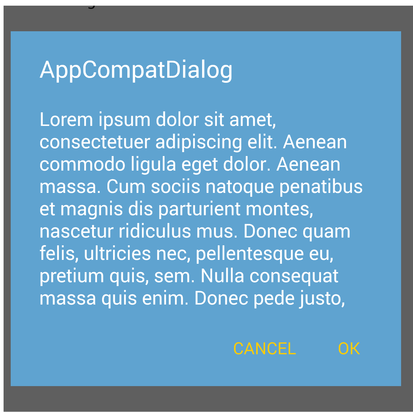
import android.support.v7.app.AlertDialog

AlertDialog.Builder builder =
       new AlertDialog.Builder(this, R.style.AppCompatAlertDialogStyle);
builder.setTitle("Dialog");
builder.setMessage("Lorem ipsum dolor ....");
builder.setPositiveButton("OK", null);
builder.setNegativeButton("Cancel", null);
builder.show();
And use a style like this:
<style name="AppCompatAlertDialogStyle" parent="Theme.AppCompat.Light.Dialog.Alert">
        <item name="colorAccent">#FFCC00</item>
        <item name="android:textColorPrimary">#FFFFFF</item>
        <item name="android:background">#5fa3d0</item>
    </style>
Otherwise you can define in your current theme:
<style name="AppTheme" parent="Theme.AppCompat.Light">
    <!-- your style -->
    <item name="alertDialogTheme">@style/AppCompatAlertDialogStyle</item>
</style>
and then in your code:
 import android.support.v7.app.AlertDialog

    AlertDialog.Builder builder =
           new AlertDialog.Builder(this);
Here the AlertDialog on Kitkat:
when initializing dialog builder, pass second parameter as the theme. It will automatically show material design with API level 21.
AlertDialog.Builder builder = new AlertDialog.Builder(this, AlertDialog.THEME_DEVICE_DEFAULT_DARK);
or,
AlertDialog.Builder builder = new AlertDialog.Builder(this, AlertDialog.THEME_DEVICE_DEFAULT_LIGHT);
AppCompat doesn't do that for dialogs (not yet at least)
EDIT: it does now. make sure to use android.support.v7.app.AlertDialog
You can consider this project: https://github.com/fengdai/AlertDialogPro
It can provide you material theme alert dialogs almost the same as lollipop's. Compatible with Android 2.1.
You could use
Material Design Library made for pretty alert dialogs, buttons, and other things like snack bars. Currently it's heavily developed.
Guide, code, example - https://github.com/navasmdc/MaterialDesignLibrary
Guide how to add library to Android Studio 1.0 - How do I import material design library to Android Studio?
.
Happy coding ;)
Material Design styling alert dialogs: Custom Font, Button, Color & shape,..
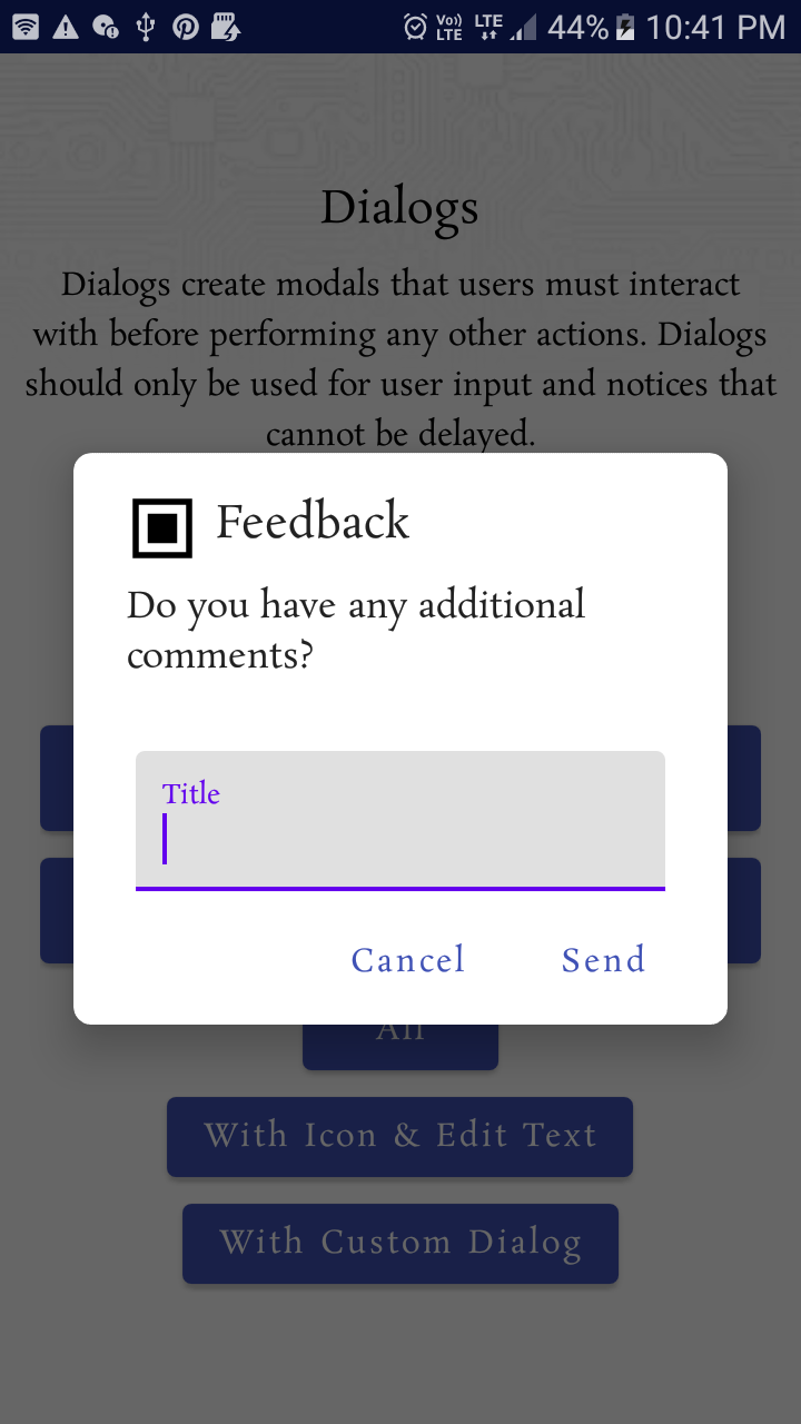
 MaterialAlertDialogBuilder(requireContext(),
                R.style.MyAlertDialogTheme
            )
                .setIcon(R.drawable.ic_dialogs_24px)
                .setTitle("Feedback")
                //.setView(R.layout.edit_text)
                .setMessage("Do you have any additional comments?")
                .setPositiveButton("Send") { dialog, _ ->

                    val input =
                        (dialog as AlertDialog).findViewById<TextView>(
                            android.R.id.text1
                        )
                    Toast.makeText(context, input!!.text, Toast.LENGTH_LONG).show()

                }
                .setNegativeButton("Cancel") { _, _ ->
                    Toast.makeText(requireContext(), "Clicked cancel", Toast.LENGTH_SHORT).show()
                }
                .show()
Style:
  <style name="MyAlertDialogTheme" parent="Theme.MaterialComponents.DayNight.Dialog.Alert">

        <item name="android:textAppearanceSmall">@style/MyTextAppearance</item>
        <item name="android:textAppearanceMedium">@style/MyTextAppearance</item>
        <item name="android:textAppearanceLarge">@style/MyTextAppearance</item>

        <item name="buttonBarPositiveButtonStyle">@style/Alert.Button.Positive</item>
        <item name="buttonBarNegativeButtonStyle">@style/Alert.Button.Neutral</item>
        <item name="buttonBarNeutralButtonStyle">@style/Alert.Button.Neutral</item>

        <item name="android:backgroundDimEnabled">true</item>

        <item name="shapeAppearanceOverlay">@style/ShapeAppearanceOverlay.MyApp.Dialog.Rounded
        </item>

    </style>


    <style name="MyTextAppearance" parent="TextAppearance.AppCompat">
        <item name="android:fontFamily">@font/rosarivo</item>
    </style>


        <style name="Alert.Button.Positive" parent="Widget.MaterialComponents.Button.TextButton">
   <!--     <item name="backgroundTint">@color/colorPrimaryDark</item>-->
        <item name="backgroundTint">@android:color/transparent</item>
        <item name="rippleColor">@color/colorAccent</item>
        <item name="android:textColor">@color/colorPrimary</item>
       <!-- <item name="android:textColor">@android:color/white</item>-->
        <item name="android:textSize">14sp</item>
        <item name="android:textAllCaps">false</item>
    </style>


    <style name="Alert.Button.Neutral" parent="Widget.MaterialComponents.Button.TextButton">
        <item name="backgroundTint">@android:color/transparent</item>
        <item name="rippleColor">@color/colorAccent</item>
        <item name="android:textColor">@color/colorPrimary</item>
        <!--<item name="android:textColor">@android:color/darker_gray</item>-->
        <item name="android:textSize">14sp</item>
        <item name="android:textAllCaps">false</item>
    </style>


  <style name="ShapeAppearanceOverlay.MyApp.Dialog.Rounded" parent="">
        <item name="cornerFamily">rounded</item>
        <item name="cornerSize">8dp</item>
    </style>
Output:
Try this library:
https://github.com/avast/android-styled-dialogs
It's based on DialogFragments instead of AlertDialogs (like the one from @afollestad). The main advantage: Dialogs don't dismiss after rotation and callbacks still work.
If you love us? You can donate to us via Paypal or buy me a coffee so we can maintain and grow! Thank you!
Donate Us With