 Menu
Menu
I am trying to nest tables within a table row, while maintaining the appearance of a single table, as shown in the example below (a table with a single row with a data value and two nested tables, one 2x2 and the other 3x3) :
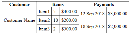
This is just an example; the actual table has significantly more rows and columns. I want to use tables because of the natural reflowing of column widths and row heights to fit the table data without having to worry about the container size (i.e. table width = 100%).
The problem I am having is that the tallest table sets the row height, but the other tables don't expand to fill that height, so the internal borders don't stretch from top to bottom as shown in the result of this snippet:
.display {
	border-collapse: collapse;
}
.display, .display td, .display th {
	border: 1px solid black;
}
.subtable {
	border-collapse: collapse;
}
.subtable td {
	border-top: 0;
	border-bottom: 1px solid black;
	border-left: 0;
	border-right: 1px solid black;
}
.subtable tr td:last-of-type {
	border-top: 0;
	border-bottom: 1px solid black;
	border-left: 0;
  border-right: 0;
}
.subtable tr:last-of-type td {
	border-top: 0;
	border-bottom: 0;
	border-left: 0;
	border-right: 1px solid black;
}
.subtable tr:last-of-type td:last-of-type {
	border: 0;
}
td {
	padding: 5px;
}
td.d-subtable {
	padding: 0;
}
<table class="display" cellpadding="0">
<tr><th>Customer</th><th>Items</th><th>Payments</th></tr>
<tr><td>Customer Name</td>
<td class="d-subtable"><table class="subtable" cellpadding="0"><tr><td>Item1</td><td>5</td><td>$400.00</td></tr><tr><td>Item2</td><td>10</td><td>$200.00</td></tr><tr><td>Item3</td><td>2</td><td>$500.00</td></tr></table></td>
<td class="d-subtable"><table class="subtable" cellpadding="0"><tr><td>12 Sep 2018</td><td>$3,000.00</td></tr><tr><td>18 Sep 2018</td><td>$2,000.00</td></tr></table></td>
</tr>
</table>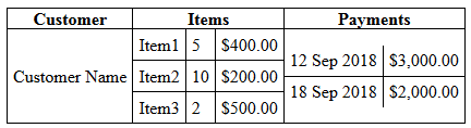
Now I know I can resolve this problem using rowspan (and that is how I am currently solving the problem) but that requires deciding in advance which rows to line up and that can lead to issues such as that generated by the below snippet, where it would clearly be better if I'd applied rowspan="2" to the first row (instead of the last row) of the table with 2 rows:
td {
  border: 1px solid black;
}

table {
  border-collapse: collapse;
  width: 500px;
}
<table cellpadding="5">
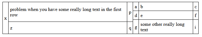
<tr><td rowspan="3">x</td>
<td>problem when you have some really long text in the first row</td><td>p</td><td>a</td><td>b</td><td>c</td></tr><tr><td rowspan="2">z</td><td rowspan="2">q</td><td>d</td><td>e</td><td>f</td></tr><tr><td>g</td><td>some other really long text</td><td>i</td>
</tr>
</table>
I would prefer the above table to look like this:
Is there a way to achieve what I want using HTML/CSS? There are a lot of rows in the table so I'd prefer the browser sort it out before rendering. However if it's not possible I'm open to a Javascript/JQuery solution.
Update
Although I did find a workable solution at the time (see my posted answer) I have since encountered some situations where setting the widths of the columns in advance (even as percentages) was difficult owing to not being able to anticipate all the possible data to be displayed. So I'm hoping to find an answer that doesn't rely on doing that.
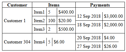
Since I didn't make it as clear as I should have, I have multiple rows in which I want to nest tables, keeping the heights matched as well as the column widths. For example, for two rows, I would like to be able to create a layout like this:
Where with raw table HTML the result looks like this:
		.display {
			border-collapse: collapse;
		}
		.display, .display td, .display th {
			border: 1px solid black;
		}
		.subtable {
			border-collapse: collapse;
		}
		.subtable td {
			border-top: 0;
			border-bottom: 1px solid black;
			border-left: 0;
			border-right: 1px solid black;
		}
		.subtable tr td:last-of-type {
			border-top: 0;
			border-bottom: 1px solid black;
			border-left: 0;
			border-right: 0;
		}
		.subtable tr:last-of-type td {
			border-top: 0;
			border-bottom: 0;
			border-left: 0;
			border-right: 1px solid black;
		}
		.subtable tr:last-of-type td:last-of-type {
			border: 0;
		}
		td {
			padding: 5px;
		}
		td.d-subtable {
			padding: 0;
		}
<table class="display" cellpadding="0">
<tr><th>Customer</th><th>Items</th><th>Payments</th></tr>
<tr><td>Customer 1</td>
<td class="d-subtable"><table class="subtable" cellpadding="0"><tr><td>Item1</td><td>5</td><td>$400.00</td></tr><tr><td>Item2</td><td>100</td><td>$20.00</td></tr><tr><td>Item3</td><td>2</td><td>$500.00</td></tr></table></td>
<td class="d-subtable"><table class="subtable" cellpadding="0"><tr><td>12 Sep 2018</td><td>$3,000.00</td></tr><tr><td>18 Sep 2018</td><td>$2,000.00</td></tr></table></td>
</tr>
<tr><td>Customer 304</td>
<td class="d-subtable"><table class="subtable" cellpadding="0"><tr><td>Item4</td><td>5</td><td>$6.00</td></tr></table></td>
<td class="d-subtable"><table class="subtable" cellpadding="0"><tr><td>20 Sep 2018</td><td>$4.00</td></tr><tr><td>27 Sep 2018</td><td>$26.00</td></tr></table></td>
</tr>
</table> 655
655
To manipulate the height or width of an entire table, place the size attribute (either "WIDTH=" or "HEIGHT=") within the <TABLE> code. To manipulate individual cells, place the size attribute within the code for that cell.
You can create nested tables to any number of levels; just remember to create an inner table inside the same cell. Below is an interpretation of nested tables.
Tables can be nested together to create a table inside a table. To create a nested table, we need to create a table using the <table> tag. This table is known as the outer table. The second table that will be nested table is called the inner table.
To set the cell width and height, use the CSS style. The height and width attribute of the <td> cell isn't supported in HTML5. Use the CSS property width and height to set the width and height of the cell respectively.
I would suggest the use of flex to achieve your need. Flex is very powerful for this kind of layout as we can easily let the content guide it. Please, see the attached snippet. It is purely made from HTML and CSS. No fixed sizes and no Javascript required.
(old snippet)
.outer {
  display: flex;
  flex-wrap: wrap;

  /* For demo purposes */
  max-width: 500px;
  margin: 20px auto;
  border-left: 1px solid black;
  border-top: 1px solid black;
}

.column {
  flex: 1 1 auto;
  display: flex;
  flex-direction: column;
  flex-wrap: wrap;
}

.row {
  display: flex;
  flex-direction: row;
  flex: 1 1 auto;
}

.inner {
  flex: 1 1 auto;
  display: flex;
  flex-direction: column;
}

.item {
  border-right: 1px solid black;
  border-bottom: 1px solid black;
  text-align: center;
  padding: 3px;
}

.item.heading {
  font-weight: bold;
}

.item:not(.heading) {
  flex: 1 1 auto;
  justify-content: center;
  align-items: center;
  display: flex;
}

.fixed .narrow {
  flex-basis: 20px;
}
<div class="outer">
<div class="column">
<div class="item heading">Customer</div>
<div class="item">
<span>Customer Name</span>
</div>
</div>
<div class="column">
<div class="item heading">Items</div>
<div class="inner fixed">
<div class="row">
<div class="item">Item1</div>
<div class="item narrow">5</div>
<div class="item last">$400.00</div>
</div>
<div class="row">
<div class="item">Item2</div>
<div class="item narrow">10</div>
<div class="item last">$200.00</div>
</div>
<div class="row">
<div class="item">Item3</div>
<div class="item narrow">2</div>
<div class="item last">$500.00</div>
</div>
</div>
</div>
<div class="column">
<div class="item heading">Payments</div>
<div class="inner">
<div class="row">
<div class="item">12 sep 2018</div>
<div class="item">$3,000.00</div>
</div>
<div class="row">
<div class="item">
18 sep 2018
</div>
<div class="item">
$2,000.00
</div>
</div>
</div>
</div>
</div>Update: Changed according to your comment/answer. It somewhat depends on your HTML structure. I had to move the headings to its own ".row.row-item" and therefor needed to set a flex-basis to align the columns. This can be extended with multiple ".row.row-item". See snippet below.
.outer {
  display: flex;
  flex-wrap: wrap;

  /* For demo purposes */
  max-width: 600px;
  margin: 20px auto;
  border-left: 1px solid black;
  border-top: 1px solid black;
}

.column {
  flex: 1 1 33.33%;
  display: flex;
  flex-direction: column;
  flex-wrap: wrap;
}

.row {
  display: flex;
  flex-direction: row;
  flex: 1 1 auto;
}

.row-item {
  flex-basis: 100%;
}

.inner {
  flex: 1 1 auto;
  display: flex;
  flex-direction: column;
}

.item {
  border-right: 1px solid black;
  border-bottom: 1px solid black;
  text-align: center;
}

.item.heading {
  font-weight: bold;
  flex: 1 1 33.33%;
}

.item:not(.heading) {
  flex: 1 1 33.33%;
  justify-content: center;
  align-items: center;
  display: flex;
}

.fixed .narrow {
  flex: 1 1 20px;
}
<div class="outer">
<div class="row row-item">
<div class="item heading">Customer</div>
<div class="item heading">Items</div>
<div class="item heading">Payments</div>
</div>
<div class="row row-item">
<div class="column">
<div class="item">
<span>Customer 1</span>
</div>
</div>
<div class="column">
<div class="inner fixed">
<div class="row">
<div class="item">Item1</div>
<div class="item narrow">5</div>
<div class="item last">$400.00</div>
</div>
<div class="row">
<div class="item">Item2</div>
<div class="item narrow">10</div>
<div class="item last">$200.00</div>
</div>
<div class="row">
<div class="item">Item3</div>
<div class="item narrow">2</div>
<div class="item last">$500.00</div>
</div>
</div>
</div>
<div class="column">
<div class="inner">
<div class="row">
<div class="item">12 sep 2018</div>
<div class="item">$3,000.00</div>
</div>
<div class="row">
<div class="item">
18 sep 2018
</div>
<div class="item">
$2,000.00
</div>
</div>
</div>
</div>
</div>
<div class="row row-item">
<div class="column">
<div class="item">
<span>Customer 304</span>
</div>
</div>
<div class="column">
<div class="inner fixed">
<div class="row">
<div class="item">Item4</div>
<div class="item narrow">5</div>
<div class="item last">$6.00</div>
</div>
</div>
</div>
<div class="column">
<div class="inner">
<div class="row">
<div class="item">20 sep 2018</div>
<div class="item">$4.00</div>
</div>
<div class="row">
<div class="item">
27 sep 2018
</div>
<div class="item">
$26.00
</div>
</div>
</div>
</div>
</div>
<div class="row row-item">
<div class="column">
<div class="item">
<span>Customer 605</span>
</div>
</div>
<div class="column">
<div class="inner fixed">
<div class="row">
<div class="item">Item5</div>
<div class="item narrow">50</div>
<div class="item last">$60.00</div>
</div>
<div class="row">
<div class="item">Item6</div>
<div class="item narrow">3</div>
<div class="item last">$260.00</div>
</div>
</div>
</div>
<div class="column">
<div class="inner">
<div class="row">
<div class="item">29 sep 2018</div>
<div class="item">$40.00</div>
</div>
<div class="row">
<div class="item">
30 sep 2018
</div>
<div class="item">
$206.00
</div>
</div>
</div>
</div>
</div>
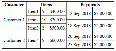
</div>I was eventually able to solve this by writing an onload function to find the maximum height of all the nested tables in a given row and then set the height of every nested table in that row to the same value.
window.onload=function () {
    let rows = document.querySelectorAll('tr');
    for (let r = 0; r < rows.length; r++) {
        let subtables = rows[r].querySelectorAll('.subtable');
        let maxHeight = 0;
        for (let i = 0; i < subtables.length; i++) {
            maxHeight = Math.max(maxHeight, subtables[i].clientHeight);
        }
        for (let i = 0; i < subtables.length; i++) subtables[i].style.height='' + maxHeight + 'px';
    }
};
The only downside of this solution was that it meant I had to assign widths to the <td>s in the nested tables. However since I could use percentage widths this wasn't too big an issue for me:
<table class="display" cellpadding="0">
    <tr><th>Customer</th><th>Items</th><th>Payments</th></tr>
    <tr><td>Customer 1</td>
        <td class="d-subtable"><table class="subtable" cellpadding="0"><tr><td width="35%">Item1</td><td width="20%">5</td><td width="45%">$400.00</td></tr><tr><td>Item2</td><td>10</td><td>$200.00</td></tr><tr><td>Item3</td><td>2</td><td>$500.00</td></tr></table></td>
        <td class="d-subtable"><table class="subtable" cellpadding="0"><tr><td width="60%">12 Sep 2018</td><td width="40%">$3,000.00</td></tr><tr><td>18 Sep 2018</td><td>$2,000.00</td></tr></table></td>
    </tr>
    <tr><td>Customer 2</td>
        <td class="d-subtable"><table class="subtable" cellpadding="0"><tr><td width="35%">Item4</td><td width="20%">5</td><td width="45%">$600.00</td></tr></table></td>
        <td class="d-subtable"><table class="subtable" cellpadding="0"><tr><td width="60%">20 Sep 2018</td><td width="40%">$4,000.00</td></tr><tr><td>27 Sep 2018</td><td>$2,000.00</td></tr></table></td>
    </tr>
</table>
Final output:
38
If you love us? You can donate to us via Paypal or buy me a coffee so we can maintain and grow! Thank you!
Donate Us With

