 Menu
Menu
I'm currently running into an issue where a site I'm working on doesn't play nicely with the way mobile devices can zoom in.
Basically there is a horizontal full-width line on that website that is fixed and centered vertically and in the background is a long text. The page is automatically scrolling and the horizontal line tells the user which text-line is of importance right now. (The page automatically scrolls so that the important text line is in the center of the screen.)
But when I zoom in on my Android phone using Firefox, the line is not centered on the screen anymore. It's even possible to zoom in to the point that the line is not on the screen anymore at all. The page will still scroll automatically even in that case and I'm sure the important text is still under that horizontal line, but it's useless when it's not visible on the screen anymore.
On a normal desktop computer this problem doesn't exist. If you zoom in the horizontal line remains in its fixed position centered on the screen.
Now I'm wondering, is it possible to modify the zoom behavior in a way that it doesn't break my site on touch devices?
I know that I could disable zooming all together, but I don't just want to take that functionality away. Also changing the font size instead of zooming wouldn't work because then the site wouldn't scroll to the correct position anymore.
Edit: Disabling zoom is not an option, even it it just disabled on touch devices. So this question doesn't help.
Edit2: Here's a very simplified version of my code:
$(function() {
    var textEl = $('#text');
    var $w = $(window);
    var percentPos = 0.000;

    setInterval(function() {
        var currentPosX = window.scrollX || window.pageXOffset;
        var newPosY = textEl.offset().top-$w.height()/2+percentPos*textEl.height();
        window.scrollTo(currentPosX, newPosY);

        percentPos += 0.001;
        if (percentPos >= 1)
            percentPos = 0.000;
    }, 100);

})
#line {
position: fixed;
background-color: #ffef011f;
height: 5px;
top: 50%;
width: 100%;
}
#container {
text-align: center;
margin-top: 500px;
margin-bottom: 500px;
}
#text {
color: #000;
font: normal 12px/1.5 Courier New,monospace,Courier;
white-space: pre;
word-break: break-all;
text-align: left;
display: inline-block;
}<script src="https://cdnjs.cloudflare.com/ajax/libs/jquery/3.3.1/jquery.min.js"></script>
<div id="line"></div>
<div id="container">
<span id="text">
Lorem ipsum dolor sit amet,
consectetur adipiscing elit,
sed do eiusmod tempor incididunt
ut labore et dolore magna aliqua.
Ut enim ad minim veniam, quis
nostrud exercitation ullamco
laboris nisi ut aliquip ex ea
commodo consequat. Duis aute irure
dolor in reprehenderit in
voluptate velit esse cillum dolore
eu fugiat nulla pariatur.
Excepteur sint occaecat cupidatat
non proident, sunt in culpa qui
officia deserunt mollit anim id est
laborum.
</span>
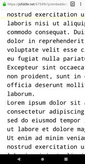
<div>To run it on a mobile device you can click here: https://jsfiddle.net/k754fb1p/embedded/result
(In reality a server is handling the scroll position and just sends the percentual position to the client via websockets.)
But you can see that if you zoom in on a desktop device the yellow line remains on the same text line and the yellow line stays in center. On my Android phone with Firefox it doesn't:
 484
484
This happens because of the way zoom works in different devices:
devicePixelRatio. From the perspective of the website, the rendering window becomes smaller.Imagine the layout viewport as being a large image which does not change size or shape. The portion of the large image that you can see through the frame is the visual viewport. You can back away from the large image while holding your frame (zoom out) to see the entire image at once, or you can move closer (zoom in) to see only a portion. From this answer.
The problem with changing the visual viewport in this case is that it doesn't change the scroll position. It still follows the layout viewport, which scrolls, though.
This is not an easy problem to fix.
UPDATE
There is a way of getting information about the visual viewport position and scale through the Visual Viewport API. You can center the line by changing its coordinates relative to window.visualViewport.offsetTop.
It's not recommended to disable zoom because of accessibility concerns, so you could replace the visual viewport zoom with custom code that simply changes the font-size, though I believe that would require listening to touch events, finding the distance between two touch points, etc...
109
If you love us? You can donate to us via Paypal or buy me a coffee so we can maintain and grow! Thank you!
Donate Us With