 Menu
Menu
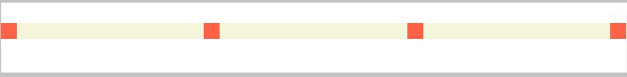
I have four items with same width. I need them to be stretched inside the fluid container. Whenever I resize the window, the gap between each item should adjust in such a way that the items are still stretching inside the container. Here is the image of what I want.
Here is the code, I have tried:
.parent {
    margin-top: 40px;
    background-color: beige;
}
.parent::after {
    content:"";
    clear: both;
    display: block;
}
.child {
    width: 20px;
    height: 20px;
    background-color: tomato;
    margin-left: 20%;
    float: left;
}
Fiddle
 728
728
Suppose, we know the number of items present in a container. Lets say the items to be 4. Lets wrap those items in separate sections each and give those sections float: left and width: 25%. Here I am giving width: 25% because there are four sections which need to cover the container completely i.e 100/4 = 25%. This will result in something similar view as shown below in the image:

As you can see in the above image, the items are still not aligned to each other. We can see gap between the last item and the container. But if you ignore the gap, you can see that the items are equally aligned to each other.

So now we should just be able to remove the width of the section holding the last item. This can be done using :last-child selection. Since, the last item holder is now hidden, we need to stretch other child holders. Hence, we need to divide 100% by 3 instead of 4.
.child-holder{
    width: 33.3%;   /* Instead of 25% */
}

.child-holder:last-child {
    width: 0px;
}
It stretches the items but this hides the last item. As you can see in the below image:

We can solve this by giving negative margin-left to each item with value equal to the items. Applying so, will now hides the first item. So, give margin-left to the container equal to the item's width (positive value).
.parent {
    margin-left: 20px;  /* This value is equal to the item's width */
}
.child {
    width: 20px;
    height: 20px;
    background-color: black;
    margin-left: -20px;  /* negative margin equal to its width */
}
Hence, this will give the solution we want:
Working Fiddle
For unknown number of items, we will replace float: left to the item holding sections with display: table-cell and to stretch those sections, we will apply display: table; width: 100%; to the parent container. and since we must apply margin-left value equal to the item's width, we will have a parent wrapper, to which we apply margin-left instead. (Because, if we apply margin-left and width: 100% to same element, then the element will overflow)
Though we are giving width: 0px to the last item holder section, it is still occupying the space.
This can be solved by applying table-layout: fixed to the parent container. This will give us the solution:
Working Fiddle
This solution will work for any number of items, added dynamically or static. It will get automatically adjusted.
For unequal/unknown width of items, we should definitely go with javascript. Here is the small code which I wrote to use in one of the projects:
function setAlign(parentClass, childCommonClass) {
    var childDivs = document.getElementsByClassName(childCommonClass);
    var childDivsTotalWidth = 0;
    var childDivsLength = childDivs.length;
    var parentElement = document.getElementsByClassName(parentClass)[0];
    var parentElementWidth = parentElement.offsetWidth;
    for (var i = 0; i < childDivsLength; i++) {
        childDivsTotalWidth += childDivs[i].offsetWidth;
    }
    var remainingWidth = parentElementWidth - childDivsTotalWidth;

    var gap = remainingWidth / (childDivsLength - 1);
    var leftWidth = 0;
    for (var j = 0; j < childDivsLength; j++) {
        if (j > 0) {
            leftWidth += gap + childDivs[j - 1].offsetWidth;
        }
        childDivs[j].style.left = leftWidth + "px";
    }
}

window.onload = setAlign('row', 'box');
window.onresize = function () {
    setAlign('row', 'box');
}
Working Fiddle
173
If you love us? You can donate to us via Paypal or buy me a coffee so we can maintain and grow! Thank you!
Donate Us With
