 Menu
Menu
Expanding on this question on how to make equal height columns in Twitter Bootstrap (original fiddle).
Now the column heights match, but I need to make the captions vertically align at the bottom.
Here is a new fiddle.
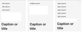
As you can see the H2 captions do not line up.
Here's how I want it to look:
Starting a new with: <div class="row-fluid col-wrap"> does not work because the captions separate from the text at media breaks.
 502
502
The problem is, the answer from the original question pretty much sets the height of each of those divs to infinite. After the content, the div just stretches on and on.
The downside of which, is we don't know where the bottom of this element is.
The padding is sized to content: But the element stretches forever

One element that does know where the element ends is the wrapper. That was it's job. So what we'd like to do is position our header tag relative to the .col-wrap container.
To position an element relative to it's grandparent, we'll set the grandchild position to absolute. This will position relative to the first parent element it finds with position equal to relative. So we can set the header to the bottom of the col-wrap container with the following code:
HTML
<div class="row-fluid col-wrap">
    <div class="span4 col well">
        <p>left column</p>
        <h2>Title or Caption</h2>
    </div>
</div>
CSS
.col-wrap {
    overflow: hidden;
    position: relative;
}
.col-wrap > .col > h2{
    position: absolute;
    bottom: 0;
}
One thing we have to adjust for is now that the header is positioned absolutely, it's taken out of the document flow and no longer occupies any space. A hackish way to get around this is to double up your header tags and use one as a placeholder.
HTML
<h2 class='absolute'>Title or Caption</h2>
<h2 class='relative'>Title or Caption</h2>
Quick CSS Overview:
visibility: hidden; /* hides an element but still takes up the same space*/
display: none;      /* hides an element and collapses*/
Using that:
visibility to hidden and positioning the absolute header at the bottom of it's grandparent.In CSS, it will look like this:
@media (min-width: 768px) {
    .col > h2.absolute{
        position: absolute;
        bottom: 0;
    }
    .col > h2.relative{
        visibility: hidden;
    }
}
@media (max-width: 767px) {
    .col > h2.absolute{
        display: none;
    }
}
Finally, since the h2 element is positioned absolutely, the column no longer acts like a container to prevent the text from spilling over. We can fix this by applying some sizing constraints on our visible absolutely positioned elements. These should be done to mimic the placeholder constraints so they line up.
We can apply a span4 class to the absolute header as well as the following css
<h2 class='absolute span4'>Title or Caption</h2>
.col > h2.absolute{
    margin-left:0;
    padding-right:40px;
}
It will look like this:
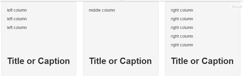
97
If you love us? You can donate to us via Paypal or buy me a coffee so we can maintain and grow! Thank you!
Donate Us With