 Menu
Menu
Currently, when you set up tabs in Bootstrap 3, the tabs are not responsive.
This:
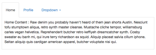
Turns into this:
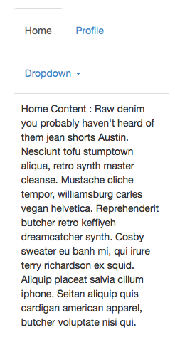
CSS. Fixing how it looks is easy, just removing the float, etc. at the max-width. However, the content is disjointed from the tab, so a stack of tabs will work like tabs but on smaller viewports you may or may not see the change in content.
This is the basic html for making a tabbed navigation:
<!--begin tabs going in wide content -->
<ul class="nav nav-tabs" id="maincontent" role="tablist">
<li class="active"><a href="#home" role="tab" data-toggle="tab">Home</a></li>
<li><a href="#profile" role="tab" data-toggle="tab">Profile</a></li>
<li class="dropdown">
<a href="#" id="myTabDrop1" class="dropdown-toggle" data-toggle="dropdown">Dropdown <span class="caret"></span></a>
<ul class="dropdown-menu" role="menu" aria-labelledby="myTabDrop1">
<li><a href="#dropdown1" tabindex="-1" role="tab" data-toggle="tab">@fat</a></li>
<li><a href="#dropdown2" tabindex="-1" role="tab" data-toggle="tab">@mdo</a></li>
</ul>
</li>
</ul><!--/.nav-tabs.content-tabs -->
<div class="tab-content">
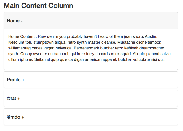
<div class="tab-pane fade in active" id="home">
<p>Home Content : ...</p>
</div><!--/.tab-pane -->
<div class="tab-pane fade" id="profile">
<p>Profile Content : ...</p>
</div><!--/.tab-pane -->
<div class="tab-pane fade" id="dropdown1">
<p>Dropdown1 - ...</p>
</div><!--/.tab-pane -->
<div class="tab-pane fade" id="dropdown2">
<p>Dropdown 2 - ...</p>
</div><!--/.tab-pane -->
</div><!--/.tab-content -->
How do you turn the Tabs into the Accordion or Collapse so that it's small viewport friendly?
 314
314
Slack has a cool way of making tabs small viewport friendly on some of their admin pages. I made something similar using bootstrap. It's kind of a tabs → dropdown.
Demo: http://jsbin.com/nowuyi/1
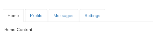
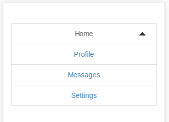
Here's what it looks like on a big viewport:
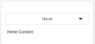
Here's how it looks collapsed on a small viewport:
Here's how it looks expanded on a small viewport:
the HTML is exactly the same as default bootstrap tabs.
There is a small JS snippet, which requires jquery (and inserts two span elements into the DOM):
$.fn.responsiveTabs = function() {
  this.addClass('responsive-tabs');
  this.append($('<span class="glyphicon glyphicon-triangle-bottom"></span>'));
  this.append($('<span class="glyphicon glyphicon-triangle-top"></span>'));

  this.on('click', 'li.active > a, span.glyphicon', function() {
    this.toggleClass('open');
  }.bind(this));

  this.on('click', 'li:not(.active) > a', function() {
    this.removeClass('open');
  }.bind(this));
};

$('.nav.nav-tabs').responsiveTabs();
And then there is a lot of css (less):
@xs: 768px;


.responsive-tabs.nav-tabs {
  position: relative;
  z-index: 10;
  height: 42px;
  overflow: visible;
  border-bottom: none;

  @media(min-width: @xs) {
    border-bottom: 1px solid #ddd;
  }

  span.glyphicon {
    position: absolute;
    top: 14px;
    right: 22px;
    &.glyphicon-triangle-top {
      display: none;
    }
    @media(min-width: @xs) {
      display: none;
    }
  }

  > li {
    display: none;
    float: none;
    text-align: center;

    &:last-of-type > a {
      margin-right: 0;
    }

    > a {
      margin-right: 0;
      background: #fff;
      border: 1px solid #DDDDDD;

      @media(min-width: @xs) {
        margin-right: 4px;
      }
    }

    &.active {
      display: block;
      a {
        @media(min-width: @xs) {
          border-bottom-color: transparent;
        }
        border: 1px solid #DDDDDD;
        border-radius: 2px;
      }
    }

    @media(min-width: @xs) {
      display: block;
      float: left;
    }

  }

  &.open {

    span.glyphicon {
      &.glyphicon-triangle-top {
        display: block;
        @media(min-width: @xs) {
          display: none;
        }
      }
      &.glyphicon-triangle-bottom {
        display: none;
      }
    }

    > li {
      display: block;

      a {
        border-radius: 0;
      }

      &:first-of-type a {
        border-radius: 2px 2px 0 0;
      }
      &:last-of-type a {
        border-radius: 0 0 2px 2px;
      }
    }
  }
}
Bootstrap tabs are not responsive out of the box. Responsive, IMO, is a style change, changing functions is Adaptive. There are a few plugins to turn the Bootstrap 3 tabs into a Collapse component. The best and most updated one is : https://github.com/flatlogic/bootstrap-tabcollapse.
Here's one way of implementing it:
This turns the content into a collapse component:
Dependencies:
HTML -- same as question with class name addition:
<ul class="nav nav-tabs content-tabs" id="maincontent" role="tablist">
jQuery:
$(document).ready(function() {

    // DEPENDENCY: https://github.com/flatlogic/bootstrap-tabcollapse
    $('.content-tabs').tabCollapse();

    // initialize tab function
    $('.nav-tabs a').click(function(e) {
        e.preventDefault();
        $(this).tab('show');
    });

});
CSS -- optional for fat fingers and active states:
.panel-heading {
    padding: 0
}
.panel-heading a {
    display: block;
    padding: 20px 10px;
}
.panel-heading a.collapsed {
    background: #fff
}
.panel-heading a {
    background: #f7f7f7;
    border-radius: 5px;
}
.panel-heading a:after {
    content: '-'
}
.panel-heading a.collapsed:after {
    content: '+'
}
.nav.nav-tabs li a,
.nav.nav-tabs li.active > a:hover,
.nav.nav-tabs li.active > a:active,
.nav.nav-tabs li.active > a:focus {
    border-bottom-width: 0px;
    outline: none;
}
.nav.nav-tabs li a {
    padding-top: 20px;
    padding-bottom: 20px;
}
.tab-pane {
    background: #fff;
    padding: 10px;
    border: 1px solid #ddd;
    margin-top: -1px;
}
I prefer a css only scheme based on horizontal scroll, like tabs on android. This's my solution, just wrap with a class nav-tabs-responsive:
<div class="nav-tabs-responsive">
  <ul class="nav nav-tabs" role="tablist">
    <li>...</li>
  </ul>
</div>
And two css lines:
.nav-tabs { min-width: 600px; }
.nav-tabs-responsive { overflow: auto; }
600px is the point over you will be responsive (you can set it using bootstrap variables)
12
If you love us? You can donate to us via Paypal or buy me a coffee so we can maintain and grow! Thank you!
Donate Us With


