 Menu
Menu
I am making a CRUD application and I want to display the 'Create' control as a Fab button that sticks to the botton-right side of the screen, and to stay there in despite of screen scrolling.
I could, finally, make the button to remain still when the screen is scrolled, but I can't find how to set its position to the bottom-right of the screen.
This is the code of my component:
import React, { Component } from 'react';
import Cookies from 'js-cookie';
import axios from 'axios';
import PropTypes from 'prop-types';
import { withStyles } from '@material-ui/core/styles';
import Table from '@material-ui/core/Table';
import TableBody from '@material-ui/core/TableBody';
import TableCell from '@material-ui/core/TableCell';
import TableHead from '@material-ui/core/TableHead';
import TableRow from '@material-ui/core/TableRow';
import Paper from '@material-ui/core/Paper';
import Fab from '@material-ui/core/Fab';
import AddIcon from '@material-ui/icons/Add';
import Icon from '@material-ui/core/Icon';
import Album from './Album.js'

const styles = theme => ({
  root: {
    width: '100%',
    marginTop: theme.spacing.unit * 3,
    overflowX: 'auto',
  },
  table: {
    minWidth: 700,
  },
  fab: {
    margin: theme.spacing.unit,
  },
  extendedIcon: {
    marginRight: theme.spacing.unit,
  },
});

class AddAlbumFloatingButton extends Component {
  constructor(props) {
    super(props);

    const {classes} = props;
  }

  render() {
    return(
      <div>
        <Fab color="primary" aria-label="Add" className={this.props.classes.fab} style={{position: 'fixed'}}>
          <AddIcon />
        </Fab>
      </div>
    )
  }
}

AddAlbumFloatingButton.propTypes = {
  classes: PropTypes.object.isRequired,
}

class Albums extends Component {
  constructor(props) {
    ...
  }

  getData() {
      ...
  }

  callDetail(instance) {
    ...
  }

  callList() {
    ...
  }

  render() {
    if(this.state.mode === 'table'){
      return (
        <div>
          <AddAlbumFloatingButton classes={this.state.classes}/>
          <AlbumsTable classes={this.state.classes} albums={this.albums} onCallDetail={this.callDetail}/>
        </div>
      );
    } else {
      return (<AlbumDetail instance={this.state.instance} onCallList={this.callList} />);
    }

  }
}

Albums.propTypes = {
  classes: PropTypes.object.isRequired,
};

export default withStyles(styles)(Albums);
 870
870
Add required styling to your class fab:
const styles = theme => ({
  ...
  fab: {
    margin: theme.spacing.unit, // You might not need this now
    position: "fixed",
    bottom: theme.spacing.unit * 2,
    right: theme.spacing.unit * 3
  },
  ...
});
And remove style prop from your <Fab> component as it is already mentioned in the class. As with normal HTML and CSS, it is best to keep all styling in classes to make them reusable and have better separation of concerns.
The styling applied above is again only some CSS: it fixes the element at the bottom, with spacing at the bottom and right according to your theme setting.
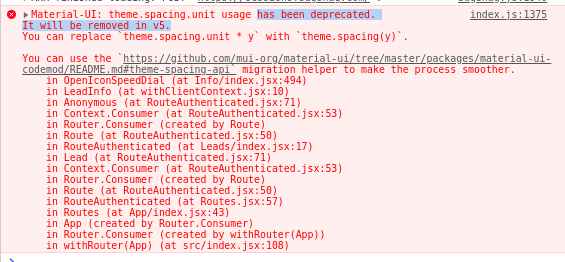
Update: theme.spacing.unit will be deprecated in Material UI v5. Check (and upvote) @yogescicak's answer for the updated version!
162
This is in reference to @Siavas's answer above in specifying spacing that has been deprecated and will be removed in MUI v5.
You may do the following instead:
const styles = theme => ({
  ...
  fab: {
    margin: theme.spacing.unit, // You might not need this now
    position: "fixed",
    bottom: theme.spacing(2),
    right: theme.spacing(2),
  },
  ...
});
If you love us? You can donate to us via Paypal or buy me a coffee so we can maintain and grow! Thank you!
Donate Us With