 Menu
Menu
I'm trying set up a layout that will look like this: 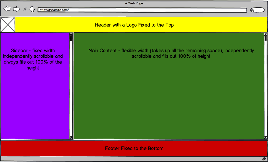
I want to use twitter bootstrap for the project, but I understand it may not be the best way to go for the basic layout that looks like this. I know how to setup the header and footer to be fixed at the top and bottom, but I have a hard time having my sidebar constant width and independently scrollable.
My current implementation is here: http://jsfiddle.net/Mwkrw/3/.
I tried setting up the fixed sidebar using Fixed sidebar navigation in fluid twitter bootstrap 2.0 and a couple of other similar answers on stack overflow, but they all break when the sidebar is longer than the content and as far as I know there is no way to give it an independent scroll.
I would ideally like to do this with pure css - no javascript. I'm sure it's possible and it's my lack of skill and knowledge that prevents me form doing it properly, so there may be no point in unnecessarily adding javascript code. (I'm still adding a javascript tag in case it's not possible)
Thanks for all the help!
EDIT: So my header clearly did not need to be position fixed. Here is the new and improved version: http://jsfiddle.net/Mwkrw/4/ I'm still struggling with the two scrollable divs though.
 296
296
The magic is in box-sizing:border-box;. For compatibility with Firefox, chrome<10, and safari<5.1, add the -webkit- and -moz- prefixes. IE supports it as of 8.0.
<!doctype html> <html lang='en'> <head> <meta charset='utf-8'> <title>very structured layout</title> <style type='text/css'> * {margin:0; padding:0;} body {background:#fff; position:absolute; width:100%; height:100%;} #main {background:#888; height:100%; padding:60px 0 40px; box-sizing:border-box;} #head {background:#f8f; position:absolute; width:100%; height:60px;} #left {background:#ff8; float:left; width:250px; height:100%; overflow:scroll;} #right {background:#8f8; height:100%; overflow:scroll;} #foot {background:#f88; position:absolute; bottom:0; width:100%; height:40px;} </style> </head> <body> <div id='head'>header: width = 100%, height = 40px</div> <div id='main'> <div id='left'>left: width = 250px, height = 100%</div> <div id='right'>right: width = 100% - 250px, height = 100%</div> </div> <div id='foot'>foot: width = 100%, height = 60px</div> </body> </html> fiddle
edit: after Andres' solution made me realize I could achieve greater compatibility, I messed around a bit and came up with an alternate solution, which I think is more intuitive as well. It doesn't work in IE7, but it does work in IE8.
The page is the same as the above, with the only change being that the CSS is replaced with this:
* {margin:0; padding:0;} body {background:#fff;} #main {background:#888; position:absolute; top:40px; bottom:60px; width:100%;} #head {background:#f8f; position:absolute; width:100%; height:40px;} #left {background:#ff8; position:absolute; width:250px; height:100%; overflow:scroll;} #right {background:#8f8; margin-left:250px; height:100%; overflow:scroll;} #foot {background:#f88; position:absolute; bottom:0; width:100%; height:60px;} fiddle
Note that, for both versions, #head and #foot need to have an overflow property other than visible if their content would otherwise extend off the page.
80
I managed to get the layout you mocked up in your post by first creating a main container class that is stretched 100% both vertically and horizontally, this way we can fully stretch the content within to the full height of your viewport. Within this container div i created another container and positioned it absolutely while stretching it in all directions, top, left, bottom, right, i felt that this method was cleaner cause this way i can easily position the header and footer without the need for negative margins (tried it like that but it didn't work).
Here is a demo of the layout: http://jsfiddle.net/andresilich/gbzTN/1/show, edit here.
And the code:
CSS
html, body { height: 100%; } .main { *zoom:1; } .main, .row-fluid { height: 100%; } .main:before, .main:after, .column:before, .column:after { content: ""; display: table; } .main:after, .column:after { clear: both; } .column { height: 100%; overflow: auto; *zoom:1; } .column .padding { padding: 20px; } .box { bottom: 40px; left: 0; position: absolute; right: 0; top: 40px; } .span9.full { width: 100%; } .footer { height: 40px; width: 100%; z-index: 100; background-color: red; bottom: 0; left:0; right:0; position: fixed; } HTML
<div class="navbar navbar-fixed-top"> <div class="navbar-inner"> <div class="container-fluid"> <a class="btn btn-navbar" data-toggle="collapse" data-target=".nav-collapse"> <span class="icon-bar"></span> <span class="icon-bar"></span> <span class="icon-bar"></span> </a> <a class="brand" href="#">Project name</a> <div class="btn-group pull-right"> <a class="btn dropdown-toggle" data-toggle="dropdown" href="#"> <i class="icon-user"></i> Username <span class="caret"></span> </a> <ul class="dropdown-menu"> <li><a href="#">Profile</a></li> <li class="divider"></li> <li><a href="#">Sign Out</a></li> </ul> </div> <div class="nav-collapse"> <ul class="nav"> <li class="active"><a href="#">Home</a></li> <li><a href="#about">About</a></li> <li><a href="#contact">Contact</a></li> </ul> </div><!--/.nav-collapse --> </div> </div> </div> <div class="main clearfix"> <div class="box"> <div class="row-fluid"> <div class="column span3"> <div class="padding"> .. content .. </div> </div> <div class="column span9"> <div class="padding"> <div class="full span9"> .. content .. </div> </div> </div> </div> </div> </div> <div class="footer clearfix"> <h3>footer</h3> </div> Edit: noticed that this solution does not work as expected in IE7 (works perfect in IE8 and above) so here is a conditional comment targeting everything below IE8 that should fix the issue and make it work as expected:
CSS
<!--[if lt IE 8]> <style type="text/css"> html { margin: 40px 0px; overflow: hidden } .main { zoom:1; } .column { overflow-x: hidden !important; overflow-y: scroll !important; zoom: 1; } .box { position: relative !important; min-height: 100%; height:100%; zoom: 1; top:0 !important; } .main { margin: 40px 0px; } </style> <![endif]--> If you love us? You can donate to us via Paypal or buy me a coffee so we can maintain and grow! Thank you!
Donate Us With


