 Menu
Menu
I am creating a website that is going to use an image that I cannot tile. I need this image to cover the entire background screen. However, I want this to work on large monitors as well as smaller monitors.
Should I make one large background image and scale it down using background-size or should I create multiple versions of the same image at various sizes then use CSS3 Media Queries to choose which image should be shown? If so what break points in screen size should I use?
 359
359
You can use background-size property set to contain or cover. This works especially well for photographic backgrounds (as opposed to patterns) where scaling artefacts are not as obvious.
Compare the two: contain vs cover
Remember about setting up a fallback rule for IE8 and under (just a stretched background should suffice).
67
I ended up choosing five breakpoint based on information from StatCounter:
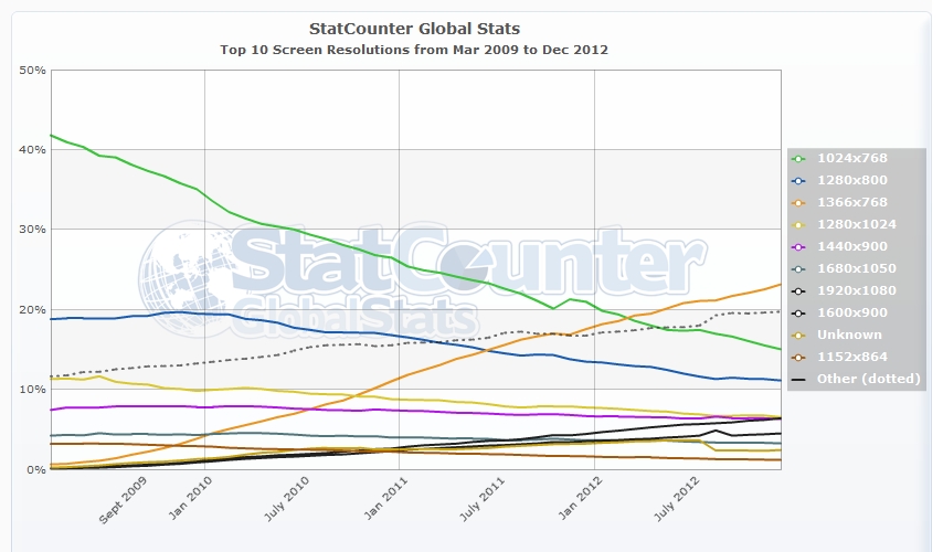
This is up till December 2012.
Based off of these numbers, my testing, and speaking to others I chose the following options:
/*Monitors Large than 1920px, image has "soft" edges to blend into background */
@media (min-width:1921px){
    html, body{
background: url(/images/backgrounds/1920-bg-large.jpg) no-repeat center top fixed #190303;
background-size:100% auto;
    }
}

/* Mointores ranging from 1367px - 1920px */
@media (min-width:1367px) and (max-width:1920px){
html, body{
background: url(/images/backgrounds/1920-bg.jpg) no-repeat center top fixed #190303;
background-size:100% auto;
    }
}

/* Mointores ranging from 769px - 1366px */
@media (min-width:769px) and (max-width:1366px){
html, body{
background: url(/images/backgrounds/1366-bg.jpg)  no-repeat center top fixed #190303;
background-size:100% auto;
    }
}
/* Tablets like the iPad 2 and iPad Mini */
@media (max-width:768px){
html, body{
background: url(/images/backgrounds/768-bg.jpg)  no-repeat center top fixed #190303;
background-size:100% auto;
    }
}

/* At a certain point the Background images become irrelevant as they are hidden behind other elements. Changed to a solid BG */
@media handheld, only screen and (max-width: 640px) {
html, body{
background:#190303;
    }
}
If you love us? You can donate to us via Paypal or buy me a coffee so we can maintain and grow! Thank you!
Donate Us With