 Menu
Menu
<div class="Card">
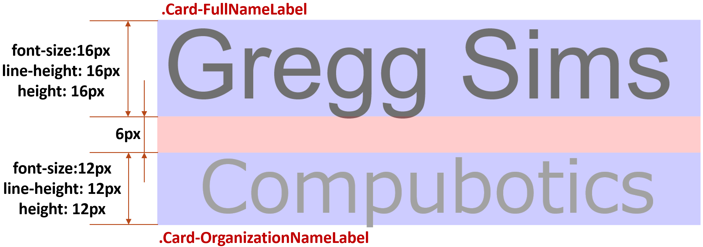
<div class="Card-FullNameLabel">Gregg Sims</div>
<div class="Card-OrganizationNameLabel">Compubotics</div>
</div>
.Card-FullNameLabel has font-size: 16px and line-height: 1..Card-OrganizationNameLabel has font-size: 12px and line-height: 1..Card-FullNameLabel and .Card-OrganizationNameLabel must be exactly 6px..Card-FullNameLabel + .Card-OrganizationNameLabel {
margin-top: 6px;
}
.Card-FullNameLabel and .Card-OrganizationNameLabel must have overflow tolerance (e. g. if this content will be
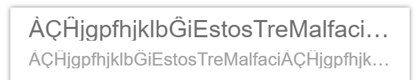
something like ÀÇĤjgpfhjklbĜiEstosTreMalfaci and so on it must not overhang from the parrent).line-height: 1.What is O'K to do: use the functionality of Pug pre-processor for markup and CSS pre-processors for styles.
🌎 Inital fiddle does not satisfied to the condition number 5: currently the card is not overflow-tolerant.
line-height: 1, the bad practiceI has been repeatedly told about I must set line-height to value more than 1.
It becomes obvious that setting line-height: 1 is a bad practice. I remind you that unitless values are font-size relative, not content-area relative, and dealing with a virtual-area smaller than the content-area is the origin of many of our problems.
Deep dive CSS: font metrics, line-height and vertical-align
Well, I don't going to dispute about it. All I want is the working solution for the reaching of my target (descripted above).
The usage of it is my responsibility and I will not reсcommend this solution if you agree that line-height must be more than 1.
But why I don't want increase the line-height so persistently?
The rule .Card-FullNameLabel + .Card-OrganizationNameLabel { margin-top: 6px; } is clear, intuitive and expresses the guidelines (represented in the picture above) by CSS. "The .Card-OrganizationNameLabel must retire from .Card-FullNameLabel by 6 pixels", and nothing more.
But what if we need to define the same vertical space between .Card-FullNameLabel and .Card-OrganizationNameLabel when line height is more than 1 (or they have the top and bottom paddings)? The value of the margin-top (visualized by non-overlayed pink area in the picture below) of .Card-FullNameLabel + .Card-OrganizationNameLabel rule now be the difference of:
.Card-FullNameLabel (designated as l_b).Card-OrganizationNameLabel (designated as l_a)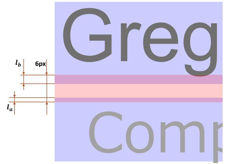
As I told above, the mental arithmetic is not allowed because it devalues the programming (CSS preprocessors capabilities in CSS case) and makes flexibility/maintainability impact (if we change the line-height or font-size or desired vertical space between labels, everything need to be mentally re-computed).
Although the preprocessor's variables (today became available in native CSS) can solve this problem, it will be too complicated to maintain it. To compute the non-intersecting red pink in the image above, we need to:
font-size of .Card-FullNameLabel
line-height of .Card-FullNameLabel
.Card-FullNameLabel.font-size of .Card-OrganizationNameLabel
line-height of .Card-OrganizationNameLabel
.Card-OrganizationNameLabel
.Card-FullNameLabel and .Card-OrganizationNameLabel (6 pixels in this example).After this, we can finally compute the margin-top for the rule .Card-FullNameLabel + .Card-OrganizationNameLabel. And same for each pair of elements like .Card-FullNameLabel and .Card-OrganizationNameLabel!! Too poor technology for the web development in 2020s.
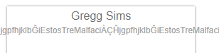
In below example, the Japanese symbols are perfectly fits to line with line-height: 1 (16px):
I suppose same will be for the Chinese, Korean and many other languages with non-latin characters.
But: in the small percentage of cases, there the foreign symbols could be mixed:

If to talk about high quality, this case must be supported.
I don't want increase the line height just for this exception. It's OK that the vertical space between lines actually became not 6px: the tails of j or À has a small weight and it will not break the geometric aesthetics.
:before and :after
The SASS-mixin TextTruncation accepts the parameter $extraSpace which adding top and bottom paddings. The :before and :after pseudo elements compensates this paddings by negative margins.
@mixin TextTruncation($extraSpace, $displayEllipsis: false) {
overflow: hidden;
white-space: nowrap;
@if ($displayEllipsis) {
text-overflow: ellipsis;
} @else {
text-overflow: clip;
}
padding-top: $extraSpace;
padding-bottom: $extraSpace;
&:before,
&:after {
content: "";
display: block;
}
&:before {
margin-top: -$extraSpace;
}
&:after {
margin-bottom: -$extraSpace;
}
}
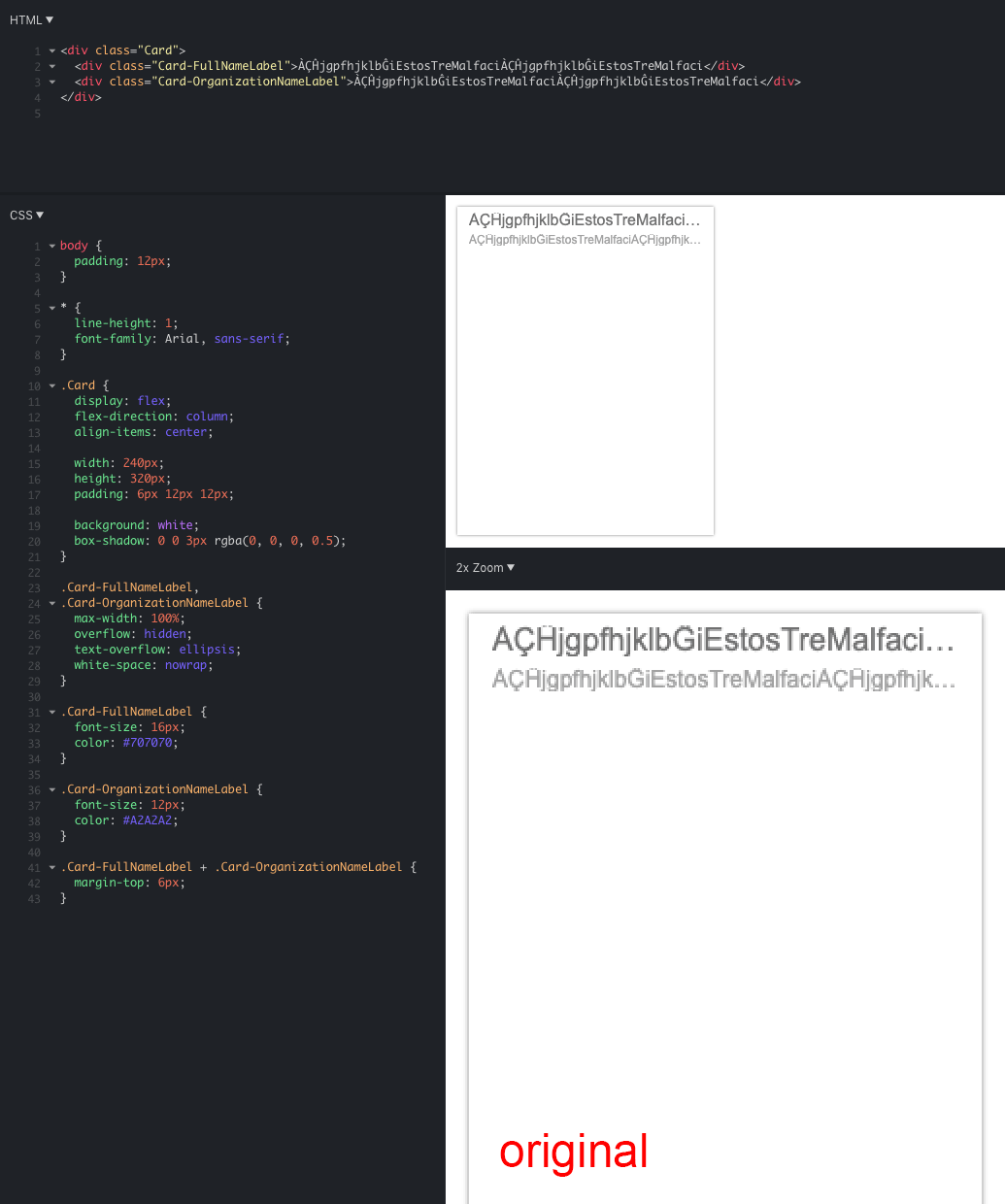
body {
padding: 12px;
}
* {
line-height: 1;
font-family: Arial, sans-serif;
}
.Card {
display: flex;
flex-direction: column;
align-items: center;
width: 240px;
height: 320px;
padding: 6px 12px 12px;
background: white;
box-shadow: 0 0 3px rgba(0, 0, 0, 0.5);
}
.Card-FullNameLabel {
max-width: 100%; /* Required when the flex parent has `align-items: center` */
@include TextTruncation($extraSpace: 2px, $displayEllipsis: true);
font-size: 16px;
color: #707070;
}
.Card-OrganizationNameLabel {
max-width: 100%; /* Required when the flex parent has `align-items: center` */
@include TextTruncation($extraSpace: 2px, $displayEllipsis: true);
font-size: 12px;
color: #A2A2A2;
}
.Card-FullNameLabel + .Card-OrganizationNameLabel {
  margin-top: 6px;
}
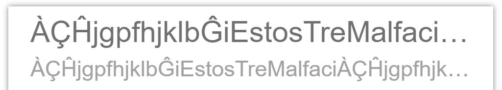
Unfortunately, It does not work: the effect is same as if no margins and no paddings has been defined:
🌎 CodePen
If the combination of overflow-x: hidden and overflow-y: visible works, it was the solution. But it does no work and this problem has been considered in the question CSS overflow-x: visible; and overflow-y: hidden; causing scrollbar issue.
I want to avid the wrappers as possible, but here it looks like the wrapper will be the last resort. To avoid of writing two tags each time, I created the Pug mixin:
mixin SingleLineLabel

  span.SingleLineLabel&attributes(attributes)
    span.SingleLineLabel-Text
      block
Well, the SingleLineLabel now a component. Besides the Pug mixin it's required to define the basic styles and SASS mixin allows to customize the label individually:
// Constant styles
.SingleLineLabel {

  overflow-y: visible;

  &:before,
  &:after {
    content: "";
    display: block;
  }


  &-Text {
    display: block;
    overflow-x: hidden;
    white-space: nowrap;
  }
}

// Variable styles
@mixin SingleLineLabel($truncatedVerticalSpaceCompensation, $displayEllipsis: false) {

  &:before {
    margin-top: -$truncatedVerticalSpaceCompensation
  }

  &:after {
    margin-bottom: -$truncatedVerticalSpaceCompensation
  }


  .SingleLineLabel-Text {

    padding-top: $truncatedVerticalSpaceCompensation;
    padding-bottom: $truncatedVerticalSpaceCompensation;

    @if ($displayEllipsis) {
      text-overflow: ellipsis;
    } @else {
      text-overflow: clip;
    }
  }
}
Now we can apply it:
.Card-FullNameLabel {

  max-width: 100%; /* Required when the flex parent has `align-items: center` */
  @include SingleLineLabel($truncatedVerticalSpaceCompensation: 1px, $displayEllipsis: true);

  font-size: 16px;
  color: #707070;
}

.Card-OrganizationNameLabel {

  max-width: 100%; /* Required when the flex parent has `align-items: center` */
  @include SingleLineLabel($truncatedVerticalSpaceCompensation: 2px, $displayEllipsis: true);

  font-size: 12px;
  color: #A2A2A2;
}

.Card-FullNameLabel + .Card-OrganizationNameLabel {
  margin-top: 6px;
}
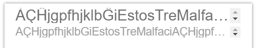
It seems like the target has been reached:
🌎 CodePen
Unfortunately, it has the bug which occurrence regularity is unclear. Sometimes the small vertical scrollbar appearing.
I really don't know how to reproduce it, but in the past experiment it has occurred, for example, if to switch the browser to device simulation mode by development tools and then exit from this mode. Most likely, you will not get the same effect if repeat same experiment in fiddle.
The solution based on your great answers will be included to growing @yamato-daiwa/frontend library.
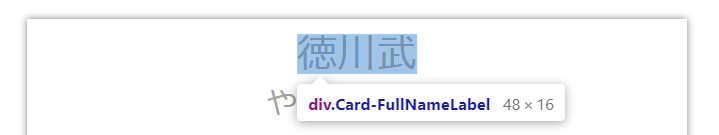
If you have the full list of the problematic symbols like g, p, À, Ĥ and so on, please share it - I'll use it for the tests and also add them to the future pug functionality for the overflow tolerance testing.
 406
406
Set Overflow to hidden to prevent unwanted horizontal scrolling and extra whitespace in your project when elements exist outside the viewport.
Leading, a.k.a. line-height in digital circles, is the space between baselines in a block of text. The nuts and bolts: The gap between adjacent lines of type in typography is known as leading. In CSS, the line-height property specifies the amount of space between inline elements.
The line-height CSS property sets the height of a line box. It's commonly used to set the distance between lines of text. On block-level elements, it specifies the minimum height of line boxes within the element. On non-replaced inline elements, it specifies the height that is used to calculate line box height.
overflow: visible By default, the overflow is visible , meaning that it is not clipped and it renders outside the element's box: You can use the overflow property when you want to have better control of the layout. The overflow property specifies what happens if content overflows an element's box.
You might wonder if you can set the topmost element’s Overflow to hidden — the Body element. If you set Overflow to hidden on the Body, this can clip the rest of the content on the page and stop users from being able to successfully scroll through your page beyond what’s initially visible in the viewport.
When you set Overflow to hidden, this means you’re hiding elements that spill outside the parent element’s boundary. Any element that spills outside the parent element’s boundary (pictured as a dark rectangle around the page content) no longer appears after setting the parent element to Overflow: hidden.
By default, the overflow is visible, meaning that it is not clipped and it renders outside the element's box: You can use the overflow property when you want to have better control of the layout. The overflow property specifies what happens if content overflows an element's box.
X-height: This is (unsurprisingly) the height of a normal, lowercase x in a line of text. Generally, this is the height of other lowercase letters, although some may have parts of their characters that will exceed the x-height.
I know you explicitly stated that you needed to keep line-height: 1 and margin-top: 6px, but as you identified with the documented overflow CSS issue, you're kind of stuck with your current restrictions.
If it is at all possible to be flexible about those restrictions, I have a solution that is visually identical to what you were originally after.
I started with your Initial Fiddle and added ellipsis truncation CSS and problematic text in the html.
.Card-FullNameLabel,
.Card-OrganizationNameLabel {
  max-width: 100%;
  overflow: hidden;
  text-overflow: ellipsis;
  white-space: nowrap;
}
The result is this state which I am calling "Original" since it leaves your line-height and margin values unmodified. Note that I have added a single overflow: hidden rule in place of the problematic mixing of overflow-x and overflow-y rules.
I propose the following CSS changes. This increases line-height to 1.5 which allows all of the font's ascenders and descenders to be visible. Then I added negative offset margins to compensate:
.Card-FullNameLabel,
.Card-OrganizationNameLabel {
  max-width: 100%;
  overflow: hidden;
  text-overflow: ellipsis;
  white-space: nowrap;

  /* Shows all ascenders and descenders */
  line-height: 1.5;
}

.Card-FullNameLabel {
  font-size: 16px;
  color: #707070;

  /* Compensates for line-height */
  margin: -4px 0;
}

.Card-OrganizationNameLabel {
  font-size: 12px;
  color: #A2A2A2;

  /* Compensates for line-height */
  margin: -3px 0;
}

.Card-FullNameLabel + .Card-OrganizationNameLabel {
  /* 6px visually (minus 3px) */
  margin-top: 3px;
}
The result can be seen in action here which I am referring to as "Proposed Fix". I have confirmed the results are consistent in latest desktop Chrome, Firefox, and Safari on MacOS and Mobile Safari on iOS.
I made a simple animation from "before" and "after" screenshots that demonstrate that the output is visually identical except that the proposed fix does not cut off the font's ascenders and descenders.
Note that you can click the animation to see a full-size, 1:1 pixel-accurate version.
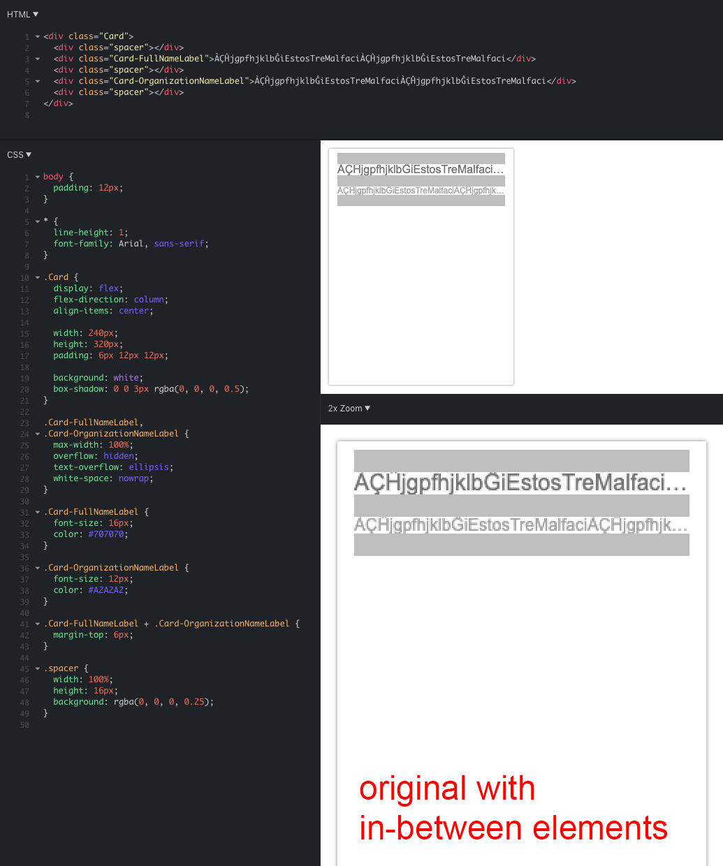
I did some additional tests with what I'm calling "in-between elements" to demonstrate that the proposed fix would behave the same as the original even if there were elements in-between.
As was made clear in the comments, one of the requirements is that there be no "hard-coded" or "magic" numbers in the CSS. So while the above solution works, it requires manual arithmetic ahead of time.
Here is an updated Codepen that can automatically produce similar CSS to what was shown above by using some SCSS logic that will calculate the offsets based on these input values:
| Variable | Current Value |
|---|---|
$globalLineHeight |
1 |
$minLineHeight |
1.5 |
$fullNameFontSize |
16px |
$fullNameLineHeight |
$globalLineHeight |
$orgNameFontSize |
12px |
$orgNameLineHeight |
$globalLineHeight |
$orgNameMarginTop |
6px |
For demonstration purposes, I added a bit of extra code that will show a "before" and "after" hover effect so you can see how the SCSS logic behaves compared to the original CSS. As is indicated in both the HTML and CSS, you can delete anything below the lines that begin with #DELETE-ME.
179
If you love us? You can donate to us via Paypal or buy me a coffee so we can maintain and grow! Thank you!
Donate Us With

