 Menu
Menu
I have a table representing coordinates.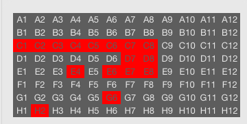
How can I have the size dynamically changing, so it always fits the parent div (width: 100%), like an image would?
Right now I use @media queries, which are hardcoded. But there must be a better way.
.hitbox {
  width: 25%; /* of page */
}

@media (min-width: 702px) and (max-width: 800px) {
  .hitbox .tablewrapper {
    font-size: 9px;
  }
}
@media (min-width: 800px) and (max-width: 840px) {
  .hitbox .tablewrapper {
    font-size: 10px;
  }
}
@media (min-width: 840px) and (max-width: 915px) {
  .hitbox .tablewrapper {
    font-size: 11px;
  }
}
edit:
The problem if the table needs to get even smaller then the text containing is fixed text size.
JSFiddle
This works fine.
 But smaller then that, It doen't work.
 It should make the font smaller, or at least cut each of the the cells (not the table).
edit 2: The whole table should be visible all the time, it is not important to read the text, but to see the pattern (with colors gray or red) it creates.
edit 3: The importance are the colors here, not the labels, so cutting the table and making it scrolling is not a solution here. It is required that like a heat map it is always completely visible.
 977
977
Use the viewport-relative units for your font-size.
1 vwunit is equal to1%of the the width of the initial containing block.
Combine it with proper widths for the parent div (upto the body and html), and it should give you the desired result. The font-size will then dynamically scale depending on the screen (viewport) size. If you reduce the viewport size, the font-size will decrease and vice-versa.
For example:
td {
    width: calc(100% / 12); padding: 2px;
    overflow: hidden; background: #bababa;
    font-size: 1.5vw; /* <---- the viewport relative font-size */
}
Demo Fiddle 1: https://jsfiddle.net/abhitalks/ucoLcm50/9/
Demo Snippet 1 (click full-screen to see the effect):
* { box-sizing: border-box; padding: 0; margin: 0; }
html, body { width: 100%; }
div { background-color: red; width: 50%; min-width: 160px; }
table { width: 100%; font-family: monospace; }
td {
    width: calc(100% / 12); padding: 2px;
    overflow: hidden; background: #bababa;
    font-size: 1.5vw; /* <---- the viewport relative font-size */
}
<div>
<table>
<tr>
<td>A1</td><td>A2</td><td>A3</td><td>A4</td>
<td>A5</td><td>A6</td><td>A7</td><td>A8</td>
<td>A9</td><td>A10</td><td>A11</td><td>A12</td>
</tr>
<tr>
<td>B1</td><td>B2</td><td>B3</td><td>B4</td>
<td>B5</td><td>B6</td><td>B7</td><td>B8</td>
<td>B9</td><td>B10</td><td>B11</td><td>B12</td>
</tr>
</table>
</div>An alternative (and a better) solution would be to keep the font-size fixed but overflow the containing div based on a min-width. This will keep the table data readable and also allow a scrollable table when there is a space constraint.
For example:
div {
    width: 50%; min-width: 180px;
    overflow-y: hidden; overflow-x: auto;
}
Demo Fiddle 2: https://jsfiddle.net/abhitalks/pu2yh0fc/1/
Demo Snippet 2:
* { box-sizing: border-box; padding: 0; margin: 0; }
html, body { width: 100%; }
div {
    background-color: red; width: 50%; min-width: 180px;
    overflow-y: hidden; overflow-x: auto;
}
table { min-width: 100%; font-family: monospace; }
td {
    min-width: calc(100% / 12); padding: 2px;
    overflow: hidden; background: #bababa;
    font-size: 1em;
}
<div>
<table>
<tr>
<td>A1</td><td>A2</td><td>A3</td><td>A4</td>
<td>A5</td><td>A6</td><td>A7</td><td>A8</td>
<td>A9</td><td>A10</td><td>A11</td><td>A12</td>
</tr>
<tr>
<td>B1</td><td>B2</td><td>B3</td><td>B4</td>
<td>B5</td><td>B6</td><td>B7</td><td>B8</td>
<td>B9</td><td>B10</td><td>B11</td><td>B12</td>
</tr>
</table>
</div>If you love us? You can donate to us via Paypal or buy me a coffee so we can maintain and grow! Thank you!
Donate Us With