 Menu
Menu
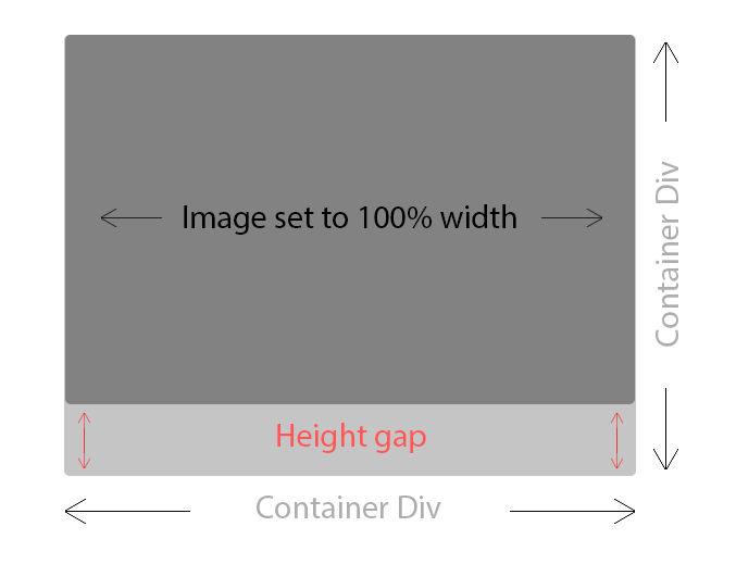
So i have a gallery where most my images are currently controlled 100% by CSS. However, in setting min-height: 100%; on my images, i cause some to stretch. I don't have too many problematic photos, but it's out of my control what the user will upload.
Is there anyway with jQuery i can get image height and check if it's meeting a requirement, and if not, somehow increase the image width in order to meet the height requirement but keep things all in ratio? So i therefore avoid causing any distortion but keep the gallery neat by having divs without gaps.
Note: The image provided is what happens when i remove my min-height: 100%; so that you can see my issue.
Update - - - - -
I found a solution that seems to work ok for the moment, it might not be the best attempt but i found another answer that helped me: How to resize images proportionally / keeping the aspect ratio?
I simply tweaked the code ever so slightly, now if an image doesn't meet the minHeight required it will resize the image in proportion so until the minHeight is then reached. Seems work fine for me in testing.
**Update Final ********* After playing around i took a small snippit from the thumb script, just the part where it absolutely positions the images within the container.
$(window).load(function() {

    $('.thumbnail img').each(function() {
        var maxWidth = 320; // Max width for the image
        var minHeight = 270;    // Max height for the image
        var ratio = 0;  // Used for aspect ratio
        var width = $(this).width();    // Current image width
        var height = $(this).height();  // Current image height

        if(width > maxWidth){
            ratio = maxWidth / width;   // get ratio for scaling image
            $(this).css("width", maxWidth); // Set new width
            $(this).css("height", height * ratio);  // Scale height based on ratio
            height = height * ratio;    // Reset height to match scaled image
            width = width * ratio;    // Reset width to match scaled image
        }

        // Check if current height is larger than max
        if(height < minHeight){
            ratio = minHeight / height; // get ratio for scaling image
            $(this).css("height", minHeight);   // Set new height
            $(this).css("width", width * ratio);    // Scale width based on ratio
            width = width * ratio;    // Reset width to match scaled image
        }

        var $img = $(this),
        css = {
            position: 'absolute',
            marginLeft: '-' + ( parseInt( $img.css('width') ) / 2 ) + 'px',
            left: '50%',
            top: '50%',
            marginTop: '-' + ( parseInt( $img.css('height') ) / 2 ) + 'px'
        };

        $img.css( css );
   });
});
This loops through all my thumbnails, resizes them accordingly. So if the minimum height is not met, the image will be scaled up until the height fits my thumbnail container. Then the bottom part will take take each image, absolutely position it, and take the width and height and divide by 2, in order to work out how much to minus off on the margins to center the image. I'm still tweaking this, but seems to work well for me at the moment. I hope this helps someone else.
Alternatively
Anyone with a similar issue i found this: http://joanpiedra.com/jquery/thumbs/ I had begun writing my own to do exactly this, but im going to look into how well this works and adapt it as needed.
 774
774
Browser will take care of keeping aspect ratio intact. i.e max-width kicks in when image width is greater than height and its height will be calculated proportionally. Similarly max-height will be in effect when height is greater than width. You don't need any jQuery or javascript for this.
I found a solution that seems to work ok for the moment, it might not be the best attempt but i found another answer that helped me: How to resize images proportionally / keeping the aspect ratio?
Updated question with my findings
$(window).load(function() {
    $('.image-gallery-item-image-link img').each(function() {
        var maxWidth = 320; // Max width for the image
        var minHeight = 270;    // Max height for the image
        var ratio = 0;  // Used for aspect ratio
        var width = $(this).width();    // Current image width
        var height = $(this).height();  // Current image height

        if(width > maxWidth){
            ratio = maxWidth / width;   // get ratio for scaling image
            $(this).css("width", maxWidth); // Set new width
            $(this).css("height", height * ratio);  // Scale height based on ratio
            height = height * ratio;    // Reset height to match scaled image
            width = width * ratio;    // Reset width to match scaled image
        }

        // Check if current height is larger than max
        if(height < minHeight){
            ratio = minHeight / height; // get ratio for scaling image
            $(this).css("height", minHeight);   // Set new height
            $(this).css("width", width * ratio);    // Scale width based on ratio
            width = width * ratio;    // Reset width to match scaled image
        }

        var $img = $(this),
        css = {
            position: 'absolute',
            marginLeft: '-' + ( parseInt( $img.css('width') ) / 2 ) + 'px',
            left: '50%',
            top: '50%',
            marginTop: '-' + ( parseInt( $img.css('height') ) / 2 ) + 'px'
        };

        $img.css( css );
   });
});
If you love us? You can donate to us via Paypal or buy me a coffee so we can maintain and grow! Thank you!
Donate Us With