 Menu
Menu
Is it possible to create Button with gradient background?
@Composable
fun GradientButtonExample() {

    val horizontalGradientBrush = Brush.horizontalGradient(
        colors = listOf(
            Color(0xffF57F17),
            Color(0xffFFEE58),
            Color(0xffFFF9C4)
        )
    )


    val verticalGradientBrush = Brush.verticalGradient(
        colors = listOf(
            Color(0xff4E342E),
            Color(0xff8D6E63),
            Color(0xffD7CCC8)
        )
    )

    Button(onClick = {}) {
        Text(
            text = "Horizontal Gradient",
            modifier = Modifier
                .background(brush = horizontalGradientBrush)
        )
    }

    Button(onClick = {}) {
        Text(
            text = "Vertical Gradient",
            modifier = Modifier
                .background(brush = verticalGradientBrush)
        )
    }
}
Adding gradient to Text with background(brush) leaves a margin between Button and Text. When i set background of button with modifier.background(brush = horizontalGradientBrush), Button is drawn with primary color, basically nothing happens. Is it possible to set background of Button, not other components, with gradient colors?
 391
391
To set an image as the background for Card in Android Jetpack Compose, specify the first element in the Card with Image composable, and the next with the content you would like to display on the card. When we place two composables in a Card, there is no guidance on their arrangement.
Compose 1.0.0-alpha10
You could do someething like this:
@Composable
fun GradientButton(
    text: String,
    gradient : Brush,
    modifier: Modifier = Modifier,
    onClick: () -> Unit = { },
) {
    Button(
        modifier = modifier,
        colors = ButtonDefaults.buttonColors(backgroundColor = Color.Transparent),
        contentPadding = PaddingValues(),
        onClick = { onClick() },
    ) {
        Box(
            modifier = Modifier
                .background(gradient)
                .then(modifier),
            contentAlignment = Alignment.Center,
        ) {
            Text(text = text)
        }
    }
}
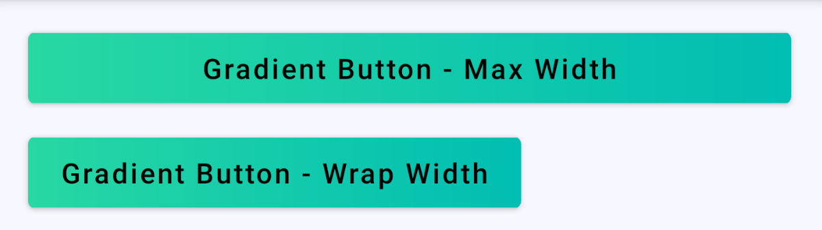
Usage sample:
@Composable
private fun Content() {

val gradient =
    Brush.horizontalGradient(listOf(Color(0xFF28D8A3), Color(0xFF00BEB2)))

    Column {
        GradientButton(
            text = "Gradient Button - Max Width",
            gradient = gradient,
            modifier = Modifier
                .fillMaxWidth()
                .padding(horizontal = 16.dp, vertical = 8.dp)
        )
        GradientButton(
            text = "Gradient Button - Wrap Width",
            gradient = gradient,
            modifier = Modifier
                .wrapContentWidth()
                .padding(horizontal = 16.dp, vertical = 8.dp)
        )
    }
}
Result sample:
98
Actually, you don't need the button... You can achieve this result using a simple Text...
Text(
    text = "Click Me",
    style = TextStyle(color = Color.White),
    modifier = Modifier
        .clickable(onClick = {})
        .background(
            Brush.verticalGradient(
                colors = listOf(
                    Color.Blue,
                    Color.Green
                )
            ),
            shape = RoundedCornerShape(4.dp)
        )
        .padding(horizontal = 16.dp, vertical = 8.dp),
)
If you love us? You can donate to us via Paypal or buy me a coffee so we can maintain and grow! Thank you!
Donate Us With


