 Menu
Menu
I have been playing with HTML and CSS to create a simple 2-player board game without using any JavaScript. I use labels, radio buttons, and checkboxes to create different states and mimic some logic so the piece will move around the board.
It works "fine", although the usability is not great. For example, after clicking on the dice, the tile moves, and I display a button to change to the next player (controlled again with a label and a checkbox)... which is not great, it would be better if it changed player "automatically."
The problem is that the <label> can only target one element, and I don't know how to trigger two "actions" (or side-effects) with only one click.
The following code is an mcve to better visualize the problem: there are two players (specified by turns), a board with three tiles (represented by 6 radio buttons: 1 per player and tile), and two buttons to change player turn (only one visible). If you click on the turn change button, the turn will go to the next player. (A more complex example can be found here)
The problem is that the users are forced to press the button to change turn, otherwise the same player will always be active. Is there a way to make so that when a label is clicked on, not only the the tile gets activated, but also the turn is changed? Or in its absence, is there an alternative to achieve this? (without using JS)
#p1:checked ~ [for=p1],
#p1:checked ~ [for^=tile-p2],
#p1:checked ~ [name^=tile-p2],
#p2:checked ~ [for=p2],
#p2:checked ~ [for^=tile-p1],
#p2:checked ~ [name^=tile-p1]
{
  display: none;
}

/* more rules to hide/show more elements */
<h1>Players:</h1>
<input type="radio" id="p1" name="player" checked /> P1
<input type="radio" id="p2" name="player" /> P2
<h1>Board: </h1>
Player 1:
<input type="radio" id="tile-p1-1" name="tile-p1" checked />
<label for="tile-p1-1">P1 to 1</label>
<input type="radio" id="tile-p1-2" name="tile-p1" />
<label for="tile-p1-2">P1 to 2</label>
<input type="radio" id="tile-p1-3" name="tile-p1" />
<label for="tile-p1-3">P1 to 3</label>
<br/>
Player 2:
<input type="radio" id="tile-p2-1" name="tile-p2" checked />
<label for="tile-p2-1">P2 to 1</label>
<input type="radio" id="tile-p2-2" name="tile-p2" />
<label for="tile-p2-2">P2 to 2</label>
<input type="radio" id="tile-p2-3" name="tile-p2" />
<label for="tile-p2-3">P2 to 3</label>
<h1>Change of turn:</h1>
<label for="p2">Change to Player 2</label>
<label for="p1">Change to Player 1</label>Is there any way to trigger two "state changes" by clicking on just one <label> or <a>?
Some attempts at solving this:
I tried putting an <a> inside a <label> to be able to trigger two readable changes: :target and :checked (with the :target I would control the player's turn, and with the :checked it would be the piece position). It seems to be valid HTML (at least according to the W3C validator), but it doesn't really work. For example, in the next snippet, clicking on the first link will highlight the text, clicking on the second will mark the box, and (I hoped) clicking on the third would do both... but it doesn't:
#test:target {
  color: red;
}

#cb:checked

a, label {
  display: block;
  text-decoration: underline;
  color: blue;
}
<input type="checkbox" id="cb" />
<div id="test">TEST</div>
<a href="#test">Highlight test</a>
<label for="cb">Check the box</label>
<label for="cb">
<a href="#test">Highlight test AND check the box</a>
</label>I also tried playing with different pseudo-classes: :checked and :invalid. It didn't do much for a checkbox, as they both would apply at the same time, and from my tests, required doesn't apply to a single radio (but I may be doing something wrong):
div {
  color: purple;
}

#radio1:checked ~ div {
  color: blue;
}

#radio2:checked ~ div {
  color: fuchsia;
}

#radio1:invalid ~ div {
  color: red;
}

#radio1:invalid + #radio2:checked ~ div {
  color: green;
}
<input type="radio" name="radio1" id="radio1" required />
<input type="radio" name="radio1" id="radio2" />
<div>Text to be green if radio2 is checked</div> 836
836
One idea is to consider the :focus state on the label that will allow you to trigger two changes. The only drawback is that the :focus state will be enabled only on the mousedown and disabled on the mouseup.
Here is an example
label:focus + #test {
 color: red;
}

label {
  display: block;
  text-decoration: underline;
  color: blue;
}
<input type="checkbox" id="cb" >
<label for="cb" tabindex=-1>Check the box and highlight the text</label>
<div id="test">TEST</div>UPDATE
Using the above logic and considering the initial code of the dice game here is an idea using animation. The trick is to create a paused animation with 2 states and on :focus I make the animation running in order to switch between the states.
Of course, this is not 100% accurate as it will depend on the speed of the click but it can be an idea to consider:
.container {
  position: relative;
}

label {
  display: block;
  position: absolute;
  top: 0;
  left: 0;
  width: 50px;
  height: 50px;
  line-height: 50px;
  background: #eeeeee;
  text-align: center;
  animation: changeOrder 0.6s infinite;
}

@keyframes changeOrder {
  from { z-index: 6;}
   to { z-index: 1; }
}
label:nth-of-type(1) { animation-delay: 0s; }
label:nth-of-type(2) { animation-delay: -0.1s; }
label:nth-of-type(3) { animation-delay: -0.2s; }
label:nth-of-type(4) { animation-delay: -0.3s; }
label:nth-of-type(5) { animation-delay: -0.4s; }
label:nth-of-type(6) { animation-delay: -0.5s; }


label:active {
  /*Mandatory to break the stacking context and allow
       the pseudo element to be above everything*/
  position: static;
  /*For illustration*/
  margin-left: 50px;
  background: red;
}

label:active::before {
  content: "";
  position: absolute;
  top: 0;
  right: 0;
  left: 0;
  bottom: 0;
  z-index: 10;
}
.player {
  display:inline-block;
  margin-top:80px;
}

.player:before {
 content:"Player One";
 animation: player .3s infinite step-end;
 animation-play-state: paused;
}

label:focus ~ .player:before{
 animation-play-state: running;
}

@keyframes player {
  0% {
     content:"Player One";
  }
  50% {
     content:"Player Two";
  }

}
<input type="radio" name="cb" id="cb1" value="1">
<input type="radio" name="cb" id="cb2" value="2">
<input type="radio" name="cb" id="cb3" value="3">
<input type="radio" name="cb" id="cb4" value="4">
<input type="radio" name="cb" id="cb5" value="5">
<input type="radio" name="cb" id="cb6" value="6">
<div class="container">
<label for="cb1" tabindex="-1">1</label>
<label for="cb2" tabindex="-1">2</label>
<label for="cb3" tabindex="-1">3</label>
<label for="cb4" tabindex="-1">4</label>
<label for="cb5" tabindex="-1">5</label>
<label for="cb6" tabindex="-1">6</label>
<span class="player" ></span>
</div>In case you want a static permanent effect, it's pretty simple as you only need to make the duration very small and use forwards.
.container {
  position: relative;
}

label {
  display: block;
  position: absolute;
  top: 0;
  left: 0;
  width: 50px;
  height: 50px;
  line-height: 50px;
  background: #eeeeee;
  text-align: center;
  animation: changeOrder 0.6s infinite;
}

@keyframes changeOrder {
  from { z-index: 6;}
   to { z-index: 1; }
}
label:nth-of-type(1) { animation-delay: 0s; }
label:nth-of-type(2) { animation-delay: -0.1s; }
label:nth-of-type(3) { animation-delay: -0.2s; }
label:nth-of-type(4) { animation-delay: -0.3s; }
label:nth-of-type(5) { animation-delay: -0.4s; }
label:nth-of-type(6) { animation-delay: -0.5s; }


label:active {
  /*Mandatory to break the stacking context and allow
       the pseudo element to be above everything*/
  position: static;
  /*For illustration*/
  margin-left: 50px;
  background: red;
}

label:active::before {
  content: "";
  position: absolute;
  top: 0;
  right: 0;
  left: 0;
  bottom: 0;
  z-index: 10;
}
.player {
  display:inline-block;
  margin-top:80px;
}

.player:before {
 content:"Click the dice!";
 animation: player .1s forwards;
 animation-play-state: paused;
}

label:focus ~ .player:before{
 animation-play-state: running;
}

@keyframes player {
  2%,100% {
     content:"Dice clicked!";
  }

}
<input type="radio" name="cb" id="cb1" value="1">
<input type="radio" name="cb" id="cb2" value="2">
<input type="radio" name="cb" id="cb3" value="3">
<input type="radio" name="cb" id="cb4" value="4">
<input type="radio" name="cb" id="cb5" value="5">
<input type="radio" name="cb" id="cb6" value="6">
<div class="container">
<label for="cb1" tabindex="-1">1</label>
<label for="cb2" tabindex="-1">2</label>
<label for="cb3" tabindex="-1">3</label>
<label for="cb4" tabindex="-1">4</label>
<label for="cb5" tabindex="-1">5</label>
<label for="cb6" tabindex="-1">6</label>
<span class="player" ></span>
</div>UPDATE 2
Here is another idea that rely on transition and is more accurate BUT I need to rely on two dice as each one will trigger a specific state in order to change the text, so we need to find a way how to make both dice above each other and change their order on click:
.container {
  position:relative;
  margin-top:20px;
  overflow:hidden;
  min-height:50px;
}

label {
  display:block;
  position: absolute;
  top: 0;
  left: 0;
  width: 50px;
  height: 50px;
  line-height: 50px;
  background: #eeeeee;
  text-align: center;
  animation: changeOrder 0.6s infinite;
}
label:active {
  /*Mandatory to break the stacking context and allow
       the pseudo element to be above everything*/
  position: static;
  width:0;
  height:0;
  overflow:hidden;
}

label:active::before {
  content: "";
  position: absolute;
  top: 0;
  right: 0;
  left: 0;
  bottom: 0;
  z-index: 10;
}

@keyframes changeOrder {
  from { z-index: 6;}
   to { z-index: 1; }
}
label:nth-of-type(1),label:nth-of-type(7) { animation-delay: 0s; }
label:nth-of-type(2),label:nth-of-type(8) { animation-delay: -0.1s; }
label:nth-of-type(3),label:nth-of-type(9) { animation-delay: -0.2s; }
label:nth-of-type(4),label:nth-of-type(10) { animation-delay: -0.3s; }
label:nth-of-type(5),label:nth-of-type(11) { animation-delay: -0.4s; }
label:nth-of-type(6),label:nth-of-type(12) { animation-delay: -0.5s; }


label.second {
  left:100px;
}

.player {
  display:inline-block;
  margin-top:80px;
  height: 18px;
  overflow:hidden;
}
.player span {
  display:block;
  margin-top:-18px;
  transition:1000s;
}


label.first:focus ~ .player span{
  margin-top:0;
  transition:0s;
}
label.second:focus ~ .player span{
  margin-top:-36px;
  transition:0s;
}
<input type="radio" name="cb" id="cb1" value="1">
<input type="radio" name="cb" id="cb2" value="2">
<input type="radio" name="cb" id="cb3" value="3">
<input type="radio" name="cb" id="cb4" value="4">
<input type="radio" name="cb" id="cb5" value="5">
<input type="radio" name="cb" id="cb6" value="6">
<div class="container">
<label class="first" for="cb1" tabindex="-1">1</label>
<label class="first" for="cb2" tabindex="-1">2</label>
<label class="first" for="cb3" tabindex="-1">3</label>
<label class="first" for="cb4" tabindex="-1">4</label>
<label class="first" for="cb5" tabindex="-1">5</label>
<label class="first" for="cb6" tabindex="-1">6</label>
<label class="second" for="cb1" tabindex="-1">1</label>
<label class="second" for="cb2" tabindex="-1">2</label>
<label class="second" for="cb3" tabindex="-1">3</label>
<label class="second" for="cb4" tabindex="-1">4</label>
<label class="second" for="cb5" tabindex="-1">5</label>
<label class="second" for="cb6" tabindex="-1">6</label>
<div class="player">
<span> Player One Clicked<br>
Which player?<br>
Player Two clicked
</span>
</div>
</div>As a side note, I have used :focus and :active so we can rely on thoses states as they can be triggered together even with nested element:
div {
  display:block;
  outline: none;
  padding:10px 0;
}
.first:active + div{
  color:red
}
.second:active + div{
  color:red
}

.first:focus + div{
  border:1px solid red
}
.second:focus + div{
  border:1px solid red
}
<div class="first" tabindex=-1 >
Click me (only last text will change)
<div class="second" tabindex=-1 >
Click me (both text will change)
</div>
<div>
I will be updated
</div>
</div>
<div>
I will be updated
</div>Regarding you question it's impossible to target multiple elements via the for attribute of an html label element.
But if a page reload is fine to start a new game, you won't really need to target two input at once with a label.
Here's a simple dice game using only CSS:
.board {
  width: 100%;
  height: 200px;
  background: green;
  position: relative;
}

.board .title {
  color: white;
  font-weight: 300;
  text-align: center;
}

.board .title #p2-turn {
  display: none;
}

.dice {
  width: 50px;
  height: 50px;
  position: absolute;
  left: 50%;
  top: 50%;
  transform: translate(-50%, -50%);
  background: white;
  cursor: pointer;
  text-align: center;
}

.dice .pips {
  position: absolute;
  width: 100%;
  height: 100%;
  left: 0;
  animation: diceRoll 600ms infinite;
  z-index: 10;
}

.dice:active .pips {
  animation-play-state: paused;
}


.dice .pips:nth-child(2) { animation-delay: 100ms; }
.dice .pips:nth-child(3) { animation-delay: 200ms; }
.dice .pips:nth-child(4) { animation-delay: 300ms; }
.dice .pips:nth-child(5) { animation-delay: 400ms; }
.dice .pips:nth-child(6) { animation-delay: 500ms; }

.dice.dice--p2 {
  display: none;
}

.results {
  position: absolute;
  left: 0;
  top: 30px;
  bottom: 0;
  right: 0;
  background: black;
  color: white;
  display: none;
  text-align: center;
  line-height: 100px;
}

.results > .result {
  display: none;
}


@keyframes diceRoll {
  from {
    z-index: 6;
  }
  to {
    z-index: 1;
  }
}

/* LOGIC */

[name="p1-result"]:checked ~ .board .title #p1-turn {
  display: none;
}

[name="p1-result"]:checked ~ .board .title #p2-turn {
  display: block;
}

[name="p1-result"]:checked ~ .board .dice--p1 {
  display: none;
}

[name="p1-result"]:checked ~ .board .dice--p2 {
  display: block;
}

[name="p1-result"]:checked ~ [name="p2-result"]:checked ~ .results {
  display: block;
}


#p1-result-2:checked ~ #p2-result-1:checked ~ .results #p1-results,
#p1-result-3:checked ~ #p2-result-1:checked ~ .results #p1-results,
#p1-result-4:checked ~ #p2-result-1:checked ~ .results #p1-results,
#p1-result-5:checked ~ #p2-result-1:checked ~ .results #p1-results,
#p1-result-6:checked ~ #p2-result-1:checked ~ .results #p1-results,
#p1-result-3:checked ~ #p2-result-2:checked ~ .results #p1-results,
#p1-result-4:checked ~ #p2-result-2:checked ~ .results #p1-results,
#p1-result-5:checked ~ #p2-result-2:checked ~ .results #p1-results,
#p1-result-6:checked ~ #p2-result-2:checked ~ .results #p1-results,
#p1-result-4:checked ~ #p2-result-3:checked ~ .results #p1-results,
#p1-result-5:checked ~ #p2-result-3:checked ~ .results #p1-results,
#p1-result-6:checked ~ #p2-result-3:checked ~ .results #p1-results,
#p1-result-5:checked ~ #p2-result-4:checked ~ .results #p1-results,
#p1-result-6:checked ~ #p2-result-4:checked ~ .results #p1-results,
#p1-result-6:checked ~ #p2-result-5:checked ~ .results #p1-results,

#p1-result-1:checked ~ #p2-result-2:checked ~ .results #p2-results,
#p1-result-1:checked ~ #p2-result-3:checked ~ .results #p2-results,
#p1-result-1:checked ~ #p2-result-4:checked ~ .results #p2-results,
#p1-result-1:checked ~ #p2-result-5:checked ~ .results #p2-results,
#p1-result-1:checked ~ #p2-result-6:checked ~ .results #p2-results,
#p1-result-2:checked ~ #p2-result-3:checked ~ .results #p2-results,
#p1-result-2:checked ~ #p2-result-4:checked ~ .results #p2-results,
#p1-result-2:checked ~ #p2-result-5:checked ~ .results #p2-results,
#p1-result-2:checked ~ #p2-result-6:checked ~ .results #p2-results,
#p1-result-3:checked ~ #p2-result-4:checked ~ .results #p2-results,
#p1-result-3:checked ~ #p2-result-5:checked ~ .results #p2-results,
#p1-result-3:checked ~ #p2-result-6:checked ~ .results #p2-results,
#p1-result-4:checked ~ #p2-result-5:checked ~ .results #p2-results,
#p1-result-4:checked ~ #p2-result-6:checked ~ .results #p2-results,
#p1-result-5:checked ~ #p2-result-6:checked ~ .results #p2-results {
  display: block;
}

#p1-result-1:checked ~ #p2-result-1:checked ~ .results #draw,
#p1-result-2:checked ~ #p2-result-2:checked ~ .results #draw,
#p1-result-3:checked ~ #p2-result-3:checked ~ .results #draw,
#p1-result-4:checked ~ #p2-result-4:checked ~ .results #draw,
#p1-result-5:checked ~ #p2-result-5:checked ~ .results #draw,
#p1-result-6:checked ~ #p2-result-6:checked ~ .results #draw {
  display: block;
}
<input type="radio" name="p1-result" id="p1-result-1" value="1">
<input type="radio" name="p1-result" id="p1-result-2" value="2">
<input type="radio" name="p1-result" id="p1-result-3" value="3">
<input type="radio" name="p1-result" id="p1-result-4" value="4">
<input type="radio" name="p1-result" id="p1-result-5" value="5">
<input type="radio" name="p1-result" id="p1-result-6" value="6">
<input type="radio" name="p2-result" id="p2-result-1" value="1">
<input type="radio" name="p2-result" id="p2-result-2" value="2">
<input type="radio" name="p2-result" id="p2-result-3" value="3">
<input type="radio" name="p2-result" id="p2-result-4" value="4">
<input type="radio" name="p2-result" id="p2-result-5" value="5">
<input type="radio" name="p2-result" id="p2-result-6" value="6">
<div class="board">
<h2 class="title">
Player
<span class="turn" id="p1-turn">1</span>
<span class="turn" id="p2-turn">2</span>
turn
</h2>
<div class="dice dice--p1">
roll
<label class="pips" for="p1-result-1"></label>
<label class="pips" for="p1-result-2"></label>
<label class="pips" for="p1-result-3"></label>
<label class="pips" for="p1-result-4"></label>
<label class="pips" for="p1-result-5"></label>
<label class="pips" for="p1-result-6"></label>
</div>
<div class="dice dice--p2">
<label class="pips" for="p2-result-1"></label>
<label class="pips" for="p2-result-2"></label>
<label class="pips" for="p2-result-3"></label>
<label class="pips" for="p2-result-4"></label>
<label class="pips" for="p2-result-5"></label>
<label class="pips" for="p2-result-6"></label>
</div>
</div>
<div class="results">
<div class="result" id="p1-results">Player 1 won!</div>
<div class="result" id="p2-results">Player 2 won!</div>
<div class="result" id="draw">Draw!</div>
</div>This could be easily adapted to display the players current tiles and determain a certain outcome.
45
I honestly don't think there's any method that can toggle multiple checkbox states using only HTML and CSS.
That's not to say that it couldn't be made more intuitive with CSS by styling the elements in a way that makes switching between players feel more like it's simply part of the process.
I whipped up a quick-and-dirty, example snippet that provides a method of implementation (using basic opacity and cursor styles). However, this method can be utilized throughout a number of different approaches.
For instance, you could move the die off-screen altogether, or toggle a div in order to block elements from being seen/clicked (using absolute positioning and z-index).
In fact, the z-index approach could be used in order to allow player switching without having to move the cursor at all, thereby making it more intuitive from the player's perspective.
Hopefully these ideas will help get the ball -- or die, rolling. 😁
/* Simple Checkbox Hack */

input[type=checkbox] {
  position: absolute;
  left: -9999px;
  }

.die {
  position: absolute;
  height: 5em;
  width: 5em;
  background: lightgray;
  border: 1pt solid gray;
  text-align: center;
  text-decoration: none;
  display: inline-block;
  font-size: 16px;
  line-height: 5em;
  margin: .5em;
  cursor: pointer;
  }


/* Default State */

.p1, .p2 {
  width: 30em;
  height: 2em;
  line-height: 2em;
  color: white;
  text-align: center;
  opacity: 0.3;
  cursor: not-allowed;
  }

.p1 {
  background: green;
  }

.p2 {
  background: blue;
  }


/* Toggled State */

input[type=checkbox]:checked ~ .p1 {
   opacity: 1;
   cursor: pointer;
}
input[type=checkbox]:checked ~ .die {
   opacity: 0.3;
   cursor: not-allowed;
}
<small style="color: gray;"> (For this example, die can be clicked more than once.) </small>
<br>
<input type="checkbox" id="toggle-1">
<label class="die" for="toggle-1">Roll me!</label>
<br> <br> <br> <br> <br> <br>
<div class="p1">Player 1 - Click to start.</div>
<div class="p2">Player 2 - Click to start.</div>Edited answer to reflect changes to original question:
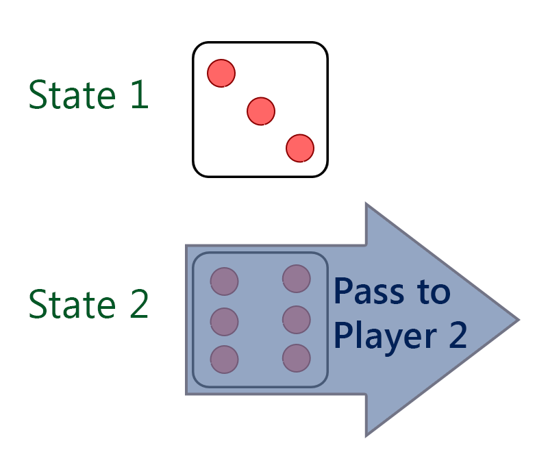
Try setting different states where each state reflects both the active player and the position of the pieces, like:
input {
  position: absolute;
  bottom: 1em;
  right: 1em;
  margin: 2px;
}

.status {
  margin: 1em;
  font-family: sans-serif;
  display: none;
}
.active1:checked ~ #status1,
.active2:checked ~ #status2,
.win1:checked ~ #status3,
.win2:checked ~ #status4 {
  display: block
}

#board {
  position: relative;
  top: 0;
  left: 0;
  border: 1px solid black;
  padding: 2px 3px;
  margin: 1em auto;
  width: 27em;
  height: 12em;
}
#board:before {
  display: block;
  position: absolute;
  bottom: 0;
  left: 0;
  margin: 2px;
  height: 9em;
  width: 9em;
  background: silver;
  content: ' ';
}
#board:after {
  display: block;
  position: absolute;
  bottom: 0;;
  right: 0;
  margin: 2px;
  height: 9em;
  width: 9em;
  background: silver;
  content: ' ';
}

.piece {
  position: absolute;
  z-index: 2;
  width: 1em;
  height: 1em;
  padding: 1em;
  margin: 1px;
  border-radius: 666em;
  line-height: 1em;
  text-align: center;
}
#piece1 {
  background: white;
  color: black;
  border: 1px solid black;
}
#piece2 {
  background: black;
  color: white;
  border: 1px solid white;
}
.win2:checked ~ #piece1,
.win1:checked ~ #piece2 {
  display: none;
}
.active1:checked ~ #piece1,
.active2:checked ~ #piece2 {
  border: 1px solid red;
}
.p1_1:checked ~ #piece1,
.p2_1:checked ~ #piece2 {
  left: 3em;
  bottom: 3em;
}
.p1_2:checked ~ #piece1,
.p2_2:checked ~ #piece2 {
  left: 12em;
  bottom: 3em;
}
.p1_3:checked ~ #piece1,
.p2_3:checked ~ #piece2 {
  right: 3em;
  bottom: 3em;
}

label {
  display: none;
  position: absolute;
  bottom: 0;
  z-index: 3;
  width: 9em;
  height: 9em;
  margin: 2px;
  text-indent: -666666em;
  /*background: green;*/
  opacity: .25;
  cursor: pointer;
}
label.pos1 {
  left: 0;
}
label.pos2 {
  left: 9em;
  margin: 2px 3px;
}
label.pos3 {
  right: 0
}
label.restart {
   top: 0;
   left: 0;
   width: 27em;
   height: 12em;
   padding: 0 1px;
   /*background: orange;*/
}
label.win1,
label.win2 {
  /*background: blue;*/
}
.active1.p2_1:checked ~ label.active1.opp1,
.active1.p2_2:checked ~ label.active1.opp2,
.active1.p2_3:checked ~ label.active1.opp3,
.active2.p1_1:checked ~ label.active2.opp1,
.active2.p1_2:checked ~ label.active2.opp2,
.active2.p1_3:checked ~ label.active2.opp3 {
  display: block;
}
.active1.p1_1:checked ~ label.active1.pos1,
.active1.p1_2:checked ~ label.active1.pos2,
.active1.p1_3:checked ~ label.active1.pos3,
.active2.p2_1:checked ~ label.active2.pos1,
.active2.p2_2:checked ~ label.active2.pos2,
.active2.p2_3:checked ~ label.active2.pos3 {
  display: none;
}
.active1.p2_1:checked ~ label.win1.pos1,
.active1.p2_2:checked ~ label.win1.pos2,
.active1.p2_3:checked ~ label.win1.pos3,
.active2.p1_1:checked ~ label.win2.pos1,
.active2.p1_2:checked ~ label.win2.pos2,
.active2.p1_3:checked ~ label.win2.pos3 {
  display: block;
}
.win1:checked ~ label.restart,
.win2:checked ~ label.restart {
  display: block;
}
<html>
<head>
<meta charset="utf-8">
<title>some game</title>
</head>
<body>
<div id="board">
<input id="s1" class="active1 p1_1 p2_2" type="radio" name="state" value="1">
<input id="s2" class="active1 p1_1 p2_3" type="radio" name="state" value="2" checked="checked">
<input id="s3" class="active1 p1_2 p2_1" type="radio" name="state" value="3">
<input id="s4" class="active1 p1_2 p2_3" type="radio" name="state" value="4">
<input id="s5" class="active1 p1_3 p2_1" type="radio" name="state" value="5">
<input id="s6" class="active1 p1_3 p2_2" type="radio" name="state" value="6">
<input id="s7" class="active2 p1_1 p2_2" type="radio" name="state" value="7">
<input id="s8" class="active2 p1_1 p2_3" type="radio" name="state" value="8">
<input id="s9" class="active2 p1_2 p2_1" type="radio" name="state" value="9">
<input id="s10" class="active2 p1_2 p2_3" type="radio" name="state" value="10">
<input id="s11" class="active2 p1_3 p2_1" type="radio" name="state" value="11">
<input id="s12" class="active2 p1_3 p2_2" type="radio" name="state" value="12">
<input id="s13" class="win1 p1_1" type="radio" name="state" value="13">
<input id="s14" class="win1 p1_2" type="radio" name="state" value="14">
<input id="s15" class="win1 p1_3" type="radio" name="state" value="15">
<input id="s16" class="win2 p2_1" type="radio" name="state" value="16">
<input id="s17" class="win2 p2_2" type="radio" name="state" value="17">
<input id="s18" class="win2 p2_3" type="radio" name="state" value="18">
<div id="status1" class="status">Player 1:</div>
<div id="status2" class="status">Player 2:</div>
<div id="status3" class="status">Player 1 won!</div>
<div id="status4" class="status">Player 2 won!</div>
<div id="piece1" class="piece">p1</div>
<div id="piece2" class="piece">p2</div>
<label for="s1" class="active2 pos2 opp1">Player 2: move piece to position 2</label>
<label for="s2" class="active2 pos3 opp1">Player 2: move piece to position 3</label>
<label for="s3" class="active2 pos1 opp2">Player 2: move piece to position 1</label>
<label for="s4" class="active2 pos3 opp2">Player 2: move piece to position 3</label>
<label for="s5" class="active2 pos1 opp3">Player 2: move piece to position 1</label>
<label for="s6" class="active2 pos2 opp3">Player 2: move piece to position 2</label>
<label for="s7" class="active1 pos1 opp2">Player 1: move piece to position 1</label>
<label for="s8" class="active1 pos1 opp3">Player 1: move piece to position 1</label>
<label for="s9" class="active1 pos2 opp1">Player 1: move piece to position 2</label>
<label for="s10" class="active1 pos2 opp3">Player 1: move piece to position 2</label>
<label for="s11" class="active1 pos3 opp1">Player 1: move piece to position 3</label>
<label for="s12" class="active1 pos3 opp2">Player 1: move piece to position 3</label>
<label for="s13" class="win1 pos1">Player 1: move piece to position 1</label>
<label for="s14" class="win1 pos2">Player 1: move piece to position 2</label>
<label for="s15" class="win1 pos3">Player 1: move piece to position 3</label>
<label for="s16" class="win2 pos1">Player 2: move piece to position 1</label>
<label for="s17" class="win2 pos2">Player 2: move piece to position 2</label>
<label for="s18" class="win2 pos3">Player 2: move piece to position 3</label>
<label for="s2" class="restart">Restart game</label>
</div>
</body>
</html>This is just some very simple example, where each player can move his piece to any field he wants and if his opponent's piece 'happens' to be on that field he wins.
In a real world scenario you might consider using some HTML- and CSS-preprocessors, like Pug / Jade and Sass to iterate over all the possible state combinations.
Update
I couldn't get this out of my head, so I played around a bit ...
:focus seemed to be a nice starting point, so I tried (hint: make sure to set tabindex="0"on the <label>s). But there's always some order to things and I couldn't find a way to achieve bidirectional relations using ~.
So I got back to my comment from yesterday, about making the UX of the 'next player' button more 'fluent'. Here is my code (the basic idea is to change the 'next player' button to a 'confirm move' state, where the player either can confirm their move or chose another tile to move to). No, it's no answer to your question, but it seems like a solution to your problem (and it scales 'nicely' more or less, at least linear, not cubical). html/css seems a bit bulky to post in here and Jade/Sass I couldn't get to work, so here's the links to those files:
34
If you love us? You can donate to us via Paypal or buy me a coffee so we can maintain and grow! Thank you!
Donate Us With