 Menu
Menu
I thought this would be (relatively) easy, but from the answers it seems harder than I anticipated.
Perhaps even impossible!
GOAL
I'd like to have a large list of div elements that can arbitrarily be assigned a .left or .right class.
All the .left divs should stack up underneath each other on the left hand side, the .right divs should stack up underneath each other on the right hand side. The number of divs in each class is arbitrary.
THREE CONDITIONS
The height of each div will not be known in advance
I would like them to stack up underneath each other on the assigned side, regardless of how many divs are present, what order they appear in, and how many are assigned to either side.
I don't want to use a 'wrapper' div as some have suggested. This is
because the solution must cater for random quantity and ordering of
.left and .right divs (see example below).
Ideally I'd like it to be a pure html / css solution, as backwards compatible as possible - though I realise this may prove unrealistic.
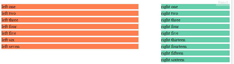
SAMPLE HTML
<div class="left">left one</div>
<div class="left">left two</div>
<div class="right">right one</div>
<div class="left">left three</div>
<div class="right">right two</div>
<div class="right">right three</div>
<div class="left">left four</div>
<div class="right">right four</div>
<div class="right">right five</div>
<div class="left">left five</div>
<div class="right">right six</div>
<div class="right">right seven</div>
UPDATE
After so many answers I'm impressed by the range of answers/techniques, but none of them quite meet all of the conditions.
Hence I'm staking a quarter of my meagre reputation on trying to get a solid solution!
UPDATE 2
It seems that my original goal is undoable. Therefore I have not marked any as the answer, although having put up a bounty I awarded it to Josh who gave me the best way of (almost) achieving that, along with great explanations of the css he used.
Thanks everyone for your help and ideas.
 912
912
Here's what I'd recommend:
Here's the key CSS that we're including:
@media (min-width:400px){
    .left {
        width: 60%;
    }
    .right {
        width: 30%;
        float: none;
        margin-left: 100%;
        transform: translateX(-100%);
    }
}
Explanation of this CSS
What that's doing is pushing your .right elements completely out of the container to the left, and then dragging them back their entire width.
The position: relative; and left: 100%; tell the element that it needs to display off the right edge of the container.
The transform: translateX(-100%); then tells the element that it needs to display to the left (hence the negative) 100% of its width - which drags it to be flush with your right edge.
With this solution, items can be reordered arbitrarily and no additional calculations need to be made.
I hope this helps!
Here's what we changed:
CSS
.right {
        width: 30%;
        float: none;
        margin-left: 100%;
        transform: translateX(-100%);
        margin-bottom: -1.2rem; /* New */
        margin-top: calc(1.2rem + 5px); /* New */
    }
    .right:first-of-type {
        margin-top: 0;    /*optional - if there's a preceding element on the page this will prevent it from being shifted downward*/
    }
What this is doing is making the DOM think these elements have negligible space they're taking up in the document flow, when in reality we're just screwing with its margins to make it display where it was before. This shouldn't fail with an arbitrarily ordered set of elements in an arbitrarily long list. Essentially we're doing something very similar to what float does in removing the element from document flow - but we're only making it reserve space as if it had no height. Plus, it doesn't get dragged to one side of the screen or the other.
The calc(1.2rem + 5px) for margin-top is basically saying: add this margin-bottom we took away back, plus the original 5px margin we had before.
I use rem units here because you don't have any defined font-sizes. Generally, you would want to use em, and we could have here. I chose 1.2 as that's the default line-height for these items. This fix, then, would only work for one line of text in an element. You'll need to have some awareness of the height of the element being rendered in order for this to work.
Hope that helps!
First, add this:
CSS
.right.last {
    margin-top: 0;
}
Then add this:
JavaScript
var rights = document.querySelectorAll(".right");
rights[rights.length-1].className += " last";
And you won't see that gap on the last element any longer.
130
If you love us? You can donate to us via Paypal or buy me a coffee so we can maintain and grow! Thank you!
Donate Us With