 Menu
Menu
Update 3
I updated the code (http://codepen.io/anon/pen/VYRJLp) and now the edges look really like torn paper effect. It uses SVG by the way.
The only problem is I don't know how to make the image as the background of the svg AT THE SAME TIME maintain the torn-paper-like edges.
Please have a look it. Any efforts are appreciated.
Update 2
It seems that it is impossible to achieve this effect without the help of PhotoShop(PS), so I would like to add PS as a part of solution.
I am not a PS expert, but from a quick thought, I think there are a few steps I need to do:
Questions for this approach:
Is it responsive?
If not, is it possible to make it responsive? As I have to make it work properly on mobile devices.
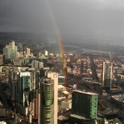
I remember that I saw a beautifully designed website, there is a picture in the background and the edges of this picture look like torn paper effect which is fantastic!
I searched the similar questions here but it turns out that the effects in the answers are primitive, which are very simple rugged black lines.
What I want:
It should look like the white area in this picture. But in my case, I will need to fill in my picture to replace the white area.
Here is my code:
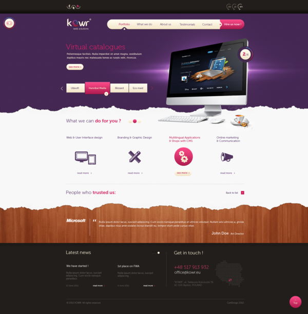
Notice: in this code, the css uses an image as the edge, BUT that is not want I want. I just want the edges to be pure CSS effects.(Is this possible?) So it will look like this one(the one on the right side, you can see that there is no white rugged edges)

<div class="row">
    <div id="letter" class="col-lg-12 col-md-12 col-sm-12 col-xs-12">

    </div>
</div>

#letter { /*torn paper border*/
    height:450px;
    position:relative;
    top:0;
    bottom:0;
    left:0;
    right:0;
    background-image:url('img/background.jpg');
    background-size:cover;
    opacity:0.8;
    border-style: solid;
    border-width: 40px 40px 40px;
       -moz-border-image: url('http://news.unchealthcare.org/images/backgrounds/paper.jpg') 80 80 80 repeat;
    -webkit-border-image: url('http://news.unchealthcare.org/images/backgrounds/paper.jpg') 80 80 80 repeat;
         -o-border-image: url('http://news.unchealthcare.org/images/backgrounds/paper.jpg') 80 80 80 repeat;
            border-image: url('http://news.unchealthcare.org/images/backgrounds/paper.jpg') 80 80 80 repeat;
}
Update
I think I found something quite similar to what I am imagine.
Here is the effect I want:
 284
284
I used some pen I found to come up with my own solution that has rips on all four sides. You can change it to have rips on only the top, bottom, left, right, or any combination thereof.
The key ingredients:
clip-path: polygon(…) to "cut" the object you want to have the rip effect.filter: drop-shadow(…) on the container to give the thing a shadow.Not only does this give a shadow, but that shadow follows the pattern of the rip so that it looks more realistic.
Live action:
https://codepen.io/carterpape/pen/rNjJKbM
90
Try this:
clip-path: polygon(3% 0, 7% 1%, 11% 0%, 16% 2%, 20% 0, 23% 2%, 28% 2%, 32% 1%, 35% 1%, 39% 3%, 41% 1%, 45% 0%, 47% 2%, 50% 2%, 53% 0, 58% 2%, 60% 2%, 63% 1%, 65% 0%, 67% 2%, 69% 2%, 73% 1%, 76% 1%, 79% 0, 82% 1%, 85% 0, 87% 1%, 89% 0, 92% 1%, 96% 0, 98% 3%, 99% 3%, 99% 6%, 100% 11%, 98% 15%, 100% 21%, 99% 28%, 100% 32%, 99% 35%, 99% 40%, 100% 43%, 99% 48%, 100% 53%, 100% 57%, 99% 60%, 100% 64%, 100% 68%, 99% 72%, 100% 75%, 100% 79%, 99% 83%, 100% 86%, 100% 90%, 99% 94%, 99% 98%, 95% 99%, 92% 99%, 89% 100%, 86% 99%, 83% 100%, 77% 99%, 72% 100%, 66% 98%, 62% 100%, 59% 99%, 54% 99%, 49% 100%, 46% 98%, 43% 100%, 40% 98%, 38% 100%, 35% 99%, 31% 100%, 28% 99%, 25% 99%, 22% 100%, 19% 99%, 16% 100%, 13% 99%, 10% 99%, 7% 100%, 4% 99%, 2% 97%, 1% 97%, 0% 94%, 1% 89%, 0% 84%, 1% 81%, 0 76%, 0 71%, 1% 66%, 0% 64%, 0% 61%, 0% 59%, 1% 54%, 0% 49%, 1% 45%, 0% 40%, 1% 37%, 0% 34%, 1% 29%, 0% 23%, 2% 20%, 1% 17%, 1% 13%, 0 10%, 1% 6%, 1% 3%);
If you love us? You can donate to us via Paypal or buy me a coffee so we can maintain and grow! Thank you!
Donate Us With