 Menu
Menu
Before you mark this as duplicated, let me tell you that this is not about making an iframe rescalable, and I'm not expecting this kind of answers: Making an iframe responsive
My problem is easy to explain: I got a site without the meta viewport tag and a width of (lets say) 1000px. Therefore, when you load it in a mobile device, it rescales to fit the 360px width, and everything is very small.
Now, I perfectly know how to make an iframe to adjust to any width but the problem here is that the site being loaded will also be displayed with a width of 1000px even if this one has the meta viewport tag. Of course, everything in this iframe is shown very small as well.
Now the question: can I make the content of that iframe to be displayed at full width and yet obey not the width of the parent document but the width of the device. (obviously I don't want a small 360px iframe).
This may help you understand: 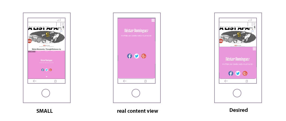
EDIT: Many people doesn't seem to understand this, so another way to explain it is this:
Pick any site that doesn't have the viewport tag
Paint a fixed frame on it
And try to make that iframe look like if it was opened on a new tab (by default the iframe's viewport will be like 1000px, I'd like it to be the phone's viewport sizes)
 567
567
If I understood correctly what you are asking, yes it is possible, but since I can't replicate the situation in a fiddle, here is below the code I've tested with success:
viewport linked)<!DOCTYPE html>
<html>
<head>
<meta charset="utf-8" />
<title>The non-responsive site</title>
<style type="text/css">
body {
margin:0;
padding:0;
}
#wrapper {
width:1000px;
margin:0 auto;
}
iframe {
max-width:1000px;
width:100%;
margin:10px auto;
display:block;
min-height:400px;
border:0
}
</style>
</head>
<body>
<div id="wrapper">
Lorem ipsum dolor sit amet, consectetur adipiscing elit. Sed vitae orci a velit pretium commodo. Vivamus ultrices auctor lectus, non semper ipsum dictum eu. Integer nulla arcu, bibendum ac hendrerit at, scelerisque in augue. Proin a nisi et purus pulvinar blandit. Nulla ac diam congue, malesuada nunc vitae, aliquam quam. Praesent volutpat turpis eu orci volutpat iaculis. Vivamus tempus varius sagittis. Sed sollicitudin, dui ac finibus placerat, ante metus volutpat dui, eu feugiat ipsum erat nec libero. Quisque eu viverra ex, sit amet congue orci. Cras porta dignissim diam, in eleifend urna vulputate sit amet. Mauris in malesuada ligula, eget facilisis nisl. Maecenas non enim orci. Nullam porttitor fringilla velit a sodales. Suspendisse et accumsan mauris. Interdum et malesuada fames ac ante ipsum primis in faucibus.
</div>
<iframe src="responsive-iframe.html"></iframe>
</body>
</html>
viewport linked)<!DOCTYPE html>
<html>
<head>
<meta charset="utf-8" />
<meta name="viewport" content="width=device-width, initial-scale=1">
<style type="text/css">
body {
margin:0;
padding:0;
}
p {
color:red;
font-size:32px;
background-color:#FEB1C7
}
@media (max-width: 480px) {
p {
color:green;
font-size:48px;
background-color:#CF0
}
}
</style>
</head>
<body>
<p>I'm green below 480px width, otherwise I'm red</p>
</body>
</html>
NOTE: the CSS above in <head> tag was just a quick way to make this demo, I always recommend to use external CSS files.
UPDATE: (I updated the code to match the SS's below)


62
If you love us? You can donate to us via Paypal or buy me a coffee so we can maintain and grow! Thank you!
Donate Us With