 Menu
Menu
Our designers have a fetish for fancy drop shadows like these but I want to avoid using image sprites. Instead I'd like to create this with css3 only. It's a little tricky though to replicate it pixel-perfect just with css3:

This is the closest I could get but I am not really happy with the result because I don't want the extra html wrapper for .box and also the fade effect to the left doesn't look right:
Fiddle: https://jsfiddle.net/valmar/k8ugjwb2/3/
My code attempt:
body{
background: #edefed;
}
.boxwrap{
width: 350px;
height: 365px;
position:relative;
}
.box{
width: 350px;
height: 350px;
background: #fff;
}
.box:after{
width: 350px;
height: 50px;
bottom: 26px;
display: block;
position:absolute;
content: " ";
z-index: -1;
-webkit-box-shadow: 0px 16px 21px -10px rgba(0,0,0,0.56);
-moz-box-shadow: 0px 16px 21px -10px rgba(0,0,0,0.56);
box-shadow: 0px 16px 21px -10px rgba(0,0,0,0.56);
-webkit-transform: rotate(-3deg);
-moz-transform: rotate(-3deg);
-o-transform: rotate(-3deg);
-ms-transform: rotate(-3deg);
transform: rotate(-3deg);
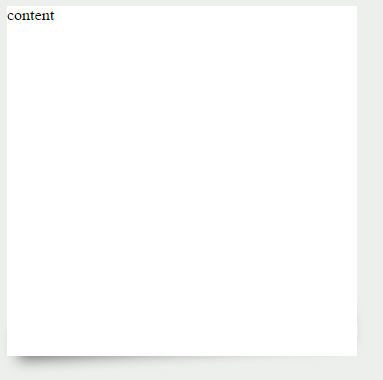
}<div class="boxwrap">
<div class="box">content</div>
</div>Is there any css guru out there who can create a pixel-perfect replica of this drop shadow without any extra markup than <div class="box">content</div>?
 398
398
Well, pixel-perfect is a hard requirement.
Bu I can show you a way, and leave it quite close. I am using a pseudo element, with 2 radial gradients, and a rotation.
You can play with the relative positions of the gradients, the colors, and the stops to fine tune it.
#testback {
  position: absolute;
  top: 0px;
  width: 900px;
  height: 210px;
  background-color: rgb(238, 238, 238);
  z-index: 1;
}
#test {
  position: absolute;
  background: white;
  width: 94%;
  height: 50%;
  left: 3%;
  z-index: auto;
}
#test:after {
  content: "";
  position: absolute;
  width: 81%;
  height: 61px;
  bottom: -10px;
  left: 1%;
  transform: rotate(-4deg);
  z-index: -1;
  background-image: radial-gradient(ellipse at center, rgb(82, 82, 82), rgba(255, 255, 255, 0) 60%),                         radial-gradient(ellipse at center, gray, rgba(255, 255, 255, 0) 70%);
  background-position: 14px 0px, center center;
}
<div id="testback">
<div id="test">
</div>
</div>If you love us? You can donate to us via Paypal or buy me a coffee so we can maintain and grow! Thank you!
Donate Us With