 Menu
Menu
We've placed a fixed button on the bottom of the webpage using:
.CTA-container {
    position:fixed;
    bottom:0;
    left:0;
    right:0;
    height:50px;
    background-color:#333;
  }

 a {
    font-size:20px;
    color:white;
    font-weight: bold;
    text-decoration: none;
    font-family: 'ProximaNova', tahoma, sans-serif;
    display: block;
    height:50px;
    line-height: 50px;
    text-align: center;
  }
<div class="CTA-container">
<a href="https://www.google.com">
Download Our App <span>👉</span>
</a>
</div>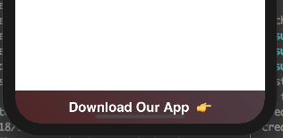
It works with Safari and Chrome on all devices. However, on iPhone X, after you scroll down and try to click the button it first shows the bar:
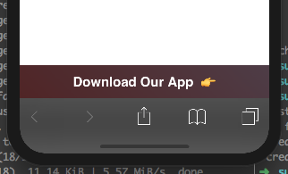
and only then the fixed button is clickable. This means users need to click twice, hence it can potentially reduce the conversion rates. We are wondering:
UPDATE: After applying Daniel's suggestion visually there seems to be a padding. As I've added:
   .CTA-container {
        margin-bottom: env(safe-area-inset-bottom);
    }

Nevertheless, the behavior continues and two click are required.
 931
931
According to this site, use env(safe-area-inset-bottom) for additional padding:
.CTA-container {
  padding-bottom: env(safe-area-inset-bottom);
}
As Daniel A. White suggests, using...
.CTA-container {
    padding-bottom: env(safe-area-inset-bottom);
}
is correct, however an additional step mentioned in his link requires you to also use 'viewport-fit=cover' to support this.
<meta name="viewport" content="width=device-width, viewport-fit=cover">
If you love us? You can donate to us via Paypal or buy me a coffee so we can maintain and grow! Thank you!
Donate Us With