 Menu
Menu
I have created this website, and so far I have not been able to find out why only on certain iPhone phones, the website is not displayed in its responsive mode. (it shows correctly on most iPhone phones).
Here is what I have done so far:
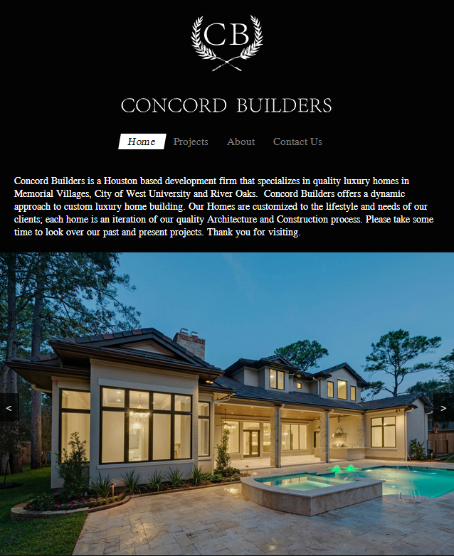
Here is a screen shot of how the website homepage SHOULD look like in iphones.
 220
220
try to use following media query
@media only screen
and (min-device-width : 320px)
and (max-device-width : 568px) { /* STYLES GO HERE */}
you are using max-width which is the width of the target display area where as max-device-width is the width of the device's entire rendering area.
i hope it will help you
136
I would assume that your problem is not using a viewport meta tag. Mobile devices often have much higher pixel densities than a desktop display would, which can cause media queries to not be read correctly.
try adding something like this to your head section:
<meta name="viewport" content="width=device-width,initial-scale=1" />
If you love us? You can donate to us via Paypal or buy me a coffee so we can maintain and grow! Thank you!
Donate Us With