 Menu
Menu
The minimal-ui viewport property is no longer supported in iOS 8. However, the minimal-ui itself is not gone. User can enter the minimal-ui with a "touch-drag down" gesture.
There are several pre-conditions and obstacles to manage the view state, e.g. for minimal-ui to work, there has to be enough content to enable user to scroll; for minimal-ui to persist, window scroll must be offset on page load and after orientation change. However, there is no way of calculating the dimensions of the minimal-ui using the screen variable, and thus no way of telling when user is in the minimal-ui in advance.
These observations is a result of research as part of developing Brim – view manager for iOS 8. The end implementation works in the following way:
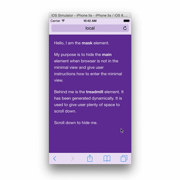
When page is loaded, Brim will create a treadmill element. Treadmill element is used to give user space to scroll. Presence of the treadmill element ensures that user can enter the minimal-ui view and that it continues to persist if user reloads the page or changes device orientation. It is invisible to the user the entire time. This element has ID
brim-treadmill.Upon loading the page or after changing the orientation, Brim is using Scream to detect if page is in the minimal-ui view (page that has been previously in minimal-ui and has been reloaded will remain in the minimal-ui if content height is greater than the viewport height).
When page is in the minimal-ui, Brim will disable scrolling of the document (it does this in a safe way that does not affect the contents of the main element). Disabling document scrolling prevents accidentally leaving the minimal-ui when scrolling upwards. As per the original iOS 7.1 spec, tapping the top bar brings back the rest of the chrome.
The end result looks like this:
For the sake of documentation, and in case you prefer to write your own implementation, it is worth noting that you cannot use Scream to detect if device is in minimal-ui straight after the orientationchange event because window dimensions do not reflect the new orientation until the rotation animation has ended. You have to attach a listener to the orientationchangeend event.
Scream and orientationchangeend have been developed as part of this project.
Since there is no programmatic way to mimic minimal-ui, we have come up with a different workaround, using calc() and known iOS address bar height to our advantage:
The following demo page (also available on gist, more technical details there) will prompt user to scroll, which then triggers a soft-fullscreen (hide address bar/menu), where header and content fills the new viewport.
<!doctype html>
<html lang="en">
<head>
    <meta charset="UTF-8">
    <meta name="viewport" content="width=device-width, initial-scale=1.0">
    <title>Scroll Test</title>

    <style>
        html, body {
            height: 100%;
        }

        html {
            background-color: red;
        }

        body {
            background-color: blue;
            margin: 0;
        }

        div.header {
            width: 100%;
            height: 40px;
            background-color: green;
            overflow: hidden;
        }

        div.content {
            height: 100%;
            height: calc(100% - 40px);
            width: 100%;
            background-color: purple;
            overflow: hidden;
        }

        div.cover {
            position: absolute;
            top: 0;
            left: 0;
            z-index: 100;
            width: 100%;
            height: 100%;
            overflow: hidden;
            background-color: rgba(0, 0, 0, 0.5);
            color: #fff;
            display: none;
        }

        @media screen and (width: 320px) {
            html {
                height: calc(100% + 72px);
            }

            div.cover {
                display: block;
            }
        }
    </style>
    <script>
        var timeout;

        window.addEventListener('scroll', function(ev) {

            if (timeout) {
                clearTimeout(timeout);
            }

            timeout = setTimeout(function() {

                if (window.scrollY > 0) {
                    var cover = document.querySelector('div.cover');
                    cover.style.display = 'none';
                }

            }, 200);

        });
    </script>
</head>
<body>

    <div class="header">
        <p>header</p>
    </div>
    <div class="content">
        <p>content</p>
    </div>
    <div class="cover">
        <p>scroll to soft fullscreen</p>
    </div>

</body>
</html>
It's true, minimal-ui could be both useful and harmful, and I suppose the trade-off now has another balance, in favor of newer, bigger iPhones.
I've been dealing with the issue while working with my js framework for HTML5 apps. After many attempted solutions, each with their drawbacks, I surrendered to considering that space lost on iPhones previous than 6. Given the situation, I think that the only solid and predictable behavior is a pre-determined one.
In short, I ended up preventing any form of minimal-ui, so at least my screen height is always the same and you always know what actual space you have for your app.
With the help of time, enough users will have more room.
EDIT
This is a little simplified, for demo purpose, but should work for you. Assuming you have a main container
html, body, #main {
  height: 100%;
  width: 100%;
  overflow: hidden;
}
.view {
  width: 100%;
  height: 100%;
  overflow: scroll;
}
Then:
then with js, I set #main's height to the window's available height. This also helps dealing with other scrolling bugs found in both iOS and Android. It also means that you need to deal on how to update it, just note that;
I block over-scrolling when reaching the boundaries of the scroll. This one is a bit more deep in my code, but I think you can as well follow the principle of this answer for basic functionality. I think it could flickr a little, but will do the job.
As a sidenote: this app too is bookmarkable, as it uses an internal routing to hashed addresses, but I also added a prompt iOS users to add to home. I feel this way helps loyalty and returning visitors (and so the lost space is back).
The easiest way I found to fix this was to set the height of the body and html elements to 100.1% for any request where the user agent was an iphone. This only works in Landscape mode, but thats all I needed.
html.iphone,
html.iphone body { height: 100.1%; }
Check it out at https://www.360jungle.com/virtual-tour/25
The root problem here seems that iOS8 safari won't hide the address bar when scrolling down if the content is equal or less than the viewport.
As you found out already, adding some padding at the bottom gets around this issue:
html {
    /* enough space to scroll up to get fullscreen on iOS8 */
    padding-bottom: 80px;
}
// sort of emulate safari's "bounce back to top" scroll
window.addEventListener('scroll', function(ev) {
    // avoids scrolling when the focused element is e.g. an input
    if (
        !document.activeElement
        || document.activeElement === document.body
    ) {
        document.body.scrollIntoViewIfNeeded(true);
    }
});
The above css should be conditionally applied, for example with UA sniffing adding a gt-ios8 class to <html>.
I want to comment/partially answer/share my thoughts. I am using the overflow-y:scroll technique for a big upcoming project of mine. Using it has two MAJOR advantages.
a) You can use a drawer with action buttons from the bottom of the screen; if the document scrolls and the bottom bar disappears, tapping on a button located at the bottom of the screen will first make the bottom bar appear, and then be clickable. Also, the way this thing works, causes trouble with modals that have buttons at the far bottom.
b) When using an overflown element, the only things that are repainted in case of major css changes are the ones in the viewable screen. This gave me a huge performance boost when using javascript to alter css of multiple elements on the fly. For example, if you have a list of 20 elements you need repainted and only two of them are on-screen in the overflown element, only those are repainted while the rest are repainted when scrolling. Without it all 20 elements are repainted.
..of course it depends on the project and if you need any of the functionality I mentioned. Google uses overflown elements for gmail to use the functionality I described on a). Imo, it's worth the while, even considering the small height in older iphones (372px as you said).
It IS possible, using something like the below example that I put together with the help of work from (https://gist.github.com/bitinn/1700068a276fb29740a7) that didn't quite work on iOS 11:
Here's the modified code that works on iOS 11.03, please comment if it worked for you.
The key is adding some size to BODY so the browser can scroll, ex: height: calc(100% + 40px);
Full sample below & link to view in your browser (please test!)
<html lang="en">
<head>
    <meta charset="UTF-8">
    <meta name="viewport" content="width=device-width, initial-scale=1.0">
    <title>CodeHots iOS WebApp Minimal UI via Scroll Test</title>

    <style>
        html, body {
            height: 100%;
        }
        html {
            background-color: red;
        }
        body {
            background-color: blue;
            /* important to allow page to scroll */
            height: calc(100% + 40px);
            margin: 0;
        }
        div.header {
            width: 100%;
            height: 40px;
            background-color: green;
            overflow: hidden;
        }
        div.content {
            height: 100%;
            height: calc(100% - 40px);
            width: 100%;
            background-color: purple;
            overflow: hidden;
        }
        div.cover {
            position: absolute;
            top: 0;
            left: 0;
            z-index: 100;
            width: 100%;
            height: 100%;
            overflow: hidden;
            background-color: rgba(0, 0, 0, 0.5);
            color: #fff;
            display: none;
        }
        @media screen and (width: 320px) {
            html {
                height: calc(100% + 72px);
            }
            div.cover {
                display: block;
            }
        }
    </style>
    <script>
        var timeout;

        function interceptTouchMove(){
            // and disable the touchmove features
            window.addEventListener("touchmove", (event)=>{
                if (!event.target.classList.contains('scrollable')) {
                    // no more scrolling
                    event.preventDefault();
                }
            }, false);
        }

        function scrollDetect(event){
            // wait for the result to settle
            if( timeout ) clearTimeout(timeout);

            timeout = setTimeout(function() {
                console.log( 'scrolled up detected..' );
                if (window.scrollY > 35) {
                    console.log( ' .. moved up enough to go into minimal UI mode. cover off and locking touchmove!');
                    // hide the fixed scroll-cover
                    var cover = document.querySelector('div.cover');
                    cover.style.display = 'none';

                    // push back down to designated start-point. (as it sometimes overscrolls (this is jQuery implementation I used))
                    window.scrollY = 40;

                    // and disable the touchmove features
                    interceptTouchMove();

                    // turn off scroll checker
                    window.removeEventListener('scroll', scrollDetect );
                }
            }, 200);
        }

        // listen to scroll to know when in minimal-ui mode.
        window.addEventListener('scroll', scrollDetect, false );
    </script>
</head>
<body>

    <div class="header">
        <p>header zone</p>
    </div>
    <div class="content">
        <p>content</p>
    </div>
    <div class="cover">
        <p>scroll to soft fullscreen</p>
    </div>

</body>
Full example link here: https://repos.codehot.tech/misc/ios-webapp-example2.html
If you love us? You can donate to us via Paypal or buy me a coffee so we can maintain and grow! Thank you!
Donate Us With