 Menu
Menu
Yesterday I was looking for sliders in Android and found this website with the Google search: https://material.io/guidelines/components/sliders.html#sliders-discrete-slider
I know that I can use a SeekBar in Android to implement sliders. However, Google seems to have very nice examples of discrete sliders but I cannot find any code examples.
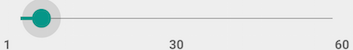
I already implemented a normal SeekBar that is looking like this:
How can I make it look like this?
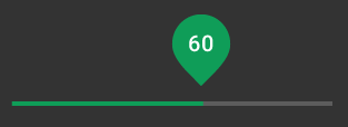
(Difference: When I move my slider, there is no big drop that shows the current value)
I think I might just have missed the code documentation for these design guidelines. Does anyone know where to find it? Or is the design difference because I got Android 5.0.2 on my phone?
 379
379
sadly google just provided how it should look like, but there seems to be no class provided by the android support libraries :(
but for now you can try this library: https://github.com/AnderWeb/discreteSeekBar
or this for even more material elements: https://github.com/navasmdc/MaterialDesignLibrary
hopefully google adds this in later releases...
193
Now you can use the official Slider in Material Components Library.
Just use something like:
<LinearLayout android:layout_width="match_parent" android:layout_height="wrap_content" android:clipChildren="false" android:clipToPadding="false"> <com.google.android.material.slider.Slider android:id="@+id/slider" android:layout_gravity="center" app:labelBehavior="withinBounds" android:value="60" android:valueFrom="0" android:valueTo="100" ..../> </LinearLayout> 
NOTE: it requires the version 1.2.0 (currently 1.2.0-beta01) of the library.
If you want to customize the tooltip shape with a circle marker instead of the default label you can use the labelStyle attribute:
<com.google.android.material.slider.Slider app:labelStyle="@style/tooltip" with:
<style name="tooltip" parent="Widget.MaterialComponents.Tooltip"> <item name="shapeAppearanceOverlay">@style/tooltipShOverylay</item> <item name="backgroundTint">@color/....</item> </style> <style name="tooltipShOverylay"> <item name="cornerSize">50%</item> </style> If you love us? You can donate to us via Paypal or buy me a coffee so we can maintain and grow! Thank you!
Donate Us With


