 Menu
Menu
I have a simple CSS related question. How do I obtain the right end blur/fade as shown in the image?

 748
748
Use a CSS gradient that goes from completely transparent to white and position it over the RHS of the image. background: linear-gradient(to right, rgba(255,255,255,0) 0%,rgba(255,255,255,1) 100%); Check which vendor prefixes apply to your target platforms.
Blurring the edges of a photo in CSS is pretty straightforward, with one gotcha. To blur a photo we need to use box-shadow in a way where the shadow "eats" the image. For this effect to work, the blur must be the same color as the surrounding background, and inset must be used.
Let's make this:
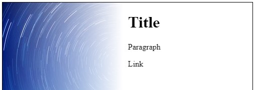
Browser Compatibility: IE 9 + for box-shadow.
Place appropriate box-shadow inset in the div
The div is given left padding to line it's text up with the white part of the background (the box-sizing: border-box essentially absorbs the padding into the width)
div {
  background: url(https://i.stack.imgur.com/AF4np.jpg) no-repeat;
  height: 500px;
  width: 500px;
  border: solid 1px #000;
  padding-left: 300px;
  box-sizing: border-box;
  box-shadow: inset -350px 0 100px 0 #FFF;
}
<div>
<h1>Title</h1>
<p>Paragraph</p>
<a>Link</a>
</div>Browser Compatibility: IE 9 + for multiple background images / IE 10 + for CSS linear gradients (IE 9 can be supported with an IE gradient filter or a partially transparent .png)
The container div is given a linear-gradient background followed by the image background (separated by a comma)
The div is given left padding to line it's text up with the white part of the background (the box-sizing: border-box essentially absorbs the padding into the width)
div {
  background: linear-gradient(to right, rgba(255, 255, 255, 0) 0, rgba(255, 255, 255, 1) 240px, rgba(255, 255, 255, 1) 290px), url(https://i.stack.imgur.com/AF4np.jpg) no-repeat;
  height: 500px;
  width: 500px;
  border: solid 1px #000;
  padding-left: 250px;
  box-sizing: border-box;
}
<div>
<h1>Title</h1>
<p>Paragraph</p>
<a>Link</a>
</div>Use a CSS gradient that goes from completely transparent to white and position it over the RHS of the image.
background: linear-gradient(to right, rgba(255,255,255,0) 0%,rgba(255,255,255,1) 100%);
Check which vendor prefixes apply to your target platforms.
45
If you love us? You can donate to us via Paypal or buy me a coffee so we can maintain and grow! Thank you!
Donate Us With