 Menu
Menu
I have also been working with this problem. Another "solution" is to add a div around the item that has the gradient and rounded corners. Make that div the same height, width, and rounded corner values. Set the overflow to hidden. This is basically just a mask, but it works for me.
HTML:
<div class="mask roundedCorners">
    <div class="roundedCorners gradient">
        Content
    </div>
</div>
CSS:
.mask
{
    overflow: hidden;
}

.roundedCorners
{
    border-radius: 5px;
    -moz-border-radius: 5px;
    -webkit-border-radius: 5px;
}

.gradient
{
    filter: progid:DXImageTransform.Microsoft.gradient( startColorstr='#0065a4', endColorstr='#a0cf67',GradientType=0 ); /* IE6-9 */
}
Here's one solution that adds a background gradient, using a data URI to create a semi-transparent image that overlays any background color. I've verified that it's clipped correctly to the border radius in IE9. This is lighter weight than SVG-based proposals but as a downside, is not resolution-independent. Another advantage: works with your current HTML/CSS and does not require wrapping with additional elements.
I grabbed a random 20x20 gradient PNG via a web search, and converted it into a data URI using an online tool. The resulting data URI is smaller than the CSS code for all that SVG mess, much less the SVG itself! (You could apply this conditionally to IE9 only using conditional styles, browser-specific css classes, etc.) Of course, generating a PNG works great for button-sized gradients, but not page-sized gradients!
HTML:
<span class="button">This is a button</span>
CSS:
span.button {
  padding: 5px 10px;
  border-radius: 10px;
  background-color: orange;
  background-image: url(data:image/png;base64,iVBORw0KGgoAAAANSUhEUgAAABQAAAAUCAYAAACNiR0NAAAAvUlEQVQ4y63VMQrDMAyF4d/BGJ+rhA4dOnTo0Kn3P4ExxnSoXVQhpx0kEMmSjyfiKAF4AhVoqrvqjXdtoqPoBMQAPAZwhMpaYkAKwH1gFtgG0v9IlyZ4E2BVabtKeZhuglegKKyqsWXFVboJXgZQfqSUCZOFATkAZwEVY/ymQAtKQJ4Jd4VZqARnuqyxmXAfiAQtFJEuG9dPwtMC0zD6YXH/ldAddB/Z/aW4Hxv3g+3+6bkvB/f15b5gXX8BL0z+tEEtuNA8AAAAAElFTkSuQmCC);
  background-size: 100% 100%;

  border: 2px solid white;
  color: white;
}
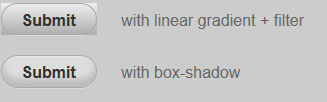
I think it's worth mentioning that in many cases you can use an inset box-shadow to "fake" the gradient effect and avoid the ugly edges in IE9. This works especially well with buttons.
See this example: http://jsfiddle.net/jancbeck/CJPPW/31/
You can also use CSS3 PIE to resolve this issue:
http://css3pie.com/
Of course, that might be overkill if you're just depending on a single element with rounded corners and a background gradient, but it is an option to consider if you're incorporating a number of common CSS3 features on your pages and want easy support for IE6+
I ran into this bug too. My suggestion would be to use a repeated background image for the gradient in ie9. IE9 correctly tiles the image behind the rounded borders (as of RC1).
I fail to see how writing 100 lines of code to replace 1 line of CSS is simple or elegant. SVG is cool and all, but why go through all that when easier solutions for gradient backgrounds have been around for years.
I also got stuck in the same problem n found that IE can't render the border radius and gradient both at a time, it both conflicts, the only way to solve this headache is to remove the filter and use the gradient via svg code, just for IE ..
you can get the svg code by using their gradient color code, from Microsoft this site (specially made for gradient to svg):
http://ie.microsoft.com/testdrive/graphics/svggradientbackgroundmaker/default.html
enjoy :)
Just use a wrapper div (rounded & overflow hidden) to clip the radius for IE9. Simple, works cross-browser. SVG, JS, and conditional comments are unnecessary.
<div class="ie9roundedgradient"><div class="roundedgradient">text or whatever</div></div>

.ie9roundedgradient {
display:inline-block; overflow:hidden; -webkit-border-radius: 8px; -moz-border-radius: 8px; border-radius: 8px;
}
.roundedgradient {
-webkit-border-radius: 8px; -moz-border-radius: 8px; border-radius: 8px;
/* use colorzilla to generate your cross-browser gradients */
}
If you love us? You can donate to us via Paypal or buy me a coffee so we can maintain and grow! Thank you!
Donate Us With