 Menu
Menu
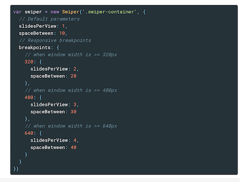
Hi I'm using iDangero Swiper on a website I'm doing and for some reason I cant get the responsive break points to work. below is the js I'm using.
var swiper = new Swiper('.s1', {
 slidesPerView: 5,
 slidesPerColumn: 2,
 spaceBetween: 30,
 nextButton: '.swiper-button-next',
 prevButton: '.swiper-button-prev',
 breakpoints: {
  1024: {
   slidesPerView: 5,
   spaceBetween: 30
  },
  768: {
   slidesPerView: 1,
   spaceBetween: 10
  },
  640: {
   slidesPerView: 1,
   spaceBetween: 10
 },
 320: {
  slidesPerView: 1,
  spaceBetween: 10
 }
},
});
Any ideas where I'm going wrong
 964
964
Currently the docs have things confusingly backwards, which is why I think many people are having issues (especially those working with sass media statements and/or ionic for example).
The issue is the crocodile symbols. They're the wrong way around. They should read '// when window width is <=320px'. Hence the method is to work backwards from the default options (eg slidesPerView, spaceBetween etc).
For example:
{
  ...
  slidesPerView: 5,
  spaceBetween: 10,
  breakpoints: {
    ...
    960: {
      slidesPerView: 4,
      spaceBetween: 8
    },
    720: {
      slidesPerView: 3,
      spaceBetween: 6
    },
    540: {
      slidesPerView: 2,
      spaceBetween: 4
    },
    320: {
      slidesPerView: 1,
      spaceBetween: 2
    },
    ...
  }
}
So we start with a default slidesPerView of 5 and spaceBetween of 10px, which is suitable for your average laptop/desktop. For screen sizes less than or equal to (<=) 960px, we set slidesPerView to 4 and spaceBetween to 8px. Then for screen sizes less than or equal to 720px, we set slidesPerView to 3 and spaceBetween to 8px. And so on.
Because things are mistakenly backwards, we work backwards, which ironically turns out to be more intuitive.
121
If you love us? You can donate to us via Paypal or buy me a coffee so we can maintain and grow! Thank you!
Donate Us With
