 Menu
Menu
I am designing a header and have a few questions about the issues I have.
The demo is here and the code is below, any help would be much appreciated.
.menu {
  position: relative;
  width: 100%;
  height: 66px;
  max-height: 90px;
  background: green;
}
.menu img {
  max-height: 30px;
}
.menu ul {
  left: 0;
  margin: 0 auto;
  width: 80%;
  margin: -30px auto 0 auto;
  font-size: 16px;
  font-weight: bold;
  max-width: 1200px;
}
.menu ul li:first-child {
  border-left: 1px solid gray;
}
.menu ul li {
  //
  width: 140px;
  width: 14%;
  display: block;
  float: left;
  text-align: center;
  border-right: 1px solid gray;
  color: white;
  height: 50px;
  line-height: 70px;
  vertical-align: bottom;
}
.menu ul li a {
  color: white;
}
.menubtn {
  width: 30px;
  height: 30px; //
  opacity: 0.5;
  cursor: pointer;
}
.menubtn .fa {
  font-size: 26px;
  color: rgb(75, 0, 130)
}
#menubtn {
  position: absolute;
  top: 2px;
  left: 4px;
}
@media only screen and (min-width: 501px) {
  .topbar {
    display: none;
  }
  .menu ul li a {
    font-size: 14px;
  }
  #mybody {
    margin-top: 8%;
  }
}
@media only screen and (max-width: 1200px) {
  .menu ul li a {
    font-size: 12px;
  }
}
@media only screen and (max-width: 888px) {
  .menu ul li a {
    font-size: 12px;
  }
}
@media only screen and (max-width: 685px) {
  .menu {
    height: 40px;
  }
  .menu ul {
    margin: 0;
  }
  .menu img {
    display: none
  }
  .menu ul {
    width: 100%;
  }
  .menu ul li {
    line-height: 40px;
    height: 40px;
    font-size: 13px;
  }
}
@media (max-height: 480px) and (min-width: 480px) and (max-width: 600px) {
  .menu {
    display: none;
  }
}
@media only screen and (min-width: 320px) and (max-width: 480px) and (orientation: landscape) {
  .menu {
    display: none;
  }
}
<!DOCTYPE html>
<html lang="en">
<head>
<meta name="viewport" content="width=device-width, initial-scale=1">
<link rel="stylesheet" href="http://maxcdn.bootstrapcdn.com/bootstrap/3.2.0/css/bootstrap.min.css">
<script src="https://ajax.googleapis.com/ajax/libs/jquery/1.11.1/jquery.min.js"></script>
<script src="http://maxcdn.bootstrapcdn.com/bootstrap/3.2.0/js/bootstrap.min.js"></script>
<link rel="stylesheet" href="http://maxcdn.bootstrapcdn.com/font-awesome/4.3.0/css/font-awesome.min.css">
<link rel="stylesheet" href="https://cdnjs.cloudflare.com/ajax/libs/bootstrap-social/4.2.1/bootstrap-social.css">
</head>
<body>
<header>
<div class="container-fluid">
<div class="row" style="background-color: lightblue;">
<div class="col-md-8 col-sm-8 col-xs-1">
<div id="banner" style="margin-left: 59%;">
<img height="25px" width="25px" src="https://encrypted-tbn2.gstatic.com/images?q=tbn:ANd9GcRROdI3yg-dOO1Wl56Ci6AHheWnzUA6j01oJDvxaUNViODWLpLX" />
<img height="40px;" width="253px;" src="http://staticx.ibncollege.com/wcsstore/ExtendedSitesCatalogAssetStore/907_90722_1_21939/images/FULLIMAGE_88753.jpg" />
</div>
</div>
<div class="col-md-2">
<div id="images" style="float: right;">
<a class="btn btn-social-icon btn-sm btn-facebook" style="text-align: center;" href="#"> <i class="fa fa-facebook"></i>
</a>
<a class="btn btn-social-icon btn-sm btn-twitter" href="#"> <i class="fa fa-twitter"></i>
</a>
<a class="btn btn-social-icon btn-sm btn-google-plus" href="#">
<i class="fa fa-google-plus"></i>
</a>
</div>
</div>
<div class="container">
<div class="row">
<div class="col-md-12 col-sm-12 col-xs-12 search-container">
<form id="searchbox" role="form" action="#" method="GET">
<div class="col-md-4 col-sm-12 col-xs-12 searchbox">
<div class="ui-widget">
<input id="Name" name="name" class="form-control searchinput" type="text" placeholder="name" value="">
</div>
</div>
<div class="col-md-4 col-sm-12 col-xs-12">
<input id="family" name="family" class="form-control searchinput" type="text" placeholder="family" value="">
</div>
<div class="col-md-2 col-sm-2 col-xs-1">
<button style="background-color: blue; border-radius: 14px; border-style: solid;" class="btn-search" type="submit" title="Search">
<div style="background-color: blue;">
<span class="glyphicon glyphicon-search"></span>
</div>
</button>
</div>
</form>
<div style="float: right; text-align: right;" class="col-md">
<a href="#">Click1</a> <a href="#">Click2</a>
</div>
</div>
</div>
</div>
<div class="hidden-xs">
<div class="menu">
<img src="https://encrypted-tbn1.gstatic.com/images?q=tbn:ANd9GcTnYmtXUnZ6g5TwfPndnVQMcVdJO8qkSJqm-dPkNRJ_13IaeTP6Pw" style="width: 100%; max-height: 40px;">
<ul id="idmenu">
<li><a href="#">Item1</a>
</li>
<li><a href="#">Item2</a>
</li>
<li><a href="#">Item3</a>
</li>
<li><a href="#">Item4</a>
</li>
<li><a href="#">Item5</a>
</li>
<li><a href="#">Item6</a>
</li>
<li><a href="#">Item7</a>
</li>
<li><a href="#">Item8</a>
</li>
</ul>
</div>
</div>
</div>
</div>
</header>
</body>
</html>The way I want it to be is as following:
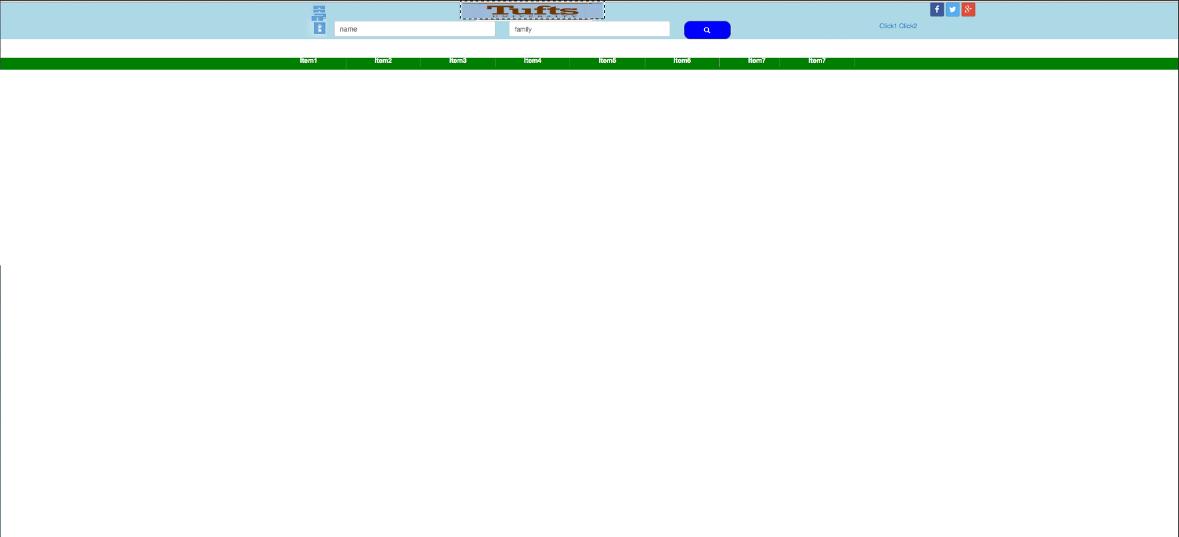
As you can see I have a logo at the right side of the search box, that is from top of the page to the bottom of the search box.
A banner in middle, three social media links and two links that are positioned in slightly right bottom side of the social media links.
I also have a white image on top of the menu that will be replaced with a proper image.
(I am not creating the menu using nav because of that image that should be on top of the menu;therefore, I have problem with mobile size screen as well, need to do that manually therefore, help to design that with nav would also be appreciated)
I was asked to narrow down the requirement,
I need to put the logo in the location that is shown in the screen shot, not where it is, (it is now at the left side of the banner - please click on 'demo is here' link to see).
Also need to create a hamburger style menu for mobile screens, as I am not using nav it is difficult to achieve. If you know how to solve the issue with nav I would appreciate it, as you can see the current menu is not based on nav.
I need it to be responsive, so if you make any changes I would be grateful if you could consider that.
 874
874
To start with, for a hamburger style menu on mobile devices I highly recommend FlexNav.
Now, most of what you are trying to do can be accomplished by adding some extra divs, I will explain:
The whole idea of a responsive design is that items are stacked on top of each other, and when you get to a certain point (breakpoint) they float up to sit beside other elements.
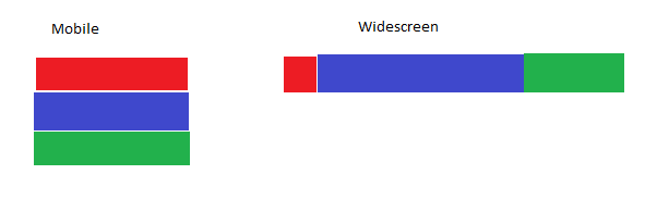
The above example shows what would happen if all containers were made float: left; at the widescreen breakpoint.
All of the elements that you want to float next to other elements need be inside the same container. In your case that means one container should have your logo in it, the next container should have your banner, input fields and search box, and the last container should have your social links. Or if you want the social links near the top on mobile you could use float: right; instead of float: left; and put them in an earlier container.
To have your form elements next to each other, they will need width of 50% or less. Percentages work very well for responsive theming.
Finally, if you're planning to do a lot of responsive theming there are tools out there than can be a bit challenging to set up and learn, but make the whole process MUCH smoother such as:
132
Well, as I always said it’s faster, easier and, specially cleaner, to NOT use boostrap when you want to translate your design to web. Bootstrap is a tool to make fast responsive webs under Twitter own design. It’s good but NOT miraculous. IF you want your own designs on webs you NEED to know css, whatever to modified bootstrap or do it from scratch (and if you know css then you woudn’t use bootstrap too much).
I will start from scratch.
It’s easier when you start with your html layout without, yet, adding the main elements:
<header>
    <div class="container-menu-top">
        <div class="menu-top">
            <div class="menu-top-center">
                <div class="icons-left">
                </div>
                <div class="container-login">
                    <div class="logo">
                    </div>
                    <div class="login">
                    </div>
                </div>
            </div>
            <div class="menu-top-right">
                <div class="social">
                </div>
                <div class="links">
                </div>
            </div>
        </div>
    </div>
    <div class="container-menu-bot">
        <div class="menu-bot">
        </div>
    </div>
</header>
And then you add css’s to position the layout correctly (and better if you use colors to make it easier to check everything is ok):
body {margin:0; padding:0;}
* {
  -webkit-box-sizing: border-box;
  -moz-box-sizing: border-box;
  box-sizing: border-box;
}
.container-menu-top {
    width:100%;
    background-color: aqua;
    height:160px;
}
.container-menu-bot {
    width:100%;
    background-color: aqua;
    height:60px;
    margin-top:40px;
}
.menu-top, .menu-bot {
    max-width:970px;
    width:100%;
    height:100%;
    background-color: green;
    margin:0 auto;
    text-align:center;
    position:relative;
}
.menu-top-center {
    display:inline-block;
    background-color: red;
    width:50%;
    height:100%;
}
.menu-top-right {
    display:inline-block;
    float:right;
    height:100%;
    background-color: violet;
    width:150px;
}
.icons-left {
    width:10%;
    float:left;
    background-color: blue;
    height:100%;
}
.container-login {
    width:90%;
    float:left;
    background-color: brown;
    height:100%;
    text-align:left;
}
.logo {
    height:20%;
    background-color: orange;
}
.login {
    height:80%;
    background-color: yellow;
}
@media only screen and (max-width: 600px) {
    .menu-top-center {width: calc(100% - 150px);}
}
As you can see in this FIDDLE in progress, everything makes sense, and is responsive just adding a single line of media queries .The social panel won’t change it’s width so at 600px (you may set your desire break width) width, I have changed the menú-top-center to get all the parent width but the social container. Notice, please I also made de main container to be of a máximum width of 970px (as in your example)
Also, I have set some heights just to be able to check the layout, later on I will delete many properties as the content will set the right height.
Now it’s time to put the elements inside their html containers.
Icons to the left of your login adding the images at the html and as css. Right atm they are on a container responsive so the images inside will change their width as you resize window. If you want a fixed size then give to the container a width on px and to the container-logina width with, again width:calc(100% - yourwidthpx); :
.icons-left img {
    width:100%;
    display:block;
    padding:5px;
}
Your “logo” image in the html with your desired size (removing now the height of his parent):
.logo img {
    height:40px;
    width:253px;
    max-width:90%;
    display:inline-block;
}
Your login inputsinside login div (removing now the height of his parent) and the mediaquery to make it resposnive:
.login input, .login button {
    display:inline-block;
}
.login input {width:35%;}
@media only screen and (max-width: 600px) {
    .login input {width:100%;}
}
Your social icons (I recomend you to insert them as a list in the html):
.social {}
.social ul {list-style:none;margin:0;}
.social li {
    height:30px;
    width:30px;
    float:right;
    background-color: blue;
    margin-left:4px;
    margin-top:4px;
    background-repeat:no-repeat;
    background-size:cover;
}
.social1 {background-image: url(http://the-route-to-your-image.com);}
.social2 {background-image: url(http://the-route-to-your-image.com);}
.social3 {background-image: url(http://the-route-to-your-image.com);}
Your Links:
.links {
    clear:both;
    text-align:left;
    margin-top:4px;
}
.links a {
    display:inline-block;
}
Then remove heights and background-colors and that’s it: FIDDLE
Of course there are still stuff to do to style your project, after all this is the layout, I will leave some work for You :)
If I have time later tonight I may complete your menu trying to explain how to make it resposive with a “burger” icon.
Trust me, All this is MUCH easier and faster tan overriding and modifying your bootstrap to make it look as you want.
Edited (“burger” menú):
Now let’s make the main menú (base on your image). The html is easy:
<div class="container-menu-bot">
        <div class="menu-bot">
            <ul id="">
                <li><a href="#">Item1</a></li>
                <li><a href="#">Item2</a></li>
                <li><a href="#">Item3</a></li>
                <li><a href="#">Item4</a></li>
                <li><a href="#">Item5</a></li>
                <li><a href="#">Item6</a></li>
                <li><a href="#">Item7</a></li>
                <li><a href="#">Item8</a></li>
            </ul>
            <div class="burger"></div>
        </div>
</div>
Where burger is the icon. We give position:absolute to this container and we hide it using display:none. Then with mediaqueries we show the icon while hidden our list. We also need to change the li’s from display:inline-block to display:block and finally set a min-height to the main container so while the list is hidden you still have the “green” menú nav:
.menu-bot {position:relative;}
.menu-bot a {color:#fff;}
.menu-bot ul {list-style:none; margin:0;}
.menu-bot li {
    display:inline-block;
    padding:10px 20px;
    border-left:1px solid #fff;
}
.menu-bot li:last-child {
    border-right:1px solid #fff;
}
.burger {
    width:25px;
    height:25px;
    background-color: red;
    position:absolute;
    top:7px;
    right:7px;
    display:none;
}
@media only screen and (max-width: 720px) {
    .burger {display:block;}
    .menu-bot ul {display:none;}
    .menu-bot li {display:block; border:0;}
}
We also add our last class:
.menu-bot .visible {display:block;}
visiblewill just change the display of your list once you click on the burger icon. For that you just need a very simple jquery code:
$(document).ready(function () {
            $('.burger').click(function () {
                $('.menu-bot ul').toggleClass("visible");
            });
        });
This could be made with just css and using hover insteed of click, but I find it much better the click event and you future users probably will have a better experience And that’s it. Quite simple, easy to understand and just a few lines of css.
Final FIDDLE. Good luck with your project
26
If you love us? You can donate to us via Paypal or buy me a coffee so we can maintain and grow! Thank you!
Donate Us With