 Menu
Menu
I was just wondering how I can obtain this kind of UI design using HTML/CSS:
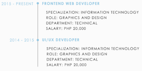
It should be that every time a user inputs a new data, it'll display the data with a divider and a bullet.
I am new to these kind of UI design in terms of HTML/CSS.
 299
299
This is pretty darn close.. Only things I can think of are that you will need to tweak the fixed sizes for your font and that it is probably not going to be pretty on a mobile device. https://jsfiddle.net/x6bthxgw/
HTML:
/* CSS:  */

    body {
      font-family: sans-serif;
    }

    ul.pretty-list {
      border-left: 1px solid grey;
      padding-left: 16px;
      margin-left: 200px;
      text-transform: uppercase;
    }

    ul.pretty-list li {
      list-style: none;
    }

    ul.pretty-list ul {
      padding-left: 0px;
    }

    ul.pretty-list h4 {
      color: skyblue;
      position: relative;
    }

    ul.pretty-list .date {
      margin-left:-216px;
      width:184px;
      text-align: right;
      padding-right: 1em;
      float: left;
      position:relative;
    }

    ul.pretty-list .date:after {
      content:"•";
      position: absolute;
      right:-10px;
      width:21px;
      font-size:30px;
      line-height:18px;
      text-align:center;
    }
<ul class="pretty-list">
<li>
<h4><div class="date">2015 - Present</div>Item 1</h4>
<ul>
<li>Subitem 1</li>
<li>Subitem 2</li>
<li>Subitem 3</li>
<li>Subitem 4</li>
</ul>
</li>
<li>
<h4><div class="date">2014 - 2015</div>Item 2</h4>
<ul>
<li>Subitem 1</li>
<li>Subitem 2</li>
<li>Subitem 3</li>
<li>Subitem 4</li>
</ul>
</li>
</ul>Try the snippet below. I dont know for certain if is this what you need. This CSS is written on simple logic:
.full-width {
	float:left;
	width:100%;
	display:flex;
}
.first_box {
	width:300px;
	display:inline-block;
	text-align:right;
	font-size:15px;
	padding-right:15px;
}
.second_box {
	width:400px;
	display:inline-block;
	text-align:left;
	padding-left:30px;
	font-size:15px;
	border-left:2px solid #069;
	position:relative;
}
.second_box:after {
	content:"";
	position:absolute;
	left:-8px;
	top:8px;
	background:#900;
	width:15px;
	height:15px;
	border-radius:50%;
}
.second_box h2 , .first_box h2 {
	margin:0;
}
<div class="full-width">
<div class="first_box">
<h2>2015 present</h2>
</div><!-- /.first_box -->
<div class="second_box">
<h2>frontend web Developer</h2>
<p>something here</p>
<p>something here</p>
<p>something here</p>
</div><!-- /.second_box -->
</div><!-- /.full-width -->
<div class="full-width">
<div class="first_box">
<h2>2015 present</h2>
</div><!-- /.first_box -->
<div class="second_box">
<h2>frontend web Developer</h2>
<p>something here</p>
<p>something here</p>
<p>something here</p>
</div><!-- /.second_box -->
</div><!-- /.full-width -->If you love us? You can donate to us via Paypal or buy me a coffee so we can maintain and grow! Thank you!
Donate Us With