 Menu
Menu
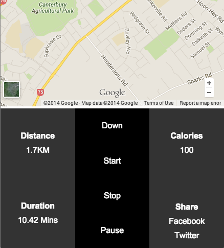
I am trying to vertically position the "Distance" and "Duration" text in the center of their respective divs using flexbox, I can't seem to get it to work. I will also apply this to the "Calories" and "Share" text aswell.
I am also want to use flexbox to evenly space my 4x links vertaically in the middle column.

Codepen demo
HTML:
<!DOCTYPE html>
<html>
<head>
    <title>Runna - Track your run!</title>
    <meta name="viewport" content="width=device-width, initial-scale=1.0 user-scalable=no">
    <link rel="stylesheet" type="text/css" href="css/reset.css">
    <link rel="stylesheet" type="text/css" href="css/style.css">
    <link href='http://fonts.googleapis.com/css?family=Lato:400,700,900' rel='stylesheet' type='text/css'>
    <link href="http://maxcdn.bootstrapcdn.com/font-awesome/4.2.0/css/font-awesome.min.css" rel="stylesheet">
    <script src="https://ajax.googleapis.com/ajax/libs/jquery/2.1.1/jquery.min.js"></script>
    <script src="js/js.js"></script>
</head>
<body>
    <div id="main-wrapper">

        <div id="head-bar">
            <img class="logo" src="imgs/logo-blue.png">
        </div>
        <div id="map-container">
    <iframe src="https://www.google.com/maps/embed?pb=!1m14!1m12!1m3!1d11564.804405086046!2d172.59430635!3d-43.56069255!2m3!1f0!2f0!3f0!3m2!1i1024!2i768!4f13.1!5e0!3m2!1sen!2snz!4v1418977732755" width="100%" height="100%" frameborder="0" style="border:0"></iframe>
        </div>
        <div id="control-container">
            <div class="left-col">
                <div class="distance-wrapper">
                    <div class="distance-title bold-title">DISTANCE:</div>
                    <div class="distance-figure">1.7KM</div>
                </div>

                <div class="duration-wrapper">
                    <div class="duration-title bold-title">DURATION</div>
                    <div class="duration-figure">10.42MINS</div>
                </div>
            </div> <!-- End of left col -->
                <div class="middle-col">
                    <ul>
                        <li class="arrow"><a href="#" class="arrowbutton"><i class="fa fa-chevron-down"></i></a></li>

                        <li><a href="#">START</a></li>
                        <li><a href="#">STOP</a></li>
                        <li><a href="#">PAUSE</a></li>
                    </ul>

                </div>


            <div class="right-col">
                <div class="calorie-wrapper">
                    <div class="calories bold-title">CALORIES</div>
                    <div class="calories-result">100 cal's</div>
                </div>
                <div class="share-wrapper">
                    <div class="share bold-title">SHARE</div>
                    <div class="share-icons">FB or Twitter</div>
                </div>

            </div> <!-- End of right col -->

        </div>

    </div>
</body>
</html>
CSS:
html {
  box-sizing: border-box;
  height: 100%;
}
*, *:before, *:after {
  box-sizing: inherit;
}

body {
    height: 100%;
    font-family: 'Lato', sans-serif;
}

#main-wrapper {
    height: 100vh;
}

@media all and (max-width: 40em) {
    #head-bar {
        background: black;
        width: 100%;
        height: 5vh;


    }

    .logo {

        display: block;
        margin: 0 auto;
        height: 85%;

    }

    #map-container {
        background: yellow;
        height: 65vh;
        width: 100%;
    }
}

/***Control columns***/
#control-container {
    width: 100%;
    height: 30vh;
    color: white;
    font-family: 'Lato', sans-serif;
    text-align: center;
    background: #1b1b1b;
    position: relative;


}
.left-col {
    display: flex;
    flex-direction: column;

    width: 33.3%;
    height: 100%;
    /*height: 60px;*/
    float: left;
}


.middle-col {
    background: #151515;
    width: 33.3%;
    height: 100%;
    float: left;
    /*box-shadow: 0 0 8px 2px #000;*/

}
.right-col {

    width: 33.3%;
    float: left;

}

.distance-wrapper, .duration-wrapper {
    flex: 1;
    /*background: #ddd;*/
    border-bottom: 1px solid yellow;
     justify-content: center;


}

.calorie-wrapper, .share-wrapper {
    display: block;
    width: 100%;

}

.bold-title {
    font-weight: 900;
    font-family: 'Lato', sans-serif;
}


/***Middle Navigation***/

.middle-col {

    border-top-left-radius: 4px;
    border-top-right-radius: 4px;

}

.middle-col ul {
    margin: 0;
    padding: 0;
    display: table;
    width: 100%;

}

.middle-col li {
    list-style-type: none;

}

.middle-col a {
    color: white;
    text-decoration: none;
    display: block;
    padding: 20px;


}

.middle-col a:hover {
    background: green;
    display: block;

}

#control-container:after {
    content: "";
    display: block;
    height: 0;
  clear: both;
}
 336
336
I created this example with a smaller amount of HTML and, hopefully, greater semantic meaning.
Let's make this:
The <section> element for the flex container
The <nav> element is a good container for the actions.
The description list element — <dl> — is a good wrapper for the stats. They have two children:
<dt> — is used for the stat headings<dd> — is used for the stat value<section class="control-container">
<dl class="distance">
<dt>Distance</dt>
<dd>1.7KM</dd>
</dl>
<dl class="duration">
<dt>Duration</dt>
<dd>10.42 Mins</dd>
</dl>
<dl class="calories">
<dt>Calories</dt>
<dd>100</dd>
</dl>
<nav class="actions">
<a href="">Down</a>
<a href="">Start</a>
<a href="">Stop</a>
<a href="">Pause</a>
</nav>
<div class="share">
<h2>Share</h2>
<a href="">Facebook</a>
<a href="">Twitter</a>
</div>
</section>
The flex <section> container has display: flex and flex-flow: column wrap so its children will layout in columns and wrap when pushed outside.
The flex items are also given display: flex, flex-flow: column wrap and justify-content: center; so that the text is vertically centered. The nav is given flex-direction: row so that its links can be evenly centered vertically with align-items: center
The 4 sections which take up half of the height are given flex: 1 1 50%; they will each get half of a column height
The navigation is given flex: 1 1 100% so it will take up an entire column on its own
.control-container {
display: flex;
flex-flow: column wrap;
}
.control-container > * {
display: flex;
flex-flow: column wrap;
justify-content: center;
flex: 1 1 50%;
width: 33.33%;
text-align: center;
}
.control-container > nav {
flex-direction: row;
align-items: center;
flex: 1 1 100%;
}
.control-container > nav a {
flex: 1 1 100%;
}
* {
margin: 0;
padding: 0;
font: 100% arial;
}
.control-container {
display: flex;
flex-flow: column wrap;
height: 40vh;
min-height: 250px;
min-width: 300px;
margin: 0 auto;
}
.control-container > * { /* target all direct children */
display: flex;
flex-flow: column wrap;
justify-content: center;
flex: 1 1 50%;
width: 33.33%;
text-align: center;
background: #333;
color: #FFF;
}
.control-container > nav {
flex-direction: row; /* allows vertical centering with align-items: center; */
align-items: center;
flex: 1 1 100%; /* take up entire column */
background: #000;
}
.control-container > nav a {
flex: 1 1 100%; /* 100% pushes each link so they wrap */
}
/*Change the order of the flex items so the stats can be kept together in the HTML*/
.distance,
.duration,
.actions {
order: 1;
}
.calories {
order: 3;
}
.share {
order: 4;
}
.wrapper {
max-width: 1200px;
margin: 0 auto;
}
.control-container dt,
.control-container h2 {
font-weight: bold;
}
.share h2 {
margin-top: calc(1em + 15px); /*push "share" down so it aligns with "duration" 1em accounts for the extra line of text */
}
.control-container a {
color: #FFF;
text-decoration: none;
}
dt,
dd,
.share * {
padding: 5px;
}
iframe {
width: 100%;
height: calc(60vh - 104px);
/* viewport height minus flex container height and header height ( + there is a stray 4px somewhere)*/
min-height: 300px;
}
header {
height: 100px;
text-align: center;
background: #000;
}<div class="wrapper">
<header>
<img src="http://www.placehold.it/100" />
</header>
<iframe src="https://www.google.com/maps/embed?pb=!1m14!1m12!1m3!1d11564.804405086046!2d172.59430635!3d-43.56069255!2m3!1f0!2f0!3f0!3m2!1i1024!2i768!4f13.1!5e0!3m2!1sen!2snz!4v1418977732755" frameborder="0" style="border:0"></iframe>
<section class="control-container">
  <dl class="distance">
    <dt>Distance</dt>
    <dd>1.7KM</dd>
  </dl>
  <dl class="duration">
    <dt>Duration</dt>
    <dd>10.42 Mins</dd>
  </dl>
  <dl class="calories">
    <dt>Calories</dt>
    <dd>100</dd>
  </dl>
  <nav class="actions">
    <a href="">Down</a>
    <a href="">Start</a>
    <a href="">Stop</a>
    <a href="">Pause</a>
  </nav>
  <div class="share">
    <h2>Share</h2>
    <a href="">Facebook</a>
    <a href="">Twitter</a>
  </div>
</section>
</div>So i ended up working it out, I didnt realise you can add the display: flex and flex-direction: column; etc properties again if you have already added them to the main container. Anyway I added the following code to my wrappers and it works:
.distance-wrapper, .duration-wrapper {
    flex: 1;
    border-bottom: 1px solid yellow;
    display: flex; // Important
    flex-direction: column; // Important
    align-items: center;// Important
    justify-content: center; // Important
}
If you love us? You can donate to us via Paypal or buy me a coffee so we can maintain and grow! Thank you!
Donate Us With

