 Menu
Menu
I have a two columns layout like this:
 <div class="row">
    <div class="col-xs-8 content">
    </div>
    <div class="col-xs-4">
    </div>
 </div>
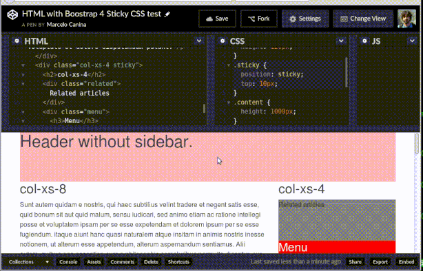
If I set the position:sticky to the sidebar column, I get the sticky behaviour of the sidebar: https://codepen.io/marcanuy/pen/YWYZEp
CSS:
.sticky {
  position: sticky;
  top: 10px;
}
HTML:
 <div class="row">
    <div class="col-xs-8 content">
    </div>
    <div class="col-xs-4 sticky">
    </div>
 </div>
But when I set the sticky property only to the menu that is located in the sidebar, so the related articles section scrolls normally and gets the sticky behaviour with the menu div, it doesn't work:
 <div class="row">
    <div class="col-xs-8 content">
    </div>
    <div class="col-xs-4">
       <div class="menu sticky">
       </div>
    </div>
 </div>
This is the screencast of the first example scrolling the whole sidebar with a sticky behaviour, and then changing the sticky property to the menu that doesn't work:
Bootstrap 4 recommends the sticky property as the dropped support for the Affix jQuery plugin:
Dropped the Affix jQuery plugin. We recommend using a position: sticky polyfill instead.
I have tested it in:
Firefox 47.0 with css.sticky.enabled=“true” under about:config
Chrome 50.0.2661.94 (64-bit) with experimental Web Platform features enabled in chrome://flags
(This is not a duplicate of How to make a sticky sidebar in Bootstrap? because that one is using BS affix)
 462
462
In the stable Bootstrap 4.0.0 release, this is done using the sticky-top class...
Demo
<div class="container">
    <nav class="navbar navbar-light bg-light navbar-expand">
        <a class="navbar-brand" href="#">Header</a>
        ...
    </nav>
    <div class="row">
        <div class="col-8 content">
            Content
        </div>
        <div class="col-4">
            <div class="sticky-top">
                <h4>Sticky menu</h4>
                ...
            </div>
        </div>
    </div>
    <div class="footer">
        ...
    </div>
</div>
This works even in the height of the header/navbar, content, and footer are dynamic/unknown.
https://codeply.com/go/QJogUAHIyg
104
I solved enabling flexbox. After raising an issue in Bootstrap's Github repository I got an answer by a Bootstrap member:
The .col-xs-4 isn't as tall as the .col-xs-8, so there's basically no space for the Menu to "float" within when the stickiness kicks in. Make the .col-xs-4 taller and things work fine: https://codepen.io/anon/pen/OXzoNJ If you enable the Flexbox version of our grid system (via $enable-flex: true;), you get automatic equal-height columns for free, which comes in handy in your case.
40
Polyfill explanation.
You need to include the JS polyfill in order to use it. The polyfills recommended by the link on the Bootstrap page are
Here is an updated codepen: https://codepen.io/anon/pen/zBpNRk
I included the required polyfill (I used stickyfill) and called it with
var stickyElements = document.getElementsByClassName('sticky');

for (var i = stickyElements.length - 1; i >= 0; i--) {
    Stickyfill.add(stickyElements[i]);
}
The library suggested you use this for your css
.sticky {
   position: -webkit-sticky;
   position: sticky;
   top: 0;
}
.sticky:before,
.sticky:after {
    content: '';
    display: table;
}
and finally you had the div order mixed up. You need to put the div with the sticky class outside of an entire row so I filled up the rest of the row with another <div class="col-xs-6"></div> that is empty.
43
The answer by @wrldbt works up to bootstrap 4 alpha 5, but in alpha 6 the -xs infix has been dropped and the grid have been rewritten.
I put something together, a bit cleaner, working with current version of bootstrap & also included a sticky footer using flexbox.
https://codepen.io/cornex/pen/MJOOeb
42
If you love us? You can donate to us via Paypal or buy me a coffee so we can maintain and grow! Thank you!
Donate Us With


