 Menu
Menu
I use bootstrap to design my web UI , and now I have a requirement as below:
I define the below div structure as their div ids are : part1 and part2
    <div class="container">
        <div class="panel panel-default">
            <div class="panel-body">
                <div id="part1" class="col-md-6">
                    <div>
                        xxxx
                    </div>
                </div>
                <div id="part2" class="col-md-6">
                    <div>
                        yyy
                    </div>
                </div>
            </div>
        </div>
    </div>
Now I want to hide the part1 automatically when shrink browser window size or my phone browser , How can I achieve this effect ?
BTW: I try to add css "collapse" to part1 as , but it hide directly even my browser is larger .
 448
448
Use utility classes for showing and hiding content by decice via media query. Try to use thses on a limited basis and avoid creating entirely differnet versions of the smae site. Instead, use them to complement each device's presentation.
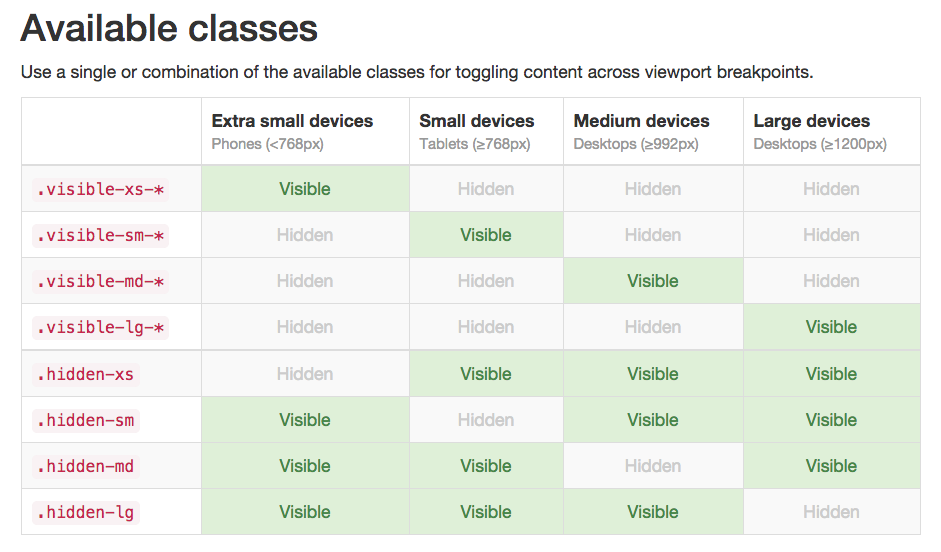
Source: http://getbootstrap.com/css/#responsive-utilities
102
This is a working code, I have tested..
    <div class="row">
    <div class="col-md-4">.col-md-4</div>
    <div class="col-md-4 ">.col-md-4</div>
    <div class="col-md-4 visible-lg">.col-md-4</div>
    </div>
If you love us? You can donate to us via Paypal or buy me a coffee so we can maintain and grow! Thank you!
Donate Us With


