 Menu
Menu
I'd like to stretch 6 nav items evenly across a 900px container, with an even amount of white space between. For instance...
---| 900px Container |---

---| HOME    ABOUT    BASIC SERVICES    SPECIALTY SERVICES    OUR STAFF    CONTACT US |---
Currently, the best method I can find to do this is the following:
nav ul {
  width: 900px;
  margin: 0 auto;
}

nav li {
  line-height: 87px;
  float: left;
  text-align: center;
  width: 150px;
}
The PROBLEM with this is two fold. First of all, it doesn't truly justify it, but rather spreads the li tags evenly throughout the ul tag.. creating uneven white-space between smaller menu items like "HOME" or "ABOUT" and larger ones like "BASIC SERVICES".
The second problem is that the layout breaks if a nav item is larger than 150px, which SPECIALTY SERVICES is - even though there is more than enough space for the whole nav.
Can anyone solve this for me? I've been scouring the web for solutions, and they all seem to come up short. CSS / HTML only if possible...
Thanks!
UPDATE (7/29/13): Using table-cell is the best modern way to implement this layout. See felix's answer below. The table cell property works on 94% of browsers currently. You'll have to do something about IE7 and below, but otherwise should be ok.
UPDATE (7/30/13): Unfortunately, there is a webkit bug that impacts this if you're combining this layout with Media Queries. For now you'll have to avoid changing the 'display' property. See Webkit Bug.
UPDATE (7/25/14): There is a better solution to this below now involving text-align: justify. Using this is simpler and you'll avoid the Webkit bug.
 220
220
The modern way to distribute items evenly is to set the following two declarations on the container element:
.container {
  display: flex; /* (1) */
  justify-content: space-between; /* (2) or space-around or space-evenly */
}
The value to use for justify-content depends on which kind of even distribution is needed.
See MDN
ul {
list-style: none;
padding: 0;
width: 90vw;
border: 3px solid gold;
display: flex;
}
a {
background: gold;
}
ul {
justify-content: space-between;
}
ul ~ ul {
justify-content: space-around;
}
ul ~ ul ~ ul {
justify-content: space-evenly;
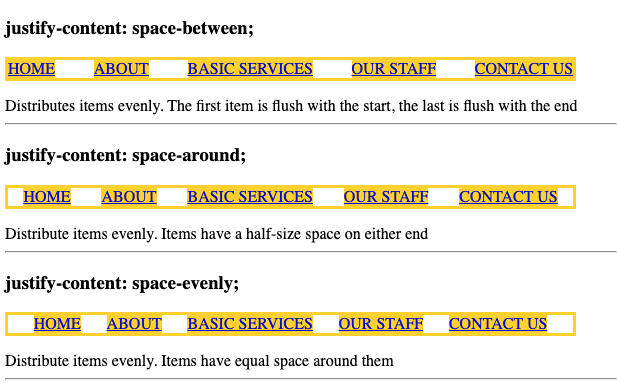
}<h3>justify-content: space-between; </h3>
<ul id="nav">
<li><a href="#">HOME</a></li>
<li><a href="#">ABOUT</a></li>
<li><a href="#">BASIC SERVICES</a></li>
<li><a href="#">OUR STAFF</a></li>
<li><a href="#">CONTACT US</a></li>
</ul>
<div>Distributes items evenly. The first item is flush with the start, the last is flush with the end </div>
<hr>
<h3>justify-content: space-around;</h3>
<ul id="nav">
<li><a href="#">HOME</a></li>
<li><a href="#">ABOUT</a></li>
<li><a href="#">BASIC SERVICES</a></li>
<li><a href="#">OUR STAFF</a></li>
<li><a href="#">CONTACT US</a></li>
</ul>
<div>Distribute items evenly. Items have a half-size space on either end</div>
<hr>
<h3>justify-content: space-evenly;</h3>
<ul id="nav">
<li><a href="#">HOME</a></li>
<li><a href="#">ABOUT</a></li>
<li><a href="#">BASIC SERVICES</a></li>
<li><a href="#">OUR STAFF</a></li>
<li><a href="#">CONTACT US</a></li>
</ul>
<div>Distribute items evenly. Items have equal space around them</div>
<hr>Use text-align:justify on the container, this way it will work no matter how many elements you have in your list (you don't have to work out % widths for each list item
    #nav {
        text-align: justify;
        min-width: 500px;
    }
    #nav:after {
        content: '';
        display: inline-block;
        width: 100%;
    }
    #nav li {
        display: inline-block;
    }
<ul id="nav">
<li><a href="#">HOME</a></li>
<li><a href="#">ABOUT</a></li>
<li><a href="#">BASIC SERVICES</a></li>
<li><a href="#">OUR STAFF</a></li>
<li><a href="#">CONTACT US</a></li>
</ul>FIDDLE
128
This one really works. Also has the benefit that you can use media queries to easily turn off the horizontal style — for instance if you want to stack them vertically when on mobile phone.
<ul id="nav">
    <li><a href="#">Link</a></li>
    <li><a href="#">Link</a></li>
    <li><a href="#">Link</a></li>
    <li><a href="#">Link</a></li>
    <li><a href="#">Link</a></li>
    <li><a href="#">Link</a></li>
</ul>
#nav {
display: table;
height: 87px;
width: 100%;
}
#nav li {
display: table-cell;
height: 87px;
width: 16.666666667%; /* (100 / numItems)% */
line-height: 87px;
text-align: center;
background: #ddd;
border-right: 1px solid #fff;
white-space: nowrap;
}
@media (max-width: 767px) {
#nav li {
display: block;
width: 100%;
}
}
http://jsfiddle.net/timshutes/eCPSh/416/
21
if you can, use flexbox:
<ul>
<li>HOME</li>
<li>ABOUT US</li>
<li>SERVICES</li>
<li>PREVIOUS PROJECTS</li>
<li>TESTIMONIALS</li>
<li>NEWS</li>
<li>RESEARCH & DEV</li>
<li>CONTACT</li>
</ul>
ul {
display: flex;
justify-content:space-between;
list-style-type: none;
}
jsfiddle: http://jsfiddle.net/RAaJ8/
Browser support is actually quite good (with prefixes an other nasty stuff): http://caniuse.com/flexbox
37
An ideal solution will:
Using a simple ul menu inside of an nav container, we can build a solution that meets the above requirements.
<nav>
  <ul>
    <li>Home</li>
    <li>About</li>
    <li>Basic Services</li>
    <li>Specialty Services</li>
    <li>Our Staff</li>
    <li>Contact Us</li>
  </ul>
</nav>
First, we need to force the ul to have the full width of its nav container. To accomplish this, we will use the :after psuedo-element with width: 100%.
This achieves our goal perfectly, but adds trailing whitespace from the psuedo-element. We can remove this whitespace across all browsers through IE8 by setting the line-height of the ul to 0 and setting it back to 100% on its li children. See the example CodePen and solution below:
nav {
  width: 900px;
}

nav ul {
  text-align: justify;
  line-height: 0;
  margin: 0;
  padding: 0;
}

nav ul:after {
  content: '';
  display: inline-block;
  width: 100%;
}

nav ul li {
  display: inline-block;
  line-height: 100%;
}
If you love us? You can donate to us via Paypal or buy me a coffee so we can maintain and grow! Thank you!
Donate Us With