 Menu
Menu
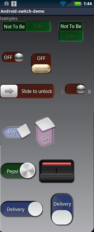
I need to implement a button in my app like this

I used a SwitchCompat button but the closest I arrived was to this point,

having two main problems:
1 - The width of the button does not adjust correctly when screen sizes change (drawable gets cut off, become too small etc), it is important that the width occupies the parent view correctly ( a small linear layout enclosing it)
2 - I was not able to understand how I could get the letters in the Switch Track
Is it possible to achieve this result with a switch button? How? Should I use another view instead of the switch button? Which one?
I stumbled upon this project but it seems a bit outdated
https://github.com/pellucide/Android-Switch-Demo-pre-4.0/tree/master/
 618
618
For example:
class SwitchCompatEx : SwitchCompat {

    companion object {

        val TRACK_COLOR = 0xFFFFFFFF.toInt()
        val TRACK_STROKE_WIDTH = 2f.dp2Px.toInt()
        val TRACK_STROKE_COLOR = 0xFF00A1FF.toInt()
        val TRACK_LABEL_COLOR = 0xFF00A1FF.toInt()
        val TRACK_LABEL_SIZE = 14f.sp2Px

        val THUMB_COLOR = 0xFF00A1FF.toInt()
        val THUMB_LABEL_COLOR = 0xFFFFFFFF.toInt()
        val THUMB_LABEL_SIZE = 14f.sp2Px

        fun drawLabel(canvas: Canvas,
                      bounds: Rect,
                      paint: Paint,
                      text: CharSequence?) {
            text ?: return

            val tb = RectF();
            tb.right = paint.measureText(text, 0, text.length)
            tb.bottom = paint.descent() - paint.ascent()
            tb.left += bounds.centerX() - tb.centerX()
            tb.top += bounds.centerY() - tb.centerY() - paint.ascent()

            canvas.drawText(text.toString(), tb.left, tb.top, paint)
        }

        private inline val Float.sp2Px
            get() = TypedValue.applyDimension(TypedValue.COMPLEX_UNIT_SP,
                    this,
                    Resources.getSystem().displayMetrics)

        private inline val Float.dp2Px
            get() = TypedValue.applyDimension(TypedValue.COMPLEX_UNIT_DIP,
                    this,
                    Resources.getSystem().displayMetrics)
    }

    private val trackLabelPaint = Paint().apply {
        isAntiAlias = true
        textSize = TRACK_LABEL_SIZE
        color = TRACK_LABEL_COLOR
    }

    private val thumbLabelPaint = Paint().apply {
        isAntiAlias = true
        textSize = THUMB_LABEL_SIZE
        color = THUMB_LABEL_COLOR
    }

    private val thumbLabel
        get () = if (isChecked) textOn else textOff

    constructor(context: Context?) : super(context)
    constructor(context: Context?, attrs: AttributeSet?) : super(context, attrs)
    constructor(context: Context?, attrs: AttributeSet?, defStyleAttr: Int) : super(context, attrs, defStyleAttr)

    init {
        background = null
        trackDrawable = TrackDrawable()
        thumbDrawable = ThumbDrawable()
    }

    override fun onSizeChanged(w: Int,
                               h: Int,
                               oldw: Int,
                               oldh: Int) {
        super.onSizeChanged(w, h, oldw, oldh)

        (trackDrawable as GradientDrawable).setSize(w, h)
        (thumbDrawable as GradientDrawable).setSize(w / 2, h)
    }

    inner class TrackDrawable : GradientDrawable() {

        private val textOffBounds = Rect()
        private val textOnBounds = Rect()

        init {
            setColor(TRACK_COLOR)
            setStroke(TRACK_STROKE_WIDTH, TRACK_STROKE_COLOR)
        }

        override fun onBoundsChange(r: Rect) {
            super.onBoundsChange(r)

            cornerRadius = r.height() / 2f

            textOffBounds.set(r)
            textOffBounds.right /= 2

            textOnBounds.set(textOffBounds)
            textOnBounds.offset(textOffBounds.right, 0)
        }

        override fun draw(canvas: Canvas) {
            super.draw(canvas)

            drawLabel(canvas, textOffBounds, trackLabelPaint, textOff)
            drawLabel(canvas, textOnBounds, trackLabelPaint, textOn)
        }
    }

    inner class ThumbDrawable : GradientDrawable() {

        private val thumbLabelBounds = Rect()

        init {
            setColor(THUMB_COLOR)
        }

        override fun onBoundsChange(r: Rect) {
            super.onBoundsChange(r)

            cornerRadius = r.height() / 2f

            thumbLabelBounds.set(r)
        }

        override fun draw(canvas: Canvas) {
            super.draw(canvas)

            drawLabel(canvas, thumbLabelBounds, thumbLabelPaint, thumbLabel)
        }
    }
}
...
<demo.sodemos.SwitchCompatEx
    android:layout_width="wrap_content"
    android:layout_height="wrap_content"
    android:layout_gravity="center"
    android:minHeight="40dp"
    android:textOff="M"
    android:textOn="F"
    app:switchMinWidth="100dp" />
...

Also check out this Custom view components Tutorial.
Hope this helps
106
After messing around I fixed rendering issue by adding below two lines at the end of onDraw function for each drawable
    invalidate()
    requestLayout()
If you love us? You can donate to us via Paypal or buy me a coffee so we can maintain and grow! Thank you!
Donate Us With


