 Menu
Menu
I'm using Python tkinter. I can customize the background color (with "bg" property) and characters' color (with "fg" property) by setting properties of Radiobutton. Now I need:
so I created a Radiobutton like this:
common_bg = '#' + ''.join([hex(x)[2:].zfill(2) for x in (181, 26, 18)])  # RGB in dec
common_fg = '#ffffff'  # pure white
Radiobutton(paraent_frame, text='abc', variable=radio_value, value=2,
            command=on_click_level_radio, bg=common_bg, fg=common_fg)
The GUI seems like this (the black arrow is added by myself):

But the problem is, the background of the circle of the radio button is white. When the 'little point' which is used to indicate whether the radio is selected, is black by default, it works well. When I set the "fg" property to white, the 'little point' becomes white, too, making it impossible to distinguish whether the radio is selected.
So I'm wondering if there is a way to separately set the color of the 'circle' of the radio button or the 'little point'.
 449
449
Sure, it's possible.
Actually, the "little point" is the indicator, and the "circle" is the indicator background.
In your case, the indicator inherits its color from the foreground/activeforeground options (these are pure white) and the indicator background is pure white by default.
To overcome this, you should set up radiobutton's color properties (you should notice the selectcolor option! ):
try:
    import tkinter as tk
except ImportError:
    import Tkinter as tk

root = tk.Tk()

common_bg = '#' + ''.join([hex(x)[2:].zfill(2) for x in (181, 26, 18)])  # RGB in dec
common_fg = '#ffffff'  # pure white

rad_button = tk.Radiobutton(root, text='abc', value=2, fg=common_fg, bg=common_bg,
                            activebackground=common_bg, activeforeground=common_fg, selectcolor=common_bg)

rad_button.pack(expand=True, fill='both')
root.mainloop()
Where result is:
However, the docs claims that this option has the system-dependent behavior:
Specifies a background color to use when the button is selected. If -indicatoron is true then the color applies to the indicator. Under Windows, this color is used as the background for the indicator regardless of the select state. If -indicatoron is false, this color is used as the background for the entire widget, in place of -background or -activeBackground, whenever the widget is selected. If specified as an empty string then no special color is used for displaying when the widget is selected.
So, consider using a ttk version of the radiobutton with an appropriate theme and options:
try:
    import tkinter as tk
    import tkinter.ttk as ttk
except ImportError:
    import Tkinter as tk
    import ttk

root = tk.Tk()
style = ttk.Style(root)

#    try also the 'clam' theme
style.theme_use('alt')

common_bg = '#' + ''.join([hex(x)[2:].zfill(2) for x in (181, 26, 18)])  # RGB in dec
#    alternatively use the "more red" version of the common_bg as the indicatorcolor
#    sel_bg = '#' + ''.join([hex(x)[2:].zfill(2) for x in (221, 26, 18)])
common_fg = '#ffffff'  # pure white

rad_button = ttk.Radiobutton(root, text='abc')
rad_button.pack(expand=True, fill='both')

style_name = rad_button.winfo_class()
style.configure(style_name, foreground=common_fg, background=common_bg, indicatorcolor=common_bg)

style.map(style_name,
          foreground = [('disabled', common_fg),
                      ('pressed', common_fg),
                      ('active', common_fg)],
          background = [('disabled', common_bg),
                      ('pressed', '!focus', common_bg),
                      ('active', common_bg)],
          indicatorcolor=[('selected', common_bg),
                          ('pressed', common_bg)]

          )
root.mainloop()
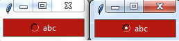
Where result is:

Theoretically, you could specify separate set of a bg/fg colors for the both label and indicator, but problem stems from implementation of the radiobutton widget.
If you print(style.layout(style_name)) you will see this structure:
[('Radiobutton.padding',
  {'children': [('Radiobutton.indicator', {'side': 'left', 'sticky': ''}),
                ('Radiobutton.focus',
                 {'children': [('Radiobutton.label', {'sticky': 'nswe'})],
                  'side': 'left',
                  'sticky': ''})],
   'sticky': 'nswe'})]
Later, look for the each element options via print(style.element_options(element):
# result of print(style.element_options('Radiobutton.indicator'))
('-background', '-foreground', '-indicatorcolor', '-lightcolor', '-shadecolor', '-bordercolor', '-indicatormargin')

# result of print(style.element_options('Radiobutton.label'))
('-compound', '-space', '-text', '-font', '-foreground', '-underline', '-width', '-anchor', '-justify', '-wraplength', '-embossed', '-image', '-stipple', '-background')
Notice that both elements has '-background'/'-foreground' options, therefore they're both reacts in the same manner, when that option set for the entire style. In other words, label and indicator share their colors by design.
101
If you love us? You can donate to us via Paypal or buy me a coffee so we can maintain and grow! Thank you!
Donate Us With