 Menu
Menu
I want to customise antd Select. When a user click on Select the antd Option should display over antd Select instead of displaying beneath the Select
antd Select: https://ant.design/components/select/
Expected behaviour:
Actual behaviour:
JSX
import { FaPlane, FaWater } from "react-icons/fa";

//outside of class
const shipmentType = {
  sea: [
    { name: "FCL", desc: "FULL CONTAINER LOAD" },
    { name: "LCL", desc: "LESS CONTAINER LOAD" }
  ],
  air: [{ name: "AIR", desc: "AIR DELIVERY" }]
};


//inside of class

render(){
       return(
              <Select
              className="container-dropdown"
              onChange={this.onSelectChange}
              defaultValue={
                  <DisplayContainer data={shipmentType.sea[0]} />
              }
              key={ shipmentType.sea[0]}
            >
              <Option value={shipmentType.sea[0].name}>
                <DisplayContainer data={shipmentType.sea[0]} />
              </Option>
              <Option value={shipmentType.sea[1].name}>
                <DisplayContainer data={shipmentType.sea[1]} />
              </Option>
            </Select>
          );
}
DisplayContainer.js component
const DisplayContainer = ({ data }) => {
  return (
    <div
      style={{
        width: "120px",
        height: "45px",
        display: "flex",
        flexFlow: "column",
        justifyContent: "center",
        alignItems: "center"
      }}
    >
      <span
        style={{
          display: "block",
          fontSize: "8px",
          padding: "5px 0px 0px 10px"
        }}
      >
        {data.desc}
      </span>

      <span style={{ padding: "2px 0px 0px 14px" }}>
        {data.name === "AIR" ? <FaPlane /> : <FaWater />}
        <span
          style={{ display: "inline", marginLeft: "14px", fontSize: "16px" }}
        >
          {data.name}
        </span>
      </span>
    </div>
  );
};
App.css
.container-dropdown {
    height: 53px;
    width: 140px;
    border: 0px solid white;
    border-radius: 0px;
    cursor: pointer;
    font-size: 18px;
    margin: 0px;
    padding: 0px;
}
custom-antd.css
.ant-select-selection.ant-select-selection--single {
    border-radius: 0px 8px 8px 0px;
    height: 53px;
}

.ant-select-selection-selected-value {
    height: 53px;
    padding: 0px;
    margin: 0px;
}

.ant-select-selection__rendered {
    padding: 0px;
    margin: 0px;
}

.ant-select-dropdown-menu.ant-select-dropdown-menu-root.ant-select-dropdown-menu-vertical {
    padding: 0px;
    margin: 0px;
}

.ant-select-dropdown-menu-item {
    padding: 0px;
    margin: 0px;
}
How can I achieve this? I have already spent hours of time. but I couldn't succeed. I will appreciate you. thank you
Edit 01:
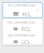
When a user clicks the Select box
I want the top Option (i.e. FCL) goes up and cover the Select box like this:
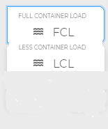
I don't want both the Options (i.e. FCL and LCL)to be displayed below Select box:
 753
753
styled-components is an npm library to help overwrite CSS styling. Note that AntD uses its own css classes to style its components. You might have noticed this if you open up AntD css with Inspect Element. styled from styled-components will apply CSS styling to that component directly!
I believe I have been able to get pretty close to what you are looking to achieve. Below is the updated custom-antd.css file.
.ant-select-selection-selected-value {
  border-radius: 0px 8px 8px 0px;
  height: 53px;
}

.ant-select-selection.ant-select-selection--single {
  height: 53px;
}

.ant-select-selection.ant-select-selection--single
  > div
  > div
  > div
  > div
  + div {
  margin-top: -5px;
  padding: 4px 5px 5px 14px !important;
}

.ant-select-selection.ant-select-selection--single > div > div > div > div {
  margin-top: -20px;
}

.ant-select-selection.ant-select-selection--single[aria-expanded="true"]
  > div
  > div
  > div
  > div {
    margin-top: -10px;
}

 /*style for when the menu is expanded: show shipment description above icon and name*/
.ant-select-selection.ant-select-selection--single[aria-expanded="true"]
    > div
    > div
    > div
    > div
    + div {
       margin-top: -15px;
}
The complete code sandbox can be found here.
Essentially what you want to do is use combinators to select the specific div's for the name, the description, etc. which ant design nests pretty deep in their structure.
EDIT
In order to get the dropdown menu to display different data based on what is currently selected (show LCL only when FCL is selected, vice versa), you can utilize an handleChange function that filters the original shipment data so it returns everything that is not currently selected (i.e. showing LCL without FCL when FCL is selected). By storing the original shipment data in state, along with a second array (filtered menu data), you can use/update the second array for your selection options.
Here is your state.
  this.state = {
     shipmentArr: [],
     shipmentType: {
        sea: [
          { name: "FCL", desc: "FULL CONTAINER LOAD" },
          { name: "LCL", desc: "LESS CONTAINER LOAD" }
        ],
        air: [{ name: "AIR", desc: "AIR DELIVERY" }]
     }
  };
Here is the new handleChange.
handleChange = value => {
   var newShipmentType = this.state.shipmentType.sea.filter(x => {
     return x.name !== value;
   });
   this.setState({
     shipmentArr: newShipmentType
   });
};
Here is the componentDidMount (utilizing handleChange).
componentDidMount = () => {
    this.handleChange(this.state.shipmentType.sea[0].name);
};
Below is the updated Select component.
<Select
    className="container-dropdown"
    onChange={this.handleChange}
    open={true} // USE THIS FOR DEBUGGING.
    defaultValue={
      <DisplayContainer data={this.state.shipmentType.sea[0]} />
    }
    key={this.state.shipmentArr[0]}
  >
    {this.state.shipmentArr.map(x => {
      return (
        <Option value={x.name}>
          <DisplayContainer data={x} />
        </Option>
      );
    })}
  </Select>
See the full updated codepen.
138
If you love us? You can donate to us via Paypal or buy me a coffee so we can maintain and grow! Thank you!
Donate Us With