 Menu
Menu
Here is my worked jsfiddle: http://jsfiddle.net/nalinc/rym2zku1/9/
nav ul,
nav ol {
  list-style: none;
  margin: 0;
  padding: 0;
}
.nav-item ul {
  padding: inherit;
  border: 1px solid black;
  text-align: left;
  border-radius: 4px;
}
.nav-item ul li:hover {
  background-color: #d1d1d1;
}
.nav-bar {
  text-align: center;
}
@media screen and (min-width: 769px) {
  .nav-bar--left {
    display: table;
    table-layout: fixed;
    width: 100%;
    text-align: left;
  }
  .nav-bar--left .grid-item {
    float: none;
    display: table-cell;
    vertical-align: middle;
  }
}
#nav {
  position: relative;
  display: block;
  list-style-type: none;
  padding: 0;
  margin: 20px 0;
  font-family: "Raleway", "HelveticaNeue", "Helvetica Neue", sans-serif;
  white-space: nowrap;
}
.nav-bar--left #nav {
  margin: 1em 0 0;
  text-align: right;
}
@media screen and (max-width: 768px) {
  #nav,
  .nav-bar--left #nav {
    width: 100%;
    white-space: normal;
    margin: 20px 0 10px;
    text-align: inherit;
  }
}
.nav-item {
  position: relative;
  display: inline-block;
  padding: 2px 30px;
}
@media screen and (max-width: 768px) {
  .nav-item {
    padding: 10px 20px;
  }
}
#nav>.nav-item {
  border-left: 1px solid #e8e8e8;
}
#nav>.nav-item.first {
  border-left: none;
  padding-left: 0;
}
@media screen and (max-width: 768px) {
  #nav>.nav-item {
    border: 0 none;
  }
}
.nav-item-link {
  display: inline-block;
  color: #211f1f;
  font-size: 14px;
  zoom: 1;
  *display: inline;
}
.nav-item-link:hover {
  color: #333;
}
.nav-item-link .nav-item.active .nav-item-link {
  color: #333333;
}
.sub-nav .sub-nav {
  display: none !important;
}
.supports-no-csstransforms .sub-nav {
  white-space: normal;
  width: 200px;
  margin-left: -100px;
}
.sub-nav:before {
  content: '';
  display: block;
  position: absolute;
  top: 5px;
  right: 47%;
  border-left: 5px solid transparent;
  border-right: 5px solid transparent;
  border-bottom: 5px solid #211f1f;
  z-index: 40;
}
.sub-nav-item,
#moreMenu--list .nav-item {
  display: block;
  overflow: hidden;
  padding: 0;
  margin: 0;
  background-color: #211f1f;
}
.sub-nav-item.first,
#moreMenu--list .nav-item:first-child {
  border-top-left-radius: 4px;
  border-top-right-radius: 4px;
}
.sub-nav-item.last,
#moreMenu--list .nav-item:last-child {
  border-bottom-right-radius: 4px;
  border-bottom-left-radius: 4px;
}
.sub-nav-item-link,
#moreMenu--list .nav-item .nav-item-link {
  display: block;
  padding: 15px 20px;
  margin: 0;
  color: #ffffff;
  text-align: center;
  border-top: 1px solid #0b0a0a;
}
.sub-nav-item-link.first,
.sub-nav-item-link:first-child,
#moreMenu--list .nav-item .nav-item-link.first,
#moreMenu--list .nav-item .nav-item-link:first-child {
  border-top: none;
}
.sub-nav-item-link:hover,
.sub-nav-item-link:focus,
#moreMenu--list .nav-item .nav-item-link:hover,
#moreMenu--list .nav-item .nav-item-link:focus {
  color: #ffffff;
  border-top: 1px solid #0b0a0a;
  background-color: #0b0a0a;
}
.sub-nav-item-link:hover.first,
.sub-nav-item-link:hover:first-child,
.sub-nav-item-link:focus.first,
.sub-nav-item-link:focus:first-child,
#moreMenu--list .nav-item .nav-item-link:hover.first,
#moreMenu--list .nav-item .nav-item-link:hover:first-child,
#moreMenu--list .nav-item .nav-item-link:focus.first,
#moreMenu--list .nav-item .nav-item-link:focus:first-child {
  border-top: none;
}
#nav {
  border-top: 1px solid #ccc;
  border-bottom: 1px solid #ccc;
  text-align: center
}
#nav a {
  text-decoration: none;
  color: #666;
  display: inline-block;
  padding: 10px;
  font-size: 13px;
}
#nav ul {
  position: absolute;
  top: 100%;
  left: 0;
  text-align: left;
  width: 170px;
  border: 1px solid #ccc;
  display: none;
}
#nav li:hover ul {
  display: block;
}
<nav id="navWrap" role="navigation">
<ul id="nav">
<li class="nav-item first active">
<a class="nav-item-link" href="/">Home</a>
</li>
<li class="nav-item">
<a class="nav-item-link" href="catalog.html">Catalog</a>
<ul>
<li><a href="#">Data Listing</a></li>
<li><a href="#">Web Scheduling</a></li>
<li><a href="#">Google Maps Application</a></li>
</ul>
</li>
<li class="nav-item">
<a class="nav-item-link" href="/blogs/news">Blog</a>
</li>
<li class="nav-item">
<a class="nav-item-link" href="/pages/about-us">About Us</a>
</li>
</ul>
</nav>Now I need to border-left for each list.
I need like this image:

When I add border-left, it will be touched in the border-bottom.
#nav ul {
    position: absolute;
    top: 100%;
    left: 0;
    text-align: left;
    width: 170px;
    border: 1px solid #ccc;
    display: none;
}
Can anyone help me to fix this? Thanks in advance.
 851
851
Add text-align:center to <li> or <a> to center the links. Add the border property to <ul> add a border around the navbar. If you also want borders inside the navbar, add a border-bottom to all <li> elements, except for the last one: Home.
If you want to set a border to the left and right, use three values (write none to the first and third values). Example: border-style: none solid none none; // border will be applied only to the right side. border-style: solid none; // border will be applied only to the top and bottom sides.
DEMO: http://jsfiddle.net/rym2zku1/29/
Additional CSS
.nav-item:not(:last-child) {
    -webkit-box-shadow: 10px 0px 0px -9px red;
       -moz-box-shadow: 10px 0px 0px -9px red;
            box-shadow: 10px 0px 0px -9px red;
}
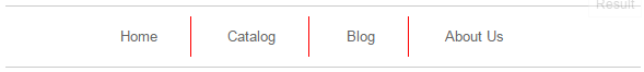
Vertical bars coloured red to better highlight the solution
Result
Explanation
We're [ab]using the CSS box-shadow property to draw a partial border around the .nav-item elements.
The "pieces" of the CSS can be described as follows:
The hack here is that the shadow is nudged 10px to the right but the spread (-9px) works against this to effectively "pull it back" in again. This reduction in spread occurs in all dimensions, so we get a 9px "pull back" from the full-height of the element too.
153
If you love us? You can donate to us via Paypal or buy me a coffee so we can maintain and grow! Thank you!
Donate Us With

