 Menu
Menu
See this fiddle in Firefox http://jsfiddle.net/qwbpZ/4/
On hover you will see this grey line
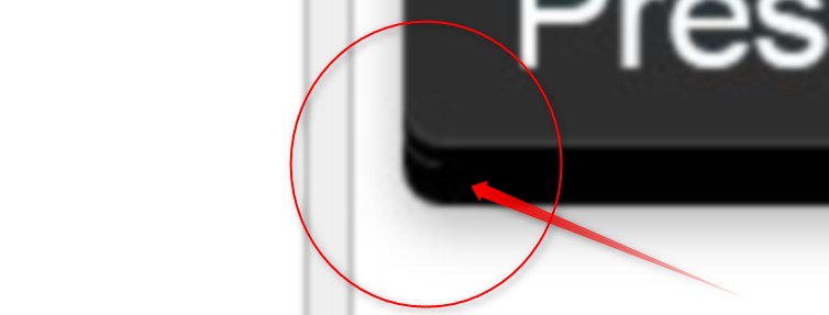
It's fine in Google Chrome but this grey border is appearing in other browsers. How can I solve this?
CSS
a, a:visited {color:#fff}

.btn {
  display: inline-block;
  -webkit-border-radius: 8px;
  -moz-border-radius: 8px;
  border-radius: 8px;
  -webkit-box-shadow: 0 9px 0 #000000, 0 13px 0 rgba(0, 0, 0, 0.1);
  -moz-box-shadow: 0 9px 0 #000000, 0 13px 0 rgba(0, 0, 0, 0.1);
  box-shadow: 0 9px 0 #000000, 0 13px 0 rgba(0, 0, 0, 0.1);
  -webkit-transition: -webkit-box-shadow .2s ease-in-out;
  -moz-transition: -moz-box-shadow .2s ease-in-out;
  -o-transition: -o-box-shadow .2s ease-in-out;
  transition: box-shadow .2s ease-in-out;
  padding: 0px;
        background: black; /*  see ? */
}

.btn span {
  display: inline-block;
  padding: 22px 22px 11px;
  font-family: Arial, sans-serif;
  line-height: 1;
  text-shadow: 0 -1px 1px rgba(19,65,88,.8);
  background: #2e2e2e;
  -webkit-border-radius: 8px;
  -moz-border-radius: 8px;
  border-radius: 8px;
  -webkit-box-shadow: inset 0 -1px 1px rgba(255,255,255,.15);
  -moz-box-shadow: inset 0 -1px 1px rgba(255,255,255,.15);
  box-shadow: inset 0 -1px 1px rgba(255,255,255,.15);
  -webkit-transition: -webkit-transform .2s ease-in-out;
  -moz-transition: -moz-transform .2s ease-in-out;
  -o-transition: -o-transform .2s ease-in-out;
  transition: transform .2s ease-in-out;
  color: #FFF;
        font-size: 32px;
        border: 0
}

.btn:hover {
  -webkit-box-shadow: 0 8px 0 #000,
    0 12px 10px rgba(0,0,0,.3);
  -moz-box-shadow: 0 8px 0 #000,
    0 12px 10px rgba(0,0,0,.3);
  box-shadow: 0 8px 0 #000,
    0 12px 10px rgba(0,0,0,.3);
}

.btn:hover span {
  -webkit-transform: translate(0, -4px);
  -moz-transform: translate(0, -4px);
  -o-transform: translate(0, -4px);
  transform: translate(0, -4px);
}

.btn:active {
  -webkit-box-shadow: 0 8px 0 #000,
    0 12px 10px rgba(0,0,0,.3);
  -moz-box-shadow: 0 8px 0 #000,
    0 12px 10px rgba(0,0,0,.3);
  box-shadow: 0 8px 0 #000,
    0 12px 10px rgba(0,0,0,.3);
  -webkit-transition: -webkit-box-shadow .2s ease-in-out;
  -moz-transition: -moz-box-shadow .2s ease-in-out;
  -o-transition: -o-box-shadow .2s ease-in-out;
  transition: box-shadow .2s ease-in-out;
}
.btn:active span {


  -webkit-transform: translate(0, 0px);
  -moz-transform: translate(0, 0px);
  -o-transform: translate(0, 0px);
  transform: translate(0, 0px);
}
 721
721
It seems, that there is no perfect solution: this antiialiased pixels between shadow and border-radius are sticky as hell.
So, I came up with the following two solutions:
Sad, but these are not universal solutions and I couldn't find a proper way to fix the bug itself.
52
try this:
-moz-background-clip: padding;
-webkit-background-clip: padding-box;
 background-clip: padding-box;
Quick fix: apply bottom and sides 1px black border to button.
Fixed button: http://jsfiddle.net/FJGeZ/2/
Notice box-shadow y-axis distance is less by 1px to compensate 1px bottom border, plus inner span with negative margins to overlap parent border.
Isolated bug here: http://jsfiddle.net/AkZE6/
1
If you love us? You can donate to us via Paypal or buy me a coffee so we can maintain and grow! Thank you!
Donate Us With