 Menu
Menu
In a FAQ page I'm trying to make I have a page with this structure:
<section id="container">

     <div id="faq_primary"></div>
     <div id="faq_sidebar"></div>

</section>

<footer>

     <div id="directory">

          <div id="col_a"></div>
          <div id="col_b"></div>
          <div id="col_c"></div>

     </div>

</footer>
Here is the relevant CSS:
#container {
    width:960px;
    margin: 0px auto;
    position:relative;
}

#faq_primary {
    width:720px;
    margin:20px 40px 0 0;
    position:relative;
    float:left;
    display:inline;
}

#faq_sidebar {
    left:760px;
    position:absolute;
}

footer {
    width:1111px;
    height:250px;
    margin:90px auto 0px;
    position:relative;
    background-image:url(../images/footer/bg.png);
    color:#7d7d7d;
}

#directory {
    width:960px;
    margin:0px auto;
    padding-top:25px;
    font-size:13px;
}

#directory ul li{
    padding-bottom:4px;
}

#dir-cola, #dir-colb, #dir-colc, #dir-cold, #dir-cole {
    width:174px;
    height:140px;
    float:left;
}

#dir-cola {
    width:150px;
}

#dir-cole {
    width:143px;
}
My page content is found in the section container, and the footer is directly below. The faq_sidebar is much shorter than faq_primary, and because the columns in the footer are all floating left, they end up to the right of the faq_primary, below the faq_sidebar.
Here's a screenshot: 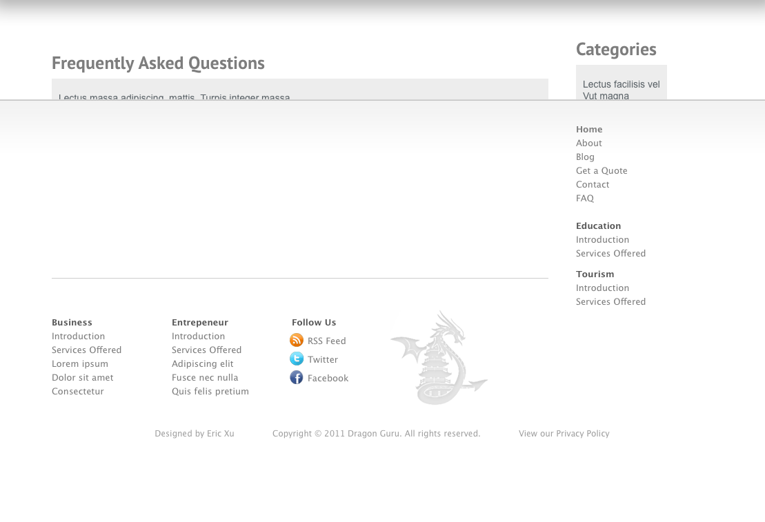
Any advice so I can prevent the content in the footer and container from overlapping?
 578
578
All that is needed to fix this is “min-height” and “min-width” in your CSS. this makes a Div responsive. minimum height will prevent the Divs from overlapping on each other.
The overflow-wrap property in CSS allows you to specify that the browser can break a line of text inside the targeted element onto multiple lines in an otherwise unbreakable place. This helps to avoid an unusually long string of text causing layout problems due to overflow.
Its hard to know without getting the same content as when i try thhis i can't produce the same as the screenshot. (Due to differences in content).
But I'm pretty sure if you:
#container
{
    // ... *snip*
    overflow: hidden;
}
Will cause the container to include the floated children in its calculation for height.
Also I would suggest you change the sidbar left: ... to right: 0 if you are trying to p[osition it on the right (alternatively float: right might be correct instead of positioning absolute).
EDIT:- I noticed one of the related questions had the same answer and i might be inclined to suggest that this is a duplicate. Question: Make outer div be automatically the same height as its floating content
70
You could add a clearing div here
<div id="faq_sidebar"></div>

<div class="clear"></div>

</section>
and then style it like this
.clear{
    clear:both;
}
If that doesn't do it, you may need to add it after the </section>
20
If you love us? You can donate to us via Paypal or buy me a coffee so we can maintain and grow! Thank you!
Donate Us With