 Menu
Menu
I'm using CSS flexbox to build a scalable, responsive grid. When applying a Google chart to one of the flexbox items, the item changes size ever so slightly. It's enough to throw the grid out of alignment. I put together the following images to help illustrate the issue.
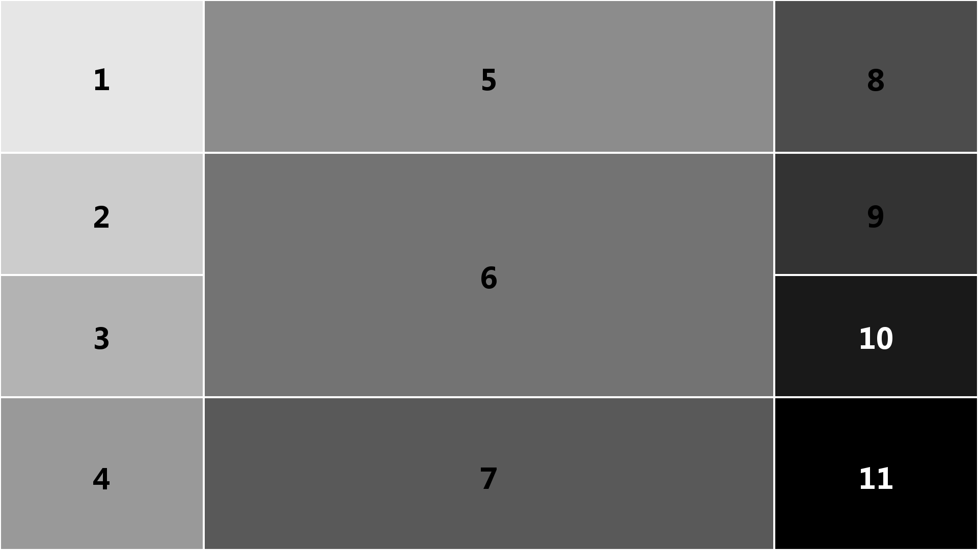
Flexbox grid before applying Google chart to item 6:
Flexbox grid after applying Google chart to item 6:
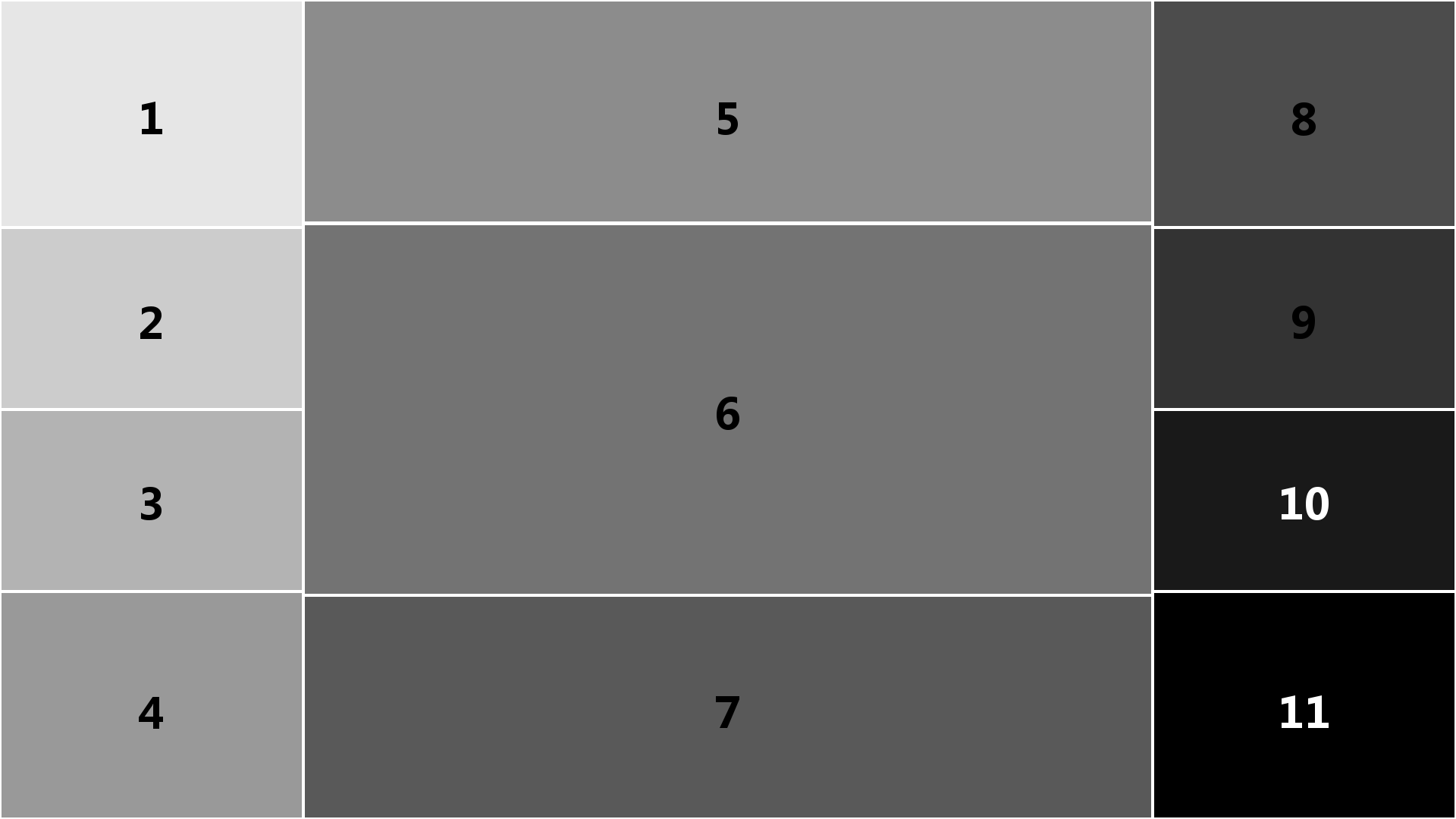
The Flexbox grid loads faster than the Google chart, so the grid originally loads correctly. However when the chart loads, item 6 expands slightly, causing image 2 above.
The middle column flex container and item 6 div are setup in css as follows:
#middlecolumn {
    width: 75%;
    height: 100%;
    display: flex;
    flex-flow: column;
    margin: 0.25%;
}

#item6_div {
    flex: 3;
    margin-top: 0.8vh;
}
Note that items 5 and 7 are setup the same way in css, with flex values of 1. I.e. item 6 is 3 times the height of items 5 and 7. As such, when item 6 resizes, the 3:1 ratio is maintained.
Is there something I'm missing in css to prevent the Google chart from resizing its flexbox container item?
 823
823
The flex-shrink property. The flex-shrink property specifies the flex shrink factor, which determines how much the flex item will shrink relative to the rest of the flex items in the flex container when negative free space is distributed.
You can use the flex-grow property to force an item to fill the remaining space on the main axis of a flex container. The item will expand as much as possible and occupy the free area.
When you tell a flex item to flex: 3 (Item 6) or flex: 1 (Items 5 & 7), here's how that shorthand property breaks down:
flex: ?  =  <flex-grow>, <flex-shrink>, <flex-basis>

flex: 3 =  flex-grow: 3, flex-shrink: 1, flex-basis: 0

flex: 1 =  flex-grow: 1, flex-shrink: 1, flex-basis: 0
In both cases, the flex-shrink factor is 1, meaning the flex item is allowed to shrink proportionally.
To prevent the flex items from shrinking, which may be causing the misalignment, I would change the flex-shrink to 0.
Instead of flex: 3 and flex: 1 try:
flex: 3 0 0;
flex: 1 0 0;
More details in the flexbox spec: 7.1.1. Basic Values of flex
But you may have another problem. You wrote:
Note that items 5 and 7 are setup the same way in css, with
flexvalues of1. I.e. item 6 is 3 times the height of items 5 and 7. As such, when item 6 resizes, the 3:1 ratio is maintained.
This is not how the flex-grow property works.
By applying flex-grow: 3 to a flex item you are telling it to consume three times more available space than flex items with flex-grow: 1. This does not necessarily mean Item 6 will be three times the size of Items 5 and 7.
Learn more about how flex-grow works here: flex-grow not sizing flex items as expected
As an alternative sizing method, you may want to use the flex-basis property. Try flex: 0 0 60% on Item 6, and flex: 0 0 20% on Items 5 and 7.
110
If you love us? You can donate to us via Paypal or buy me a coffee so we can maintain and grow! Thank you!
Donate Us With

