 Menu
Menu
I've stacked my divs to look like unfolded paper. I want to put text on each div, to split them into sections.
But the way I made my divs, the only visible parts are the borders. When I add text to the divs, the text appears above or below where it should show (because they're on the invisible divs).
Basically, my divs are invisible. My borders are visible. I need the text to appear on the borders. But to do that, I have to change the padding for each block of text. Is there a way to put text just on the borders? Or is there an easier way of getting the tilted divs?
I've tried rotateY but It only makes them shrink.
The catch -- I can only use HTML and CSS.
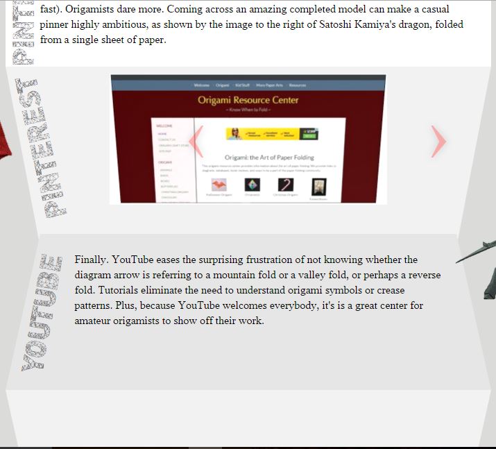
Here is a screenshot of how it currently appears:
CSS:
#slant1 {
width: 700px;
height: 225px;
background-color: white;
font-family: thorndale for vst;
font-size: 16px;
}
#slant2 {
border-top: 260px solid #F2F2F2;
border-left: 50px solid transparent;
border-right: 50px solid transparent;
height: 2600px;
width: 600px;
position: absolute;
z-index: -1;
}
#slant3 {
border-bottom: 225px solid #E6E6E6;
border-left: 50px solid transparent;
border-right: 50px solid transparent;
height: 225px;
width: 600px;
font-family: thorndale for vst;
font-size: 16px;
}
#slant4 {
border-top: 225px solid #F2F2F2;
border-left: 50px solid transparent;
border-right: 50px solid transparent;
height: 225px;
width: 600px;
}
<!DOCTYPE html>
<html lang="en" id="Origami">
<head>
<meta http-equiv="Content-Type" content="text/html; charset=utf-8" />
<title>Origami</title>
<link href="discover.css" rel="stylesheet" type="text/css" />
<meta name="description" content="Origami" />
<meta name="keywords" content="Origami">
<meta name="author" content="JojoRae" />
</head>
<body>
<div id="columnwrapper2">
<div id="slant1">
<div class="adamas1"></div> <div class="adamas"></div>
<p class="p">
</p>
</div>
<div id="slant2">
<ul class="slides">
<input type="radio" name="group3" id="img-11" checked />
<li class="slide-container">
<div class="slide">
<img src="../ei/treasure.gif" />
</div>
<div class="nav">
<label for="img-15" class="prev">‹</label>
<label for="img-12" class="next">›</label>
</div>
</li>
</ul>
</div>
<div id="slant3">
<div class="adamas3"></div>
<p class="p2"></p>
</div>
<div id="slant4">
</div>
</div> <!--closes columnwrapper-->
</body>
</html>
 205
205
I would personally leave out the border option (it's a bit hacky) and go with something different (and probably easier). Here are a couple of options:
1) Using CSS3 3D Transforms
You tried this one but it didn't work. From what you say in the question, the issue that you found when using rotateY (it only shrank) seems to be because you didn't combine it with perspective. Once you do so (and play a little bit with the values so they adjust to what you are looking for), not only the div will skew but also its content making it look like it's in the same angle as the paper effect.
Here is an example (also available on this JSFiddle):
html, body {
  background:#444;
}

#columnwrapper2 {
  min-width:700px;
}

.slant {
  margin:auto auto;
}

#slant1 {
  width: 700px;
  height: 225px;
  background-color: white;
  font-family: thorndale for vst;
  font-size: 16px;
}

#slant2 {
  width:655px;
  height:225px;
  background:#eee;
  transform: perspective(600px) rotateX(-20deg);
}

#slant3 {
  width:668px;
  height:225px;
  background:#ddd;
  transform: perspective(600px) rotateX(20deg) translateY(-33px);
}

#slant4 {
  width:642px;
  height:225px;
  background:#eee;
  transform: perspective(600px) rotateX(-20deg) translateY(-33px);
}
<div id="columnwrapper2">
<div id="slant1" class="slant">
<div>
Lorem ipsum dolor sit amet, consectetur adipiscing elit. Mauris mi odio, fermentum eget ex sed, tincidunt consectetur enim. Suspendisse viverra commodo ultrices. In eu facilisis leo, quis consectetur ex. Nam congue fringilla elit, ac mattis velit dictum ac. Donec tincidunt placerat ligula fermentum vulputate. Sed malesuada orci sit amet enim euismod, et euismod nunc pretium. Ut molestie et sem eu consectetur. Praesent fringilla elit enim, a convallis nulla sodales id. Sed tristique cursus libero. Cras ac magna id nisl pulvinar iaculis eu sit amet velit.
</div>
</div>
<div id="slant2" class="slant">
<div>
<img src="http://lorempixel.com/500/200/people" alt="Random Picture" />
</div>
</div>
<div id="slant3" class="slant">
<div>
Vivamus interdum facilisis justo ut fermentum. Cras turpis diam, efficitur sit amet mi sit amet, dapibus fermentum odio. Aenean fermentum tincidunt placerat. Vivamus dictum, diam quis elementum laoreet, lacus ex consectetur neque, eget fringilla ipsum neque nec sem. Ut eget venenatis urna, quis feugiat orci. Pellentesque vel interdum ante. Nulla blandit ex quam, non sollicitudin lectus laoreet nec. Integer vitae finibus elit. Duis pellentesque turpis odio, sit amet convallis libero blandit et. Maecenas accumsan est eros, vel scelerisque nulla scelerisque sit amet.
</div>
</div>
<div id="slant4" class="slant">
<div>
Duis non placerat nisi, in maximus tellus. Nullam in interdum nunc, sed tempus nunc. Suspendisse lorem nisi, blandit vel odio ac, varius rhoncus sem. Phasellus quis placerat enim, id iaculis eros. Nunc at egestas nisi. Nulla in dui mattis, lacinia lectus ac, commodo ligula. Fusce fringilla vitae magna sit amet dignissim. Fusce quis elit elementum, faucibus eros id, facilisis mi. In vitae accumsan tellus. Quisque venenatis lacus urna, volutpat luctus eros feugiat id. Duis pretium pulvinar molestie. Nulla eget rhoncus sapien.
</div>
</div>
</div> <!--closes columnwrapper-->2) Using SVG
Another option would be using SVG. This maybe an easier alternative if you don't want the text to skew with the paper folding effect (or one that doesn't require playing with the numbers). It will require you to know the exact height of each section though.
You could create an image in SVG (directly as image or as the code below), and place it in the background of #columnwrapper2, the rest of the content would go on top of the image.
See this demo (also available on this JSFiddle):
html, body {
  background:#444;
}

#columnwrapper2 {
  width:700px;
  position:relative;
}

.slant {
  margin:auto auto;
  height:250px;
  width:600px;
  padding:50px auto;
  z-index:2;
  position:relative;
}
<div id="columnwrapper2">
<svg width="700px" height="1000px" style="position:absolute;top:0;left:0;z-index:1;">
<path fill="#ffffff" d="M0,0 700,0 700,250 0,250Z" />
<path fill="#eeeeee" d="M0,250 700,250 650,500 50,500Z" />
<path fill="#dddddd" d="M50,500 650,500 700,750 0,750Z" />
<path fill="#eeeeee" d="M0,750 700,750 650,1000 50,1000Z" />
</svg>
<div id="slant1" class="slant">
<div>
Lorem ipsum dolor sit amet, consectetur adipiscing elit. Mauris mi odio, fermentum eget ex sed, tincidunt consectetur enim. Suspendisse viverra commodo ultrices. In eu facilisis leo, quis consectetur ex. Nam congue fringilla elit, ac mattis velit dictum ac. Donec tincidunt placerat ligula fermentum vulputate. Sed malesuada orci sit amet enim euismod, et euismod nunc pretium. Ut molestie et sem eu consectetur. Praesent fringilla elit enim, a convallis nulla sodales id. Sed tristique cursus libero. Cras ac magna id nisl pulvinar iaculis eu sit amet velit.
</div>
</div>
<div id="slant2" class="slant">
<div>
<img src="http://lorempixel.com/500/200/people" alt="Random Picture" />
</div>
</div>
<div id="slant3" class="slant">
<div>
Vivamus interdum facilisis justo ut fermentum. Cras turpis diam, efficitur sit amet mi sit amet, dapibus fermentum odio. Aenean fermentum tincidunt placerat. Vivamus dictum, diam quis elementum laoreet, lacus ex consectetur neque, eget fringilla ipsum neque nec sem. Ut eget venenatis urna, quis feugiat orci. Pellentesque vel interdum ante. Nulla blandit ex quam, non sollicitudin lectus laoreet nec. Integer vitae finibus elit. Duis pellentesque turpis odio, sit amet convallis libero blandit et. Maecenas accumsan est eros, vel scelerisque nulla scelerisque sit amet.
</div>
</div>
<div id="slant4" class="slant">
<div>
Duis non placerat nisi, in maximus tellus. Nullam in interdum nunc, sed tempus nunc. Suspendisse lorem nisi, blandit vel odio ac, varius rhoncus sem. Phasellus quis placerat enim, id iaculis eros. Nunc at egestas nisi. Nulla in dui mattis, lacinia lectus ac, commodo ligula. Fusce fringilla vitae magna sit amet dignissim. Fusce quis elit elementum, faucibus eros id, facilisis mi. In vitae accumsan tellus. Quisque venenatis lacus urna, volutpat luctus eros feugiat id. Duis pretium pulvinar molestie. Nulla eget rhoncus sapien.
</div>
</div>
</div> <!--closes columnwrapper-->One advantage of SVG is that it is supported by most browsers (with the previous transform solution, you may find some issues with IE that will need tweaking).
116
If you love us? You can donate to us via Paypal or buy me a coffee so we can maintain and grow! Thank you!
Donate Us With