 Menu
Menu
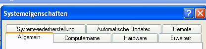
I'm trying to create a CSS fluid tab menu, with a variable number of tabs (similar to what can be seen in Windows, where tabs expand depending on length of contained header, see below).
Here is an example, I have setup (I need to keep element structure):
<div class="test">
    <div class="element">
        <h3>
            <span class="dummy-a">
                <span class="dummy-ui-btn-inner">
                    <span class="dummy-ui-btn-text">very long text is this</span>
                </span>
            </span>
        </h3>
    </div>
     <div class="element">
        <h3>
            <span class="dummy-a">
                <span class="dummy-ui-btn-inner">
                    <span class="dummy-ui-btn-text">Two</span>
                </span>
            </span>
        </h3>
    </div>
     <div class="element">
        <h3>
            <span class="dummy-a">
                <span class="dummy-ui-btn-inner">
                    <span class="dummy-ui-btn-text">Three</span>
                </span>
            </span>
        </h3>
    </div>
     <div class="element">
        <h3>
            <span class="dummy-a">
                <span class="dummy-ui-btn-inner">
                    <span class="dummy-ui-btn-text">Four</span>
                </span>
            </span>
        </h3>
    </div>
    <div class="element">
        <h3>
            <span class="dummy-a">
                <span class="dummy-ui-btn-inner">
                    <span class="dummy-ui-btn-text">Five</span>
                </span>
            </span>
        </h3>
    </div>
</div>
And CSS:
.test { width: 100%; display: table; }
.test .element { border: 1px solid red; float: left; min-width: 19%;  }
.test .element.prelast { border: 1px solid green; }
.test .element.last { float: none !important; overflow: hidden; }
.test .element h3 {  overflow: hidden; text-overflow: ellipsis; white-space: nowrap; }
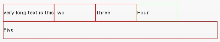
This will create the following:

When I shrink the screen, the menu breaks to multiple lines with the last element filling the remaining width:
My problem is expanding the elements in "the first row" to cover available space once the menu breaks. Simply setting min-width: 19% is the problem, but I can't get anything to work.
Question:
How would I make the elements in a "row" (it's not really a row, if it breaks into multiple rows) take up all the available space by using CSS only?
EDIT:
Here is a sample page showing what I mean. Shrink the browser window and see how the elements behave. I'm looking for a way to make the first row expand full width AFTER breaking into multiple lines.
UPDATE:
I have updated the sample page. See here. I don't have any problems expanding elements while they are all "in one row". The problem starts when the row "breaks" into multiple rows. I would like to know if it's possible to fill the top right gap by making elements expand all across the screen.
Here are two additional screenshots.
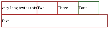
So the gap next to element "Four" needs to be closed
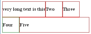
Now the gap next to element "Three" needs to be closed. You can see it does not work setting something on element "Four", because it will not always be at the top right position. Rather it should be a CSS rule I'm setting on all elements (I guess).
Also, if this can easily be done using Javascript/Jquery, I would also listen for ideas?
Thanks for helping out!
 726
726
The first thing I can think of is that since you're already setting your .test div to display: table, maybe set your .test .element to display: table-cell. This will keep them all in the same row and just expand to 100%. The only thing is that < IE8 doesn't handle display: table-cell, but there are solutions around this. One being here. I'm not sure if this really achieves exactly what you want, but it's a possibility. I'll keep my subconscious thinking about it though. Good question!
fiddle
157
If you love us? You can donate to us via Paypal or buy me a coffee so we can maintain and grow! Thank you!
Donate Us With

