 Menu
Menu
I tried to make Bootstrap Modal box work and make it responsive, and read this question too: Bootstrap Modal Dialog. Can the grid system be used within a modal context?
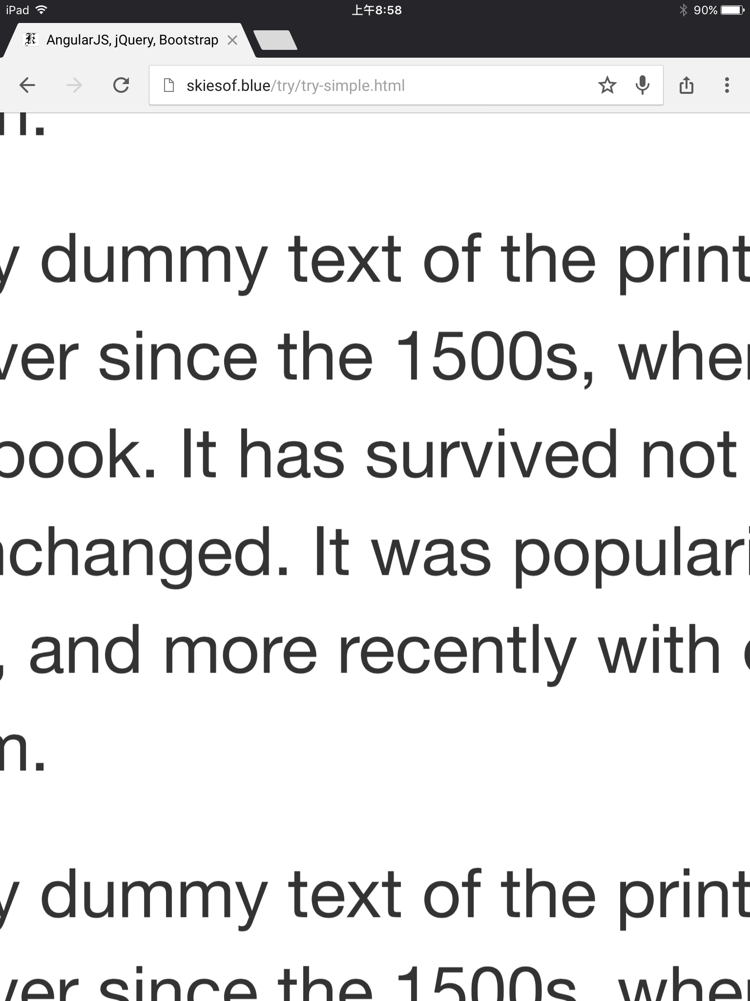
However, the page worked well in Google Chrome, and worked well in Google Chrome simulated iPhone 5, 6, or 6 Plus (note: as simulated in developer tool) -- but not work on a real iPhone 6 Plus or iPad (in the portrait mode). (the text appears really huge).
Is there a way to make it work?
The code:
<div class="modal-body">
    <div class="container col-md-12">
        <div class="row">
            <p class="col-md-4">
                1 Lorem Ipsum is simply dummy text of the printing and typesetting industry. Lorem Ipsum has been the industry's standard dummy text ever since the 1500s, when an unknown printer took a galley of type and scrambled it to make a type specimen book. It has survived not only five centuries, but also the leap into electronic typesetting, remaining essentially unchanged. It was popularised in the 1960s with the release of Letraset sheets containing Lorem Ipsum passages, and more recently with desktop publishing software like Aldus PageMaker including versions of Lorem Ipsum.
            </p>
            <p class="col-md-4">
                2 Lorem Ipsum is simply dummy text of the printing and typesetting industry. Lorem Ipsum has been the industry's standard dummy text ever since the 1500s, when an unknown printer took a galley of type and scrambled it to make a type specimen book. It has survived not only five centuries, but also the leap into electronic typesetting, remaining essentially unchanged. It was popularised in the 1960s with the release of Letraset sheets containing Lorem Ipsum passages, and more recently with desktop publishing software like Aldus PageMaker including versions of Lorem Ipsum.
            </p>
            <p class="col-md-4">
                3 Lorem Ipsum is simply dummy text of the printing and typesetting industry. Lorem Ipsum has been the industry's standard dummy text ever since the 1500s, when an unknown printer took a galley of type and scrambled it to make a type specimen book. It has survived not only five centuries, but also the leap into electronic typesetting, remaining essentially unchanged. It was popularised in the 1960s with the release of Letraset sheets containing Lorem Ipsum passages, and more recently with desktop publishing software like Aldus PageMaker including versions of Lorem Ipsum.
            </p>
        </div>
    </div>
</div>
sample page on: http://skiesof.blue/try/
P.S. I am looking into this issue further. With my iPhone 6 Plus that has iOS 9.3.1, it seems to work well, but on an iPad with iOS 9.0 or 9.1, it has this when the modal is popped up:
 978
978
Bootstrap modals don't work correctly on Android and iOS. The issue tracker acknowledges the problem but does not offer a working solution: Modals in 2.0 are broken on mobile. The screen darkens but the modal itself is not visible in the viewport.
Bootstrap modals are supposed to be responsive by default. Something to look out for is if you have a width set on your Modal. For example I had a form body container inside of my modal with a height of 40rem.
To trigger the modal window, you need to use a button or a link. Then include the two data-* attributes: data-toggle="modal" opens the modal window. data-target="#myModal" points to the id of the modal.
Seems like this is an iOS9 issue and it's unrelated to the content of the modal. I haven't got an iPhone 6+ but I experienced the same issue on my iPad. Adding the following CSS made it work for me:
body {
  padding-right: 0px !important
}

.modal-open {
  overflow-y: auto;
}
https://stackoverflow.com/a/32720590/1581477
https://github.com/jschr/bootstrap-modal/issues/64#issuecomment-55794181
87
 answered Sep 28 '22 17:09
According to bootstrap example there is no need to add container col-md-12 after modal-body just add your html after modal-body.
<div class="modal-body">
  <div class="row">
    <div class="col-md-3">
      <p>1st col 3</p>
    </div>
    <div class="col-md-3">
      <p>2nd col 3</p>
    </div>
    <div class="col-md-3">
      <p>3rd col 3</p>
    </div>
    <div class="col-md-3">
      <p>4th col 3</p>
    </div>
  </div>
</div>
If you love us? You can donate to us via Paypal or buy me a coffee so we can maintain and grow! Thank you!
Donate Us With