 Menu
Menu
I want to keep my footer at the bottom of the page. I try this
position: absolute;
left: 0;
bottom: 0;
height: 100px;
width: 100%;
but my footer getting messy. My website is made in WordPress. If possible I don't want to use any plugin for this. And I want to use a pure CSS only.
Here the CSS script
footer #bottom-footer{
background: none repeat scroll 0 0 #FFFFFF;
color: #000000;
border-top: 5px solid #F80000;
text-align: left;
padding: 9px;
font-size: 13px;
}
.footer-wrap a{
color:#000000;
}
.footer-wrap a:hover{
color:#F80000;
}
.footer-logo a {
margin-bottom: 6px;
display: block;
}
.footer-socials {
float: left;
line-height: 0px;
}
.footer-socials a {
border-radius: 100%;
color: #ffffff;
display: inline-block;
font-size: 14px;
height: 30px;
line-height: 30px;
margin-left: 3px;
text-align: center;
vertical-align: middle;
width: 30px;
}
.footer-socials a.facebook {
background: none repeat scroll 0 0 #1f69b3;
}
.footer-socials a.twitter {
background: none repeat scroll 0 0 #43b3e5;
}
.footer-socials a.gplus {
background: none repeat scroll 0 0 #d84734;
}
.footer-socials a.youtube {
background: none repeat scroll 0 0 #df2126;
}
.ak-contact-address .socials a.pinterest {
background: none repeat scroll 0 0 #ff3635;
}
.footer-socials a.linkedin {
background: none repeat scroll 0 0 #1a7696;
}
.footer-socials .socials a.flickr {
background: none repeat scroll 0 0 #e1e2dd;
}
.footer-socials .socials a.vimeo {
background: none repeat scroll 0 0 #7fdde8;
}
.footer-socials .socials a.instagram {
background: none repeat scroll 0 0 #c8c5b3;
}
.footer-socials .socials a.tumblr {
background: #395976;
}
.footer-socials .socials a.rss {
background: none repeat scroll 0 0 #fbc95d;
}
.footer-socials .socials a.github {
background: none repeat scroll 0 0 #383838;
}
.footer-socials .socials a.stumbleupon {
background: none repeat scroll 0 0 #e94c29;
}
.footer-socials .socials a.skype {
background: none repeat scroll 0 0 #09c6ff;
}
.footer-socials .social-icons span {
cursor: pointer;
display: inline-block;
}
.footer-socials .socials i {
-webkit-backface-visibility: hidden;
-moz-backface-visibility: hidden;
backface-visibility: hidden;
}
.tagcloud a{
font-size: 13px !important;
background: rgba(0,0,0,0.4);
padding: 8px 10px;
margin: 0 2px 4px 0;
display: inline-block;
line-height: 1;
}
.sidebar .tagcloud a{
background: #23A38F;
color: #FFF;
}
Website link
 331
331
Using FlexboxSet the body display to flex display: flex; and flex-direction to column flex-direction: column; . Select footer element (of whatever you want to stick to bottom) and set top margin to auto margin-top: auto; .
The Sticky footer pattern needs to meet the following requirements: Footer sticks to the bottom of the viewport when content is short. If the content of the page extends past the viewport bottom, the footer then sits below the content as normal.
CSS. Control the look and feel of the header and footer of your site with your CSS. To edit your CSS, click "Edit" at the right of the "Custom Header / Footer CSS" field under the "Appearance" tab of your Management Console.
CSS Demo: position To see the effect of sticky positioning, select the position: sticky option and scroll this container. The element will scroll along with its container, until it is at the top of the container (or reaches the offset specified in top ), and will then stop scrolling, so it stays visible.
A couple modern methods using a sprinkle of flex box CSS and the following HTML structure:
<body>
    <header></header>
    <main></main>
    <footer></footer>
</body>
Method 1: (fixed height footer) Apply display:flex and flex-direction:column to the body. Apply flex:1 (flex-grow:1) to the main element.
The main element will grow vertically to occupy any empty space, thus making the footer stick to the bottom.
body {
  display: flex;
  flex-direction: column;
  min-height: 100vh;
  margin:0;
}

header {
  background-color: #cffac7;
  height:50px;
}

main {
  background-color: #f8e2ff;
  flex:1;
}

footer {
  background-color: #fceec7;
  height:50px;
}
<header></header>
<main></main>
<footer></footer>Method 2: (fixed height footer) Apply display:flex and flex-direction:column to the body. Apply margin-top:auto the footer.
You're done, because auto margins inside flex containers absorb all available free space, making the footer stick to the bottom. Note that this is not dependent on main having any height or content. In this case, we've given main no flex rules at all, and so it gets the default value of flex:initial (flex: 0 1 auto).
body {
      display: flex;
      flex-direction: column;
      min-height: 100vh;
      margin:0;
    }

    header {
      background-color: #cffac7;
      height:50px;
    }

    main {
      background-color: #f8e2ff;
    }

    footer {
      background-color: #fceec7;
      height:50px;
      margin-top:auto;
    }
<header></header>
<main></main>
<footer></footer>Method 3: (fluid height footer) This is really the same technique as in #1 but with elements that have no intrinsic height. By virtue of the ratio between the (unitless) flex-grow values given to the competing elements, main will grow at five times the rate as the header and footer.
body {
  display: flex;
  flex-direction: column;
  min-height: 100vh;
  margin:0;
}

header {
  background-color: #cffac7;
  flex:1;
}

main {
  background-color: #f8e2ff;
  flex:5;
}

footer {
  background-color: #fceec7;
  flex:1
}
<header></header>
<main></main>
<footer></footer>This works perfect. It's the example from W3SCHOOLS
https://www.w3schools.com/howto/howto_css_fixed_footer.asp
<!DOCTYPE html>
<html>
<head>
<meta name="viewport" content="width=device-width, initial-scale=1">
<style>
.footer {
   position: fixed;
   left: 0;
   bottom: 0;
   width: 100%;
   background-color: red;
   color: white;
   text-align: center;
}
</style>
</head>
<body>

<h2>Fixed/Sticky Footer Example</h2>
<p>The footer is placed at the bottom of the page.</p>

<div class="footer">
  <p>Footer</p>
</div>

</body>
</html>
Following a clean method implemented from an online source no longer available (dead link), the minimum code you should need for your page would be (note - probably best to use #bottom-footer instead of footer #bottom-footer for the selection of your footer - that could be part of the issue):
html {
    position: relative;
    min-height: 100%;
}
body {
    margin: 0 0 100px; /* bottom = footer height */
}
#bottom-footer {
    position: absolute;
    left: 0;
    bottom: 0;
    height: 100px;
    width: 100%;
}
If you're here, then you probably suffered for far too long like I did :)
Here's a solution that will work. It's what I use for my site here:
https://aleksandrhovhannisyan.github.io/
You can verify that it works regardless of how much content is on a page by navigating to a fake URL under my site domain:
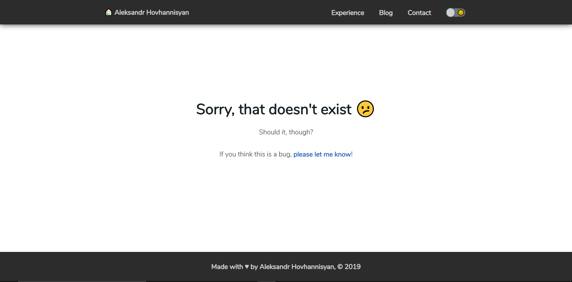
I'll keep things very generic and reusable. Below is all the code you need, with a basic DOM consisting of a fixed top navigation/navbar, a main content area, and a sticky footer.
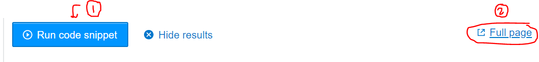
I recommend you run and view it in full-page mode to verify that it works:
body {
    display: grid;
    /* Replace 80 with your footer height, or with auto for variable-height footers */
    grid-template-rows: 1fr 80px;
    /* These two are important */
    min-height: 100vh;
    position: relative;
}

#topnav {
  background-color: black;
  color: white;
  /* Recommended by Google, but adjust as you see fit */
  min-height: 64px;
  position: fixed;
  right: 100%;
  top: 0;
  width: 100%;
  /* This is to ensure that it always appears above everything. */
  z-index: 100;
  left: 0;
}

#page-content {
    grid-row: 1;
    /* https://css-tricks.com/preventing-a-grid-blowout/ */
    min-width: 0;
    /* change as you see fit */
    padding-bottom: 64px;
    padding-top: 64px;
}

#page-footer {
    background: black;
    bottom: 0;
    color: white;
    display: flex;
    grid-row: 2;
    height: 80px;
    position: absolute;
    width: 100%;
}
<body>
<header>
<nav id="topnav">topnav stuff goes in here</nav>
</header>
<main id="page-content">
<h1>Page content goes here</h1>
</main>
<footer id="page-footer" class="container">
<div>Made by Name</div>
</footer>
</body>If you love us? You can donate to us via Paypal or buy me a coffee so we can maintain and grow! Thank you!
Donate Us With