 Menu
Menu
I'm trying to have a bootstrap 4 form with some fields that should be in one row for screens larger than sm, and to put them in 2 rows otherwise.
I tried to do that using this code:
<div class="form-group row">
  <label class="col-sm-2 col-form-label">File:</label>
  <div class="col-sm-10 col-md-6">
    <input class="form-control" type="text" />
  </div>
  <label class="col-sm-2 col-md-2 col-form-label">Type</label>
  <div class="col-sm-4 col-md-2">
    <select class="form-control"><option value=""></option></select>
  </div>
</div>
For md+, the fields will be in one row: 2+6+2+2
For sm, the row will be 2+10 (let's name that A), and the next one - B - 2+4...
My problem is that between the new 'rows' A and B there is no margin, like it would be if we would had 2 divs with the "row" class.
See in this fiddle: https://jsfiddle.net/truesoft/q1djhp5b/ there is Row 1 just for example of the margin, it has a margin between the next one. But there is no margin when the Type label and select go on the next line when the screen is sm. I tried to make a margin for the submit button, but if I put to those ones, it will not be displayed ok in the other case.
Which would be the best way to do this?
 422
422
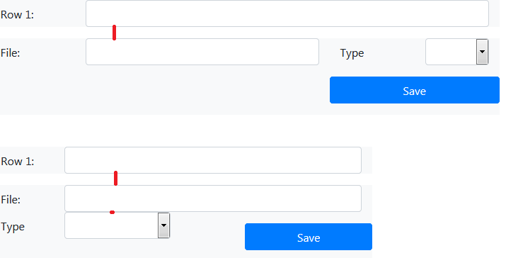
You almost got it. You just need to add in the correct combination of spacing utilities.
.row {
  background: #f8f9fa;
}
<link href="https://stackpath.bootstrapcdn.com/bootstrap/4.1.0/css/bootstrap.min.css" rel="stylesheet"/>
<div class="container">
<div class="form-group row py-sm-3 mb-0">
<label class="col-sm-2 col-form-label">Row 1:</label>
<div class="col-sm-10">
<input class="form-control" type="text">
</div>
</div>
<div class="form-group row pb-3">
<label class="col-sm-2 col-form-label" for="file">File:</label>
<div class="col-sm-10 col-md-6">
<input class="form-control mb-sm-3" id="file" type="text">
</div>
<label class="col-sm-2 col-md-1 col-form-label" for="type">Type</label>
<div class="col-sm-5 col-md-3 mb-3">
<select class="form-control" id="type">
<option value=""></option>
<option value="1">1</option>
</select>
</div>
<div class="offset-sm-1 offset-md-8 col-sm-4">
<input name="commit" value="Save" class="btn btn-primary btn-block" type="submit">
</div>
</div>
</div>Note: I also took the liberty to make the type field a tad bigger on md, as it seemed a bit too squeezed and I had where to take space from. Of course, that's totally optional, it will work if you revert them back.
What your example was missing were the {property}{sides}-{breakpoint}-{size} classes.
160
If you love us? You can donate to us via Paypal or buy me a coffee so we can maintain and grow! Thank you!
Donate Us With

