 Menu
Menu
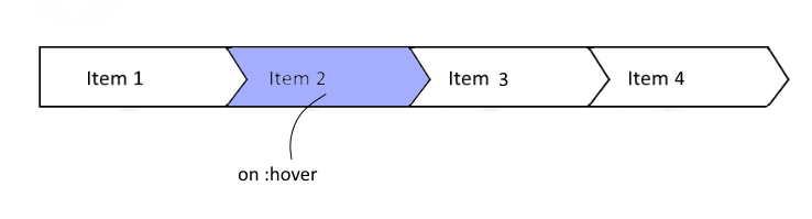
I want to make menu navigation bar with several inline-block li elements, each of them must have arrow-like right side. Like this:
I googled for it and the most common answer is to use css tricks with transparent border. Like this one: http://jsfiddle.net/jx99z/5/
html:
<div class="text">Some Text<span class="arrow"></span></div>
css:
.text {
    background-color:#ff0000;
    color:#fff;
    display:inline-block;
    padding-left:4px;
}
.arrow {
    border-style: dashed;
    border-color: transparent;
    border-width: 0.20em;
    display: -moz-inline-box;
    display: inline-block;
    /* Use font-size to control the size of the arrow. */
    font-size: 100px;
    height: 0;
    line-height: 0;
    position: relative;
    vertical-align: middle;
    width: 0;
    background-color:#fff; /* change background color acc to bg color */
    border-left-width: 0.2em;
    border-left-style: solid;
    border-left-color: #ff0000;
    left:0.25em;
}
It seems pretty good, but when I try to add other elements with :hover, they don't look and behave properly: http://jsfiddle.net/txayr2j6/
html:
<div class="text">Some Text<span class="arrow"></span></div>
<div class="text">Some Text<span class="arrow"></span></div>
css:
.text {
    background-color:#ff0000;
    color:#fff;
    display:inline-block;
    padding-left:4px;
}
.arrow {
    border-style: dashed;
    border-color: transparent;
    border-width: 0.20em;
    display: -moz-inline-box;
    display: inline-block;
    /* Use font-size to control the size of the arrow. */
    font-size: 100px;
    height: 0;
    line-height: 0;
    position: relative;
    vertical-align: middle;
    width: 0;
    background-color:#fff; /* change background color acc to bg color */
    border-left-width: 0.2em;
    border-left-style: solid;
    border-left-color: #ff0000;
    left:0.25em;
}
.text:hover {
    background-color:#ccc;
    border-left-color: #ccc;
}
Another solution, which I found, is that I can draw any element using svg (whatever that means) like this: http://codepen.io/anon/pen/OXWoXd
html:
<svg xmlns="http://www.w3.org/2000/svg" version="1.1">
  <polygon points="
    0,0
    0,200
    270,200
    300,100
    270,0
    150,0
    " />
<div>Item 1</div>
</svg>
css:
svg polygon {
    fill: transparent;
    stroke: black;
    stroke-width: 2px;
}

svg {
    background-color: #ccc;
    height: 50%;
}

body, html {
    height: 100%;
    margin: .2em;
}
But that solution is even worse: somehow I can't make element wider than 300 px and look at those ugly border and background. Also, I want that bar to be responsive. Thanks!
 274
274
Used a polygon element for the shape.
Text element for the link description.
A element for creating a link.
#arrow-menu a polygon {
  fill: #888;
  stroke: #222;
}
#arrow-menu a:hover polygon {
  stroke: #222;
  fill: black;
}
#arrow-menu a:hover text {
  fill: cornflowerblue;
}
#arrow-menu a {
  font-size: 5px;
}
<svg id="arrow-menu" viewBox="-1 -1 112 22" xmlns:xlink="http://www.w3.org/1999/xlink">
<a xlink:href="#">
<polygon points="0,0 20,0 25,10 20,20 0,20 0,0"></polygon>
<text x="1.5" y="11.5">Menu link</text>
</a>
<a xlink:href="#">
<polygon transform="translate(22)" points="0,0 20,0 25,10 20,20 0,20 5,10 0,0"></polygon>
</a>
<a xlink:href="#">
<polygon transform="translate(44)" points="0,0 20,0 25,10 20,20 0,20 5,10 0,0"></polygon>
</a>
<a xlink:href="#">
<polygon transform="translate(66)" points="0,0 20,0 25,10 20,20 0,20 5,10 0,0"></polygon>
</a>
</svg>If you love us? You can donate to us via Paypal or buy me a coffee so we can maintain and grow! Thank you!
Donate Us With