 Menu
Menu
The design I have been given to try to match requires a checkbox to be a circle. I'm using MUI with React.
Border radius does not work because the border of the actual icon is not the border of the visible checkbox.
I can't just use something like Font Awesome, because it needs to actually be checked and unchecked.
// Current Styling
const styles = theme => ({
  nested: {
    paddingLeft: theme.spacing.unit * 4,
  },
  icon: {
    margin: theme.spacing.unit,
    fontSize: 25,
  },
  root: {
    color: cyan['A400'],
    '&$checked': {
      color: cyan['A400'],
    },
  },
  checked: {},
});

// Actual checkbox code
return (
  // Holds the individual step with edit icon and delete icon
  <>
    <ListItemIcon>
      {/* Checkbox */}
      <Checkbox
        type="checkbox"
        defaultChecked={step.completed}
        onChange={this.onChange}
        value="true"
        classes={{
          root: classes.root,
          checked: classes.checked,
        }}
      />
    </ListItemIcon>
I want to keep the working code of MUI Checkbox but just change some styling to make the edges a perfect circle (like a radio button but with a checkmark in the middle.
 469
469
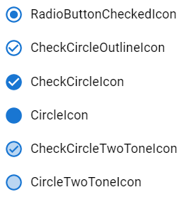
You can override the checked and unchecked icons of the Checkbox as explained in this section. To make it round like the Radio button, you can use the following material icons:
import Checkbox from '@mui/material/Checkbox';

import RadioButtonUncheckedIcon from '@mui/icons-material/RadioButtonUnchecked';
import RadioButtonCheckedIcon from '@mui/icons-material/RadioButtonChecked';
import CheckCircleOutlineIcon from '@mui/icons-material/CheckCircleOutline';
import CheckCircleIcon from '@mui/icons-material/CheckCircle';
import CircleIcon from '@mui/icons-material/Circle';
import CheckCircleTwoToneIcon from '@mui/icons-material/CheckCircleTwoTone';
import CircleTwoToneIcon from '@mui/icons-material/CircleTwoTone';
<Checkbox
  icon={<RadioButtonUncheckedIcon />}
  checkedIcon={<RadioButtonCheckedIcon />}
/>
<Checkbox
  icon={<RadioButtonUncheckedIcon />}
  checkedIcon={<CheckCircleOutlineIcon />}
/>
<Checkbox
  icon={<RadioButtonUncheckedIcon />}
  checkedIcon={<CheckCircleIcon />}
/>
<Checkbox
  icon={<RadioButtonUncheckedIcon />}
  checkedIcon={<CircleIcon />}
/>
<Checkbox
  icon={<RadioButtonUncheckedIcon />}
  checkedIcon={<CheckCircleTwoToneIcon />}
/>
<Checkbox
  icon={<RadioButtonUncheckedIcon />}
  checkedIcon={<CircleTwoToneIcon />}
/>

160
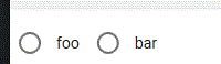
Material's Checkbox supports custom icons. There are circular checked circle Material icons, and for the empty circle, you can cheat a bit and use the icon for Radio input (they are the same size, so it works perfectly):
import Checkbox from '@material-ui/core/Checkbox';
import CircleChecked from '@material-ui/icons/CheckCircleOutline';
import CircleCheckedFilled from '@material-ui/icons/CheckCircle';
import CircleUnchecked from '@material-ui/icons/RadioButtonUnchecked';

…

<Checkbox
  icon={<CircleUnchecked />}
  checkedIcon={<CircleChecked />}
  …
/>

// or with filled checked icon:

<Checkbox
  icon={<CircleUnchecked />}
  checkedIcon={<CircleCheckedFilled />}
  …
/>
…and it looks like this (foo is CheckCircleOutline, bar is CheckCircle):
38
If you love us? You can donate to us via Paypal or buy me a coffee so we can maintain and grow! Thank you!
Donate Us With


